
 Black Steel Doors
 Woodstock Campers
 Phillips Joinery
TL;DR:
- Effective marketing graphics require clarity, brand coherence, and impactful visuals that drive measurable actions. Utilising strong, distinct CTAs, platform-specific formats, and consistent branding enhances audience engagement and conversion rates. AI tools enable rapid variation testing, reducing costs and optimising design performance across channels.
The best graphic design ideas for marketing are defined by three non-negotiable qualities: clarity, brand cohesion, and visual impact that drives measurable action. Strong design is not decoration. It is the mechanism by which your brand communicates trust, guides attention, and converts browsers into buyers. Incorporating strong CTAs and audience-focused benefits into your marketing visuals can increase conversion rates by up to 400%. That figure alone should settle any debate about whether design investment is worth it. This guide covers the most effective visual marketing strategies available right now, with practical examples you can act on immediately.
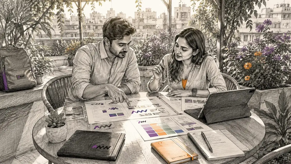
1. graphic design ideas for marketing that actually convert
The foundation of any effective marketing graphic is a clear call to action. Without it, even the most beautiful design is just wallpaper. Visual hierarchy, contrast, and whitespace guide the viewer’s eye toward the most important element on the page, whether that is a button, a headline, or a product image.
Strong CTAs work best when they are visually distinct from surrounding content. Use a contrasting colour for your CTA button, pair it with a short benefit-driven label (“Get your free quote” beats “Submit”), and give it breathing room with whitespace. Tools like Canva, Adobe Express, and Figma make it simple to test these variations without a full design team.
Brand-cohesive colour schemes and typography are equally critical. Consistent use of your brand palette across every touchpoint builds recognition over time. Research from the design industry consistently shows that audiences form visual associations with brands faster through colour than through logos alone.
- Use no more than two typefaces per design: one for headlines, one for body copy
- Stick to a defined colour palette of three to five brand colours
- Apply whitespace deliberately to prevent visual clutter
Pro Tip: Save your brand colours as hex codes in every tool you use, from Canva to Adobe Illustrator, so every team member produces on-brand assets without guessing.
2. mobile-first design is no longer optional
Mobile devices account for the majority of digital content consumption in the UK. Designing for desktop first and then scaling down is a workflow that produces mediocre results on the screens where most of your audience actually lives. Mobile-first design means starting with the smallest screen and building up.
Practically, this means larger text sizes, thumb-friendly button placements, and simplified layouts that do not rely on hover states or fine detail. High-contrast colour combinations are especially important on mobile, where screen brightness and ambient light vary wildly. Dark mode optimisation is now a genuine consideration: designs that look clean on a white background can appear washed out or broken in dark mode.
About 8% of potential users will abandon a site immediately if the interface is difficult to use. That is not a rounding error. It represents a real slice of your audience walking away before they have seen your offer.
Accessible design practices, including sufficient colour contrast ratios, alt text on images, and legible font sizes, reduce that abandonment rate and widen your potential audience. The Web Content Accessibility Guidelines (WCAG) provide a clear standard to design against.
3. how AI transforms creative marketing graphics at scale
AI design tools have changed the economics of creative production. Platforms like Zsky AI, The Brief AI, and BrandGene now generate platform-specific marketing visuals in minutes, not days. The real advantage is volume: practitioners generate 20 to 50 design variations per campaign for testing, which was simply not feasible with traditional workflows.
That volume matters because it enables proper A/B testing. Instead of guessing which headline or colour scheme performs better, you run both and let the data decide. Volume-based testing with AI-generated designs reduces cost per acquisition by 40 to 60% compared to single-asset workflows. For any brand running paid advertising, that is a significant efficiency gain.
“AI does not replace the creative brief. It executes it faster. The quality of your output is still determined by the quality of your input, which means your brand strategy, your audience insight, and your message clarity all matter more than ever.”, BrandGene Blog
AI Smart Resize technology adapts a single design to over 50 platform-specific sizes while preserving layout and hierarchy. This solves one of the most tedious problems in marketing production: manually reformatting assets for Instagram Stories, Facebook feed posts, Google Display banners, and email headers. You can read more about how these workflows fit into broader content strategy in AMW Media’s piece on AI in content creation.
When writing prompts for AI design tools, include your brand colours, typeface names, target platform, and the single message you want the viewer to take away. Vague prompts produce generic results.
4. which formats and channels maximise visual impact
Different platforms reward different design formats. A square graphic that performs well on Instagram will look awkward as a Google Display banner. Understanding platform-specific constraints is not optional if you want your creative marketing graphics to perform.
Effective marketing graphics use platform-specific design constraints including safe copy zones, crop areas, and mobile readability. Ignoring these constraints means your headline gets cropped, your CTA disappears, or your image looks compressed.
| Platform | Recommended Format | Key Design Consideration |
|---|---|---|
| Instagram Feed | 1080 x 1080px (square) | Bold visuals, minimal text overlay |
| Instagram Stories | 1080 x 1920px (vertical) | Text within safe zones, strong CTA |
| Facebook Feed | 1200 x 628px (landscape) | Clear headline above the fold |
| Google Display | 300 x 250px (rectangle) | High contrast, legible at small size |
| Email Header | 600 x 200px (wide) | Minimal layout, single focal point |
| LinkedIn Post | 1200 x 627px (landscape) | Professional tone, data-led visuals |
Animated banners and GIFs add movement without the page weight of video. They are particularly effective for display advertising, where static images compete for attention in a cluttered environment. Keep animations under three seconds and loop them cleanly so the message lands even if the viewer only catches one cycle.
5. branding design ideas that build recognition fast
Brand recognition is built through repetition and consistency, not through novelty alone. The most effective branding design ideas combine a fixed visual identity with fresh executions that feel current without abandoning what makes the brand recognisable.
A defined brand colour palette is your most powerful recognition tool. Brands like Innocent Drinks and Monzo have built instant visual recognition through disciplined colour use across every touchpoint, from packaging to social media to app interfaces. You do not need a Monzo-sized budget to apply the same principle.
Typography carries more personality than most marketers realise. A serif typeface signals heritage and authority. A geometric sans-serif reads as modern and direct. Mixing both strategically, a bold serif headline with a clean sans-serif body, creates visual contrast that holds attention without feeling chaotic.
- Choose one primary brand typeface and use it consistently across all materials
- Define secondary and accent colours for CTAs and highlights
- Create a simple one-page brand style guide that any designer or AI tool can reference
Pro Tip: Build a shared folder of approved brand assets, including logos, colour swatches, and typeface files, and share it with every freelancer, agency, or AI tool you use. Consistency at this level is what separates professional brands from amateur ones.
6. practical design concepts that make brands stand out
Standing out in a crowded feed requires more than a nice colour scheme. The most effective graphic content for campaigns combines attention-grabbing formats with clear, disciplined messaging. Eye-catching GIFs and subtle motion in digital marketing designs capture attention without impairing load times. Motion draws the eye instinctively, which is why even a subtle animation on a CTA button outperforms a static one in most tests.
Trust signals such as testimonials and badges in marketing graphics enhance credibility and conversion likelihood. A five-star review quote overlaid on a product image, or a “Google Partner” badge in an email footer, does more for conversion than most headline copy changes. Audiences are sceptical. Proof points embedded directly into the visual remove friction.
Message economy is the discipline that separates good designers from great ones. Successful ads require one claim, one benefit, and one clear CTA per graphic to maximise retention and conversion. Every additional element you add to a design competes for attention. The shift towards message economy places a premium on clarity and visual hierarchy, reducing clutter to boost effectiveness.
Minimalist and bold design styles are not opposites. The most effective marketing visuals often combine a minimal layout with one bold, unexpected element, an oversized number, a full-bleed photograph, or a single high-contrast colour block. This approach gives the eye a clear entry point and a clear path to the CTA. AMW Media’s guide on creating scroll-stopping visuals covers this technique in detail.
7. how to design marketing materials with a consistent system
Designing individual assets in isolation produces inconsistent results. The most efficient approach is to build a design system: a reusable set of templates, components, and rules that any team member can apply. This is how larger brands maintain visual consistency across hundreds of assets per month without a bottleneck.
Start with three to five master templates covering your most-used formats: a social media post, an email header, a web banner, and a paid ad. Build these in Figma or Adobe XD with locked brand elements (logo, colours, typefaces) and editable content zones (headline, image, CTA). Every new asset becomes a variation of an existing template rather than a blank-canvas project.
Figma’s component system is particularly well suited to this workflow. You can define a “CTA button” component once, update its colour globally, and every template that uses it updates automatically. This removes the risk of off-brand assets slipping through when you are producing at volume.
Document your design decisions. A simple one-page brief that states your brand colours, typefaces, tone of voice, and CTA style takes thirty minutes to create and saves hours of back-and-forth with designers or AI tools. AMW Media’s article on optimising your digital strategy covers how design systems fit into a broader marketing framework.
8. graphic design trends worth adopting in 2026
Not every trend deserves your attention. The ones worth adopting are those that align with your audience’s expectations and your brand’s existing identity. Chasing every visual trend produces inconsistency and dilutes recognition.
The most durable graphic design trends in 2026 share a common thread: they prioritise clarity over complexity. Flat design with bold colour blocking, kinetic typography (text that moves to emphasise meaning), and data visualisation as a storytelling tool are all gaining traction in marketing materials. Each of these works because it makes information easier to absorb, not harder.
Dark mode design is no longer a niche consideration. With a significant proportion of UK smartphone users keeping their devices in dark mode, designing assets that look intentional on dark backgrounds is now a baseline requirement for mobile-first brands.
Retro and nostalgic aesthetics are performing well in consumer-facing campaigns, particularly for food, lifestyle, and fashion brands. The appeal is emotional: familiar visual cues lower psychological resistance and create warmth. Used selectively, a retro colour palette or hand-drawn illustration style can differentiate a brand in a category dominated by clean, corporate visuals.
Key takeaways
Effective graphic design ideas for marketing require brand consistency, message economy, and platform-specific formats to convert audiences reliably.
| Point | Details |
|---|---|
| CTAs drive conversions | Clear, visually distinct calls to action can increase conversion rates by up to 400%. |
| Message economy wins | One claim, one benefit, one CTA per graphic maximises retention and reduces clutter. |
| AI accelerates testing | Generating 20 to 50 design variations per campaign cuts cost per acquisition by 40 to 60%. |
| Platform formats matter | Adapting designs to each channel’s constraints prevents cropping, clutter, and poor readability. |
| Consistency builds recognition | A defined brand palette, typeface system, and reusable templates produce reliable, on-brand output at scale. |
Why most marketing design fails before it reaches the audience
I have reviewed hundreds of marketing briefs and design assets over the years, and the same problem appears repeatedly. Brands treat design as the final step in a process rather than the first. They write the copy, choose the offer, pick the channel, and then ask a designer to “make it look good.” That sequence produces mediocre results almost every time.
The brands whose design work performs start with the visual constraint. They ask: what does this platform reward? What does our audience respond to? What is the single thing we want someone to feel or do when they see this? The design brief answers those questions before a single pixel is placed.
I am also sceptical of the idea that AI tools will replace creative judgement. They will not. What they do is remove the production bottleneck, which is useful. But the strategic decisions, the choice of message, the tone, the emotional register, still require human input. Brands that hand their entire creative process to an AI generator without a clear brief will produce a lot of content that looks polished and says nothing.
The most common mistake I see is overloading a single graphic with too much information. A designer adds a headline, a subheadline, a product image, a testimonial, a badge, and a CTA, and then wonders why the ad does not convert. Simplicity is not laziness. It is the hardest discipline in design, and it is the one that pays off most consistently.
Test more. Most brands test far less than they should. If you are running paid ads and you have not tested at least three headline variants and two visual treatments, you are leaving performance on the table. The data will tell you what works. Trust it.
Amir
How AMW Media brings your marketing design to life
AMW Media works with ambitious brands that need more than a template. The team blends strategic thinking with hands-on creative production to deliver marketing assets that are built for performance, not just aesthetics. Our Manchester page untangles media agency, creative agency and digital agency, three labels used interchangeably by people selling all three.
From social media management that includes professional asset creation and scheduling, to custom web design built around brand cohesion and conversion, AMW Media covers the full creative spectrum. The team uses both AI-assisted workflows and human creative direction to produce volume without sacrificing quality. If you want marketing visuals that are consistent, on-brand, and built to convert, get in touch with AMW Media to discuss what your brand needs.
FAQ
What are the most effective graphic design ideas for marketing?
The most effective ideas combine a clear CTA, strong visual hierarchy, and brand-consistent colours and typography. Designs that apply these principles can increase conversion rates by up to 400%.
How does AI help with marketing graphic design?
AI tools generate multiple design variations quickly, enabling volume-based testing that reduces cost per acquisition by 40 to 60%. Platforms like The Brief AI and Zsky AI also handle multi-format resizing automatically.
How many design variations should i test per campaign?
Practitioners typically generate 20 to 50 variations per campaign for meaningful testing. That volume gives you statistically useful data on which visuals, headlines, and CTAs actually perform.
What is message economy in graphic design?
Message economy means limiting each graphic to one claim, one benefit, and one CTA. This discipline reduces visual clutter and improves how much of your message the viewer retains.
Which graphic design formats work best on social media?
Square formats (1080 x 1080px) suit Instagram and Facebook feeds, while vertical formats (1080 x 1920px) perform best in Stories. Each platform has specific safe zones and crop areas that your design must respect to avoid key content being cut off.
Recommended
- Creative branding ideas list: top strategies for 2026 | AMW Media
- Creative content production steps for marketing success in 2026
- How to master your digital marketing process for 2026
- What is marketing strategy and how to build one in 2026
Our free marketing audit looks at your site, your ads and your content, and comes back with a 30 day plan. No pitch deck.

Owns how everything looks and feels, from a brand identity to the grade on a reel, and makes the animated films such as Blue Light Services' Journey to Net Zero. Meet the team.