
 Black Steel Doors
 Woodstock Campers
 Phillips Joinery
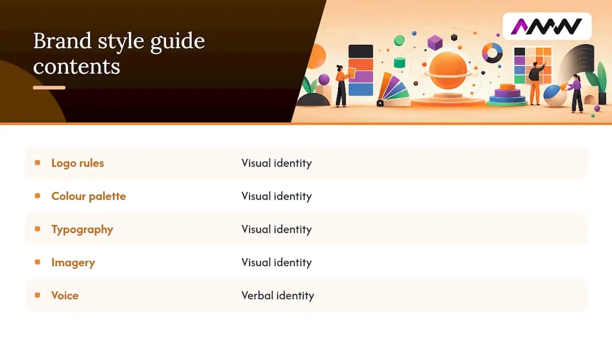
A brand style guide is the instruction manual for how your brand looks, sounds and behaves. It sets out your logo rules, colour palette, typography, imagery style and voice so anyone, from your in-house designer to a freelance copywriter, produces work that looks like it came from the same company.
If you’re starting from scratch, don’t overthink it. Open Figma or Adobe Creative Cloud and document three things first:
- Your logo system: primary mark, variations, and clear space rules
- Your primary colour palette with hex, RGB and CMYK values
- Your headline type hierarchy (H1, H2, body text)
That’s the skeleton. Everything else, voice, imagery, iconography, hangs off it. Even a quick one-pager built in Canva beats no guide at all.
Key Takeaways
A usable brand style guide documents logo, colour, typography, imagery and voice rules clearly enough that any team member can apply them without asking for help.
| Point | Details |
|---|---|
| Start with the essentials | Document your logo system, colour palette and type hierarchy before anything else. |
| Build in accessibility | Set minimum contrast ratios and legible type sizes from the outset, not as an afterthought. |
| Assign a named owner | A guide with no maintainer goes out of date within a year. |
| Keep it searchable | Teams should find an answer within seconds, or the guide won’t get used. |
| Consider a done-for-you build | AMW Media builds full brand systems, audits, and implementation support for teams without the time to do it in-house. |
What is a brand style guide?
A brand style guide is a reference document that defines a brand’s visual and verbal identity so every team member, agency and supplier applies it consistently. It’s not the same as an editorial style guide, which typically only covers grammar, punctuation and word choices for writers. A brand style guide covers both the visual system (logo, colour, type, imagery) and the verbal system (tone, vocabulary, messaging).
You’ll see these documents in a few common formats: a static PDF, a Notion workspace, or a living design-system portal built in Figma or a dedicated platform like Standards. Teams reach for a brand style guide during onboarding, when briefing a new agency, or when a client handover risks losing months of visual consistency overnight.
A brand style guide is the rulebook for everything you create, from fonts to logo treatments, and works best when teams actually open it rather than let it gather dust in a shared drive.
Tools like Adobe Creative Cloud and Figma have made producing and distributing these guides far less painful than the old days of emailing PDFs back and forth.
What should a brand style guide include?
Most brand style guides include detailed logo systems and usage rules covering approved variations, clear space requirements, and minimum size guidelines for print and digital. They also list unacceptable treatments such as stretching or recolouring outside the approved palette. NASA’s original graphics manual from 1976 remains an exemplar of precise technical brand standards.
Colour system. Document primary, secondary and accent colours with hex, RGB and CMYK values, plus Pantone if you print. Flag which combinations meet accessible contrast ratios so nobody accidentally builds a call-to-action button nobody can read.
Typography. Name your primary and supporting typefaces, define a clear scale (H1 through to body copy), list web-safe fallbacks for email and third-party platforms, and note any licence restrictions. This last point trips up more teams than you’d expect. A designer buys a typeface licence for print use, someone reuses it on the website, and legally that’s a breach.
Imagery and illustration style. Set rules for photographic tone (warm or cool, posed or candid), composition and cropping, and which filters or treatments are permitted. Vague guidance like “bright and modern” is useless. Show three approved images and three rejected ones instead.
Iconography, patterns and UI components. Define your icon grid, stroke weight and spacing rules so a new designer doesn’t invent a fourth icon style by accident.
Voice and tone. List three to five voice traits, show how tone shifts across channels (a support email reads differently to an Instagram caption), and include grammar conventions plus a short list of banned words or phrases.
Accessibility. Specify minimum contrast ratios, legible type sizes, and note if you’ve chosen a typeface with dyslexia-friendly characteristics.
Examples and screenshots. Show correct versus incorrect usage side by side across web, social, print and packaging. This single addition does more for adoption than pages of written rules.
- Logo: variations, clear space, minimum size, banned treatments
- Colour: hex/RGB/CMYK values, accessible pairings
- Type: hierarchy, fallbacks, licence notes
- Imagery: approved style, cropping, filters
- Voice: traits, channel adaptations, banned words
- Accessibility: contrast ratios, legible sizes
Pro Tip: Every “don’t” needs a “do” right next to it. A rule that only says what not to do leaves people guessing, and guessing is exactly what a style guide exists to prevent.
Referencing your existing visual identity work here helps you spot gaps before you start writing rules for elements you haven’t actually designed yet.
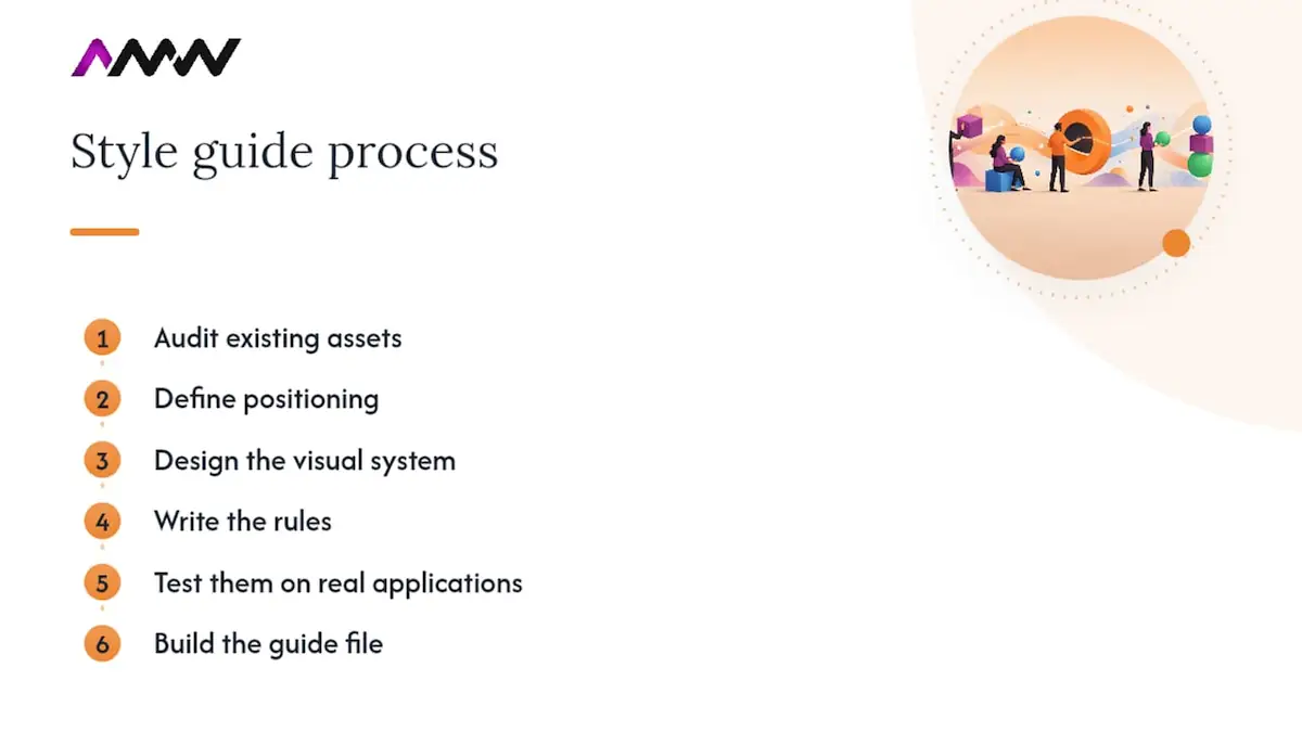
How do you create a brand style guide?
Building one properly takes seven steps, and skipping any of them is how you end up with a guide nobody trusts.
- Discovery and audit. Collect every existing asset, logo file, old brochure, social template, and note where inconsistencies have crept in.
- Define positioning and pillars. Agree on what the brand stands for before you touch a colour swatch. Design decisions without strategic grounding tend to get relitigated later.
- Design the visual assets. Build or refine the logo, palette and type system based on the positioning work.
- Write the rules. Turn design decisions into plain-language guidance, not designer jargon nobody else understands.
- Test with real applications. Mock up a social post, an email header and a print flyer using the new rules. If something looks awkward in practice, fix the rule now, not after rollout.
- Build the guide file or portal. Assemble everything into your chosen format.
- Handover and train. Walk the team through it live. A guide nobody’s been shown is a guide nobody uses.
Timelines vary by scale. Small businesses with lean identities can often complete this process relatively quickly, while mid-size companies managing several product lines typically take longer. Enterprise rebrands involving legal review, multiple regional teams, and complex sign-off processes can take several months.
Ownership matters as much as process. You typically need:
- A brand owner (usually marketing leadership) who signs off the final guide
- A creative lead responsible for visual assets
- A content lead responsible for voice and messaging
- A developer if the guide includes web components or a design-system portal
- An ops or brand manager who maintains it going forward
Pro Tip: Assign the maintenance role before launch, not after. A guide with no named owner is a guide that’s out of date within a year.
Choose your format based on team size and workflow. A PDF works fine for a five-person startup. A Notion page suits a fast-moving marketing team that updates things often. A Figma-based or dedicated design-system portal makes sense once multiple designers and developers need to pull live assets, which is increasingly how larger teams manage this. The three most common failure modes are guides that run 80 pages nobody reads, rules so vague they mean nothing (“keep it modern and fresh”), and missing source files that force people to recreate assets from scratch. Avoid all three and you’re most of the way there.
Where can you find brand style guide examples and templates?
Building from a blank page is the slow way to do this. Study real guides first.
Brandingstyleguides hosts an archive of genuine brand PDFs from real companies, useful for benchmarking how much detail is normal and how sections are typically ordered. HubSpot’s roundup of 25 examples is a good shortcut for seeing real screenshots and application examples rather than descriptions of them. Canva’s gallery of 50 style guides leans toward smaller brands and startups, which makes it more realistic if you’re not building for a Fortune 500 marketing department.
When you’re reviewing examples, copy the structure and the level of detail, not the stylistic choices. A guide built for a fintech brand will have a completely different visual language to yours, but its section order and the way it documents accessibility notes might be exactly what you need.
Three template scales to consider:
- A one-page cheat sheet (logo, colours, fonts) for a solo founder or tiny team
- A 20 to 40 page guide for most SMEs, covering all core elements above
- An interactive design-system portal for larger teams shipping product and marketing assets simultaneously
How do you roll out a brand style guide and keep it enforced?
A guide that sits unopened in a shared drive has failed regardless of how good the content is. Rollout needs its own plan.
Start with an announcement, then a training session, then make sure the assets themselves are easy to download from wherever the guide lives. Add the guide to onboarding for new hires and to the brief you send every external supplier or freelancer.
Version control matters more than most teams expect. Name one person as the owner of updates, keep a simple changelog (even a dated list of what changed is enough), and set a review cadence, quarterly for fast-moving brands, annually for more established ones.
Governance is where most guides quietly fall apart. Set clear rules on who can approve new applications of the brand, keep a single source of truth (one live file, not five outdated copies floating around inboxes), and actually flag it when something goes out that doesn’t match the rules. Enforcement without confrontation works best: a quick “here’s the correct version” message beats a lecture on brand consistency.
Measuring adoption doesn’t need to be complicated. Track portal downloads or page views if you’re hosting digitally, and build a quick compliance check into design reviews so drift gets caught before it ships, not after.
- Announce, train, and make assets easy to find
- Assign a named owner and a review cadence
- Keep one live source of truth, not multiple copies
- Check compliance during design reviews, not after launch
Pro Tip: A single-page cheat sheet pinned in your team’s Slack or Teams channel drives more day-to-day compliance than the full 40-page guide ever will. People will glance at a cheat sheet who’d never open a PDF.
What file formats and naming conventions should you use for brand assets?
Your guide is only as useful as the files behind it. Keep source files (AI, EPS) alongside ready-to-use exports: SVG for scalable web use, PNG at 300dpi for print-quality digital use, and web-optimised PNG or JPEG for anything going straight onto a website or social post. Add print-ready PDFs for anyone briefing a printer.
Use a naming convention that tells people what they’re looking at without opening the file: something like logo_primary_RGB_colour.svg or logo_secondary_CMYK_mono.eps. Organise folders by asset type first (logos, colour, type, imagery), then by use case.
For storage, cloud asset libraries or a proper DAM (digital asset management) system work well for larger teams; marketplaces like Capterra list several options worth comparing. Smaller teams often manage fine with a well-organised shared drive, provided someone keeps it tidy. Note any font licence terms and third-party asset attributions directly in the folder, so nobody accidentally breaches a licence months later.
- Keep source files (AI/EPS) plus ready exports (SVG, PNG, PDF)
- Use consistent, descriptive file names
- Store in a DAM or shared drive with clear folder structure
- Note font licences and attribution requirements up front
How AMW Media approaches building a brand style guide
We start with discovery: understanding positioning, auditing what already exists, and identifying where inconsistency is actually costing you recognition. From there, we build the creative system, logo, colour, type, imagery, before documenting the rules that keep it consistent.
Clients typically receive a brand book PDF, a full asset package in every export format they’ll need, ready-to-use templates, and either a Notion portal or design-system site depending on team size.
The guides that hold up over time are the ones designed to be used, not just admired. If a rule doesn’t help someone make a faster, better decision, it doesn’t belong in the document.
You can see examples of this work and read what past clients have said in the case studies and testimonials on the AMW Media site.
Common pitfalls when creating or updating a brand style guide
The most common mistake is writing rules before defining strategy. Colour and type decisions made without agreed positioning tend to get challenged and reversed later, wasting the entire exercise.
The second is over-length. A 100-page guide with dense paragraphs gets opened once and never again. Teams need answers in seconds, not after ten minutes of scrolling.
Vague language is the third trap. “Keep it fresh and modern” tells a designer nothing. Specific, measurable rules with visual examples of right and wrong usage do the actual work.
Missing source files is the quiet killer. A guide that shows the logo but doesn’t include an editable AI or EPS file forces every future designer to recreate it from a screenshot, and quality erodes with every recreation.
Finally, treating the guide as a one-off project rather than a living document guarantees it goes stale. Brands evolve, new channels appear, and a guide frozen at launch stops reflecting how the brand actually shows up eighteen months later.
Lessons from building brand guides
The guides that last aren’t the prettiest ones, they’re the ones people actually open. After building dozens of these, the pattern is always the same: one named owner, one live source of truth, and answers findable in under a minute. Everything else is decoration.
If you’d rather have someone else build it for you
Building a brand style guide properly takes real hours: discovery, design, writing, testing and training. If your team’s stretched thin, AMW Media builds the whole system for you, or refreshes one that’s drifted, so you end up with a guide that’s genuinely consistent, accessible and easy to update rather than another PDF nobody opens.
We offer full brand systems with a complete guide, standalone brand audits if your existing rules just need tightening, and implementation support to help your website and campaigns actually apply the new standards. If your brand shows up differently across your website, social channels and print, that’s usually the first place worth fixing. Our web design team can rebuild your site to match the new system, or our social media team can build channel-specific templates from your guide once it exists. Get in touch and we’ll talk through what a brand system project would actually look like for your business.
Sources
If you want to see real brand PDFs before you start, BrandingStyleGuides.com is the deepest archive for benchmarking structure and detail. HubSpot’s example roundup is a fast way to see real screenshots in context. Canva’s gallery suits smaller brands after quick templates, while Figma’s resource library is worth exploring once you’re ready to build a live, collaborative design system rather than a static PDF.
- Create a brand style guide for your business.
- The branding style guidelines documents archive • The design …
- 50 of the best brand style guides to inspire you
FAQ
What is a brand style guide?
A brand style guide is a reference document defining a brand’s visual and verbal identity, covering logo rules, colour palette, typography, imagery and voice, so every team applies the brand consistently.
What are the core pillars a brand style guide should cover?
Most guides need to document logo usage, colour, typography, imagery, iconography, voice and tone, and accessibility, giving each area clear rules rather than general descriptions.
How do you create a style guide for your brand?
Follow a seven-step process: audit existing assets, define positioning, design the visual system, write the rules, test them on real applications, build the guide file, then train your team on it.
What is the 3-7-27 rule in branding?
Definitions of this rule vary across sources and it isn’t a standard covered by major branding references, so it’s worth treating with caution rather than as an established framework.
Should a brand style guide be a PDF or an online portal?
Either works. A PDF suits smaller teams and simple identities, while an interactive portal built in Figma or a platform like Standards.site suits larger teams needing live, collaborative access to assets.
Recommended
- Essential branding checklist: build a brand that sticks | AMW Media
- Elevate your brand identity: What is visual branding? | AMW Media
- How to build brand identity for market advantage | AMW Media
- Creative branding ideas list: top strategies for 2026 | AMW Media
Our free marketing audit looks at your site, your ads and your content, and comes back with a 30 day plan. No pitch deck.

Owns how everything looks and feels, from a brand identity to the grade on a reel, and makes the animated films such as Blue Light Services' Journey to Net Zero. Meet the team.