
 Black Steel Doors
 Woodstock Campers
 Phillips Joinery
TL;DR:
- Visual branding is a strategic, multi-element system that influences recognition and customer perception.
- Consistency in visual branding boosts revenue by building trust and reducing friction.
- Investing in professional, accessible, and scalable visual assets creates a strong competitive advantage.
Visual branding shapes how the world perceives your business before a single word is read. 94% of first impressions are design-related, which means your colour choices, typography, and imagery are quietly making or breaking commercial relationships every single day. Most marketing professionals instinctively understand this, yet many businesses still treat visual branding as a one-off logo project rather than the powerful, compounding strategic asset it truly is. This article breaks down exactly what visual branding is, what it is made of, why consistency matters enormously, and how to implement it with genuine competitive intent.
Key Takeaways
| Point | Details |
|---|---|
| First impressions matter | Over 90% of first brand impressions are formed visually, making design critical for trust. |
| Consistency drives revenue | Businesses with consistent visual branding see up to 23% higher revenues. |
| Accessibility pays off | WCAG-compliant, scalable assets increase reach and future-proof your brand. |
| Brand updates need caution | Abrupt or poorly planned visual changes can lead to costly losses in sales and recognition. |
| Strategic branding is a growth engine | Investing in visual identity delivers compounding business returns and long-term differentiation. |
Defining visual branding: Beyond just a logo
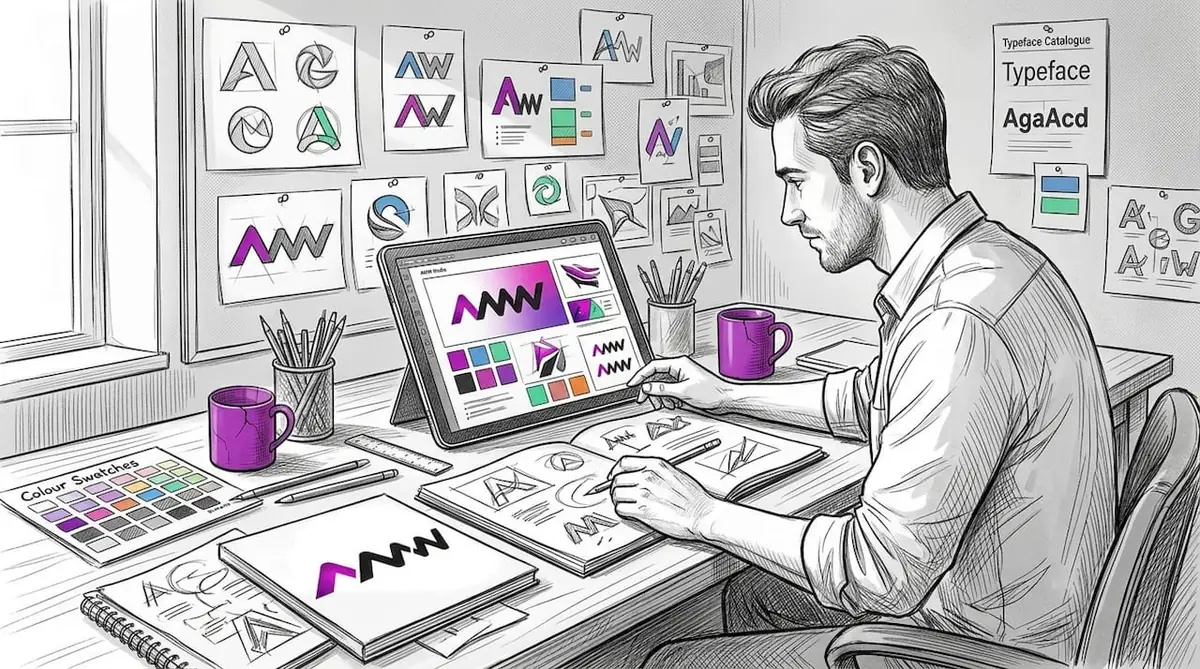
The word “branding” gets used so loosely that it has almost lost its meaning in boardroom conversations. Ask a room of business owners what visual branding means, and most will say “our logo.” That answer is correct, but it is also wildly incomplete. Visual branding is the entire collection of visible signals that communicate who you are, what you stand for, and why customers should choose you over anyone else.
Think of it this way. When you walk into an Apple store, you are not just seeing a logo on a wall. You are experiencing a complete visual language. The white space, the product layout, the typography on price tags, the staff uniforms, and even the packaging of the device you purchase all speak the same visual dialect. That is visual branding working at its most sophisticated.
The elements that make up a complete visual branding system include:
- Logo and logo variations (primary, secondary, icon-only, reversed)
- Colour palette (primary, secondary, and neutral tones)
- Typography (headline fonts, body fonts, and their hierarchy)
- Imagery style (photography, illustration, and graphic treatment)
- Iconography and symbols (custom icons, patterns, and graphic devices)
- Layout principles (grid systems, white space, and compositional rules)
- Motion and animation guidelines (for digital and video contexts)
Each element on its own is merely a design choice. Together, they form a recognisable, emotionally resonant identity that customers connect with across every touchpoint. This is also where brand storytelling becomes inseparable from visual execution. Your story needs a visual language to travel.
“A brand is the set of expectations, memories, stories, and relationships that, taken together, account for a consumer’s decision to choose one product or service over another.”, Seth Godin
The commercial case for getting this right is not subtle. Consistent branding increases revenue by 23%, which is a remarkable return on what many brands treat as a discretionary design budget. If you are wondering why branding matters in tangible financial terms, that statistic alone should settle the debate.
Pro Tip: Create a one-page visual brand reference card that every team member and supplier can access instantly. When your designer, social media manager, and email marketer are all working from the same visual rules, the consistency you need builds naturally rather than through constant supervision.
Building your brand from scratch or reviewing what already exists: starting with professional graphic design services ensures that the foundational elements are solid, scalable, and strategically considered from day one.
The building blocks of successful visual branding
Understanding the components of visual branding at a surface level is one thing. Understanding how each element functions psychologically and commercially is what separates brands that are merely recognised from brands that are genuinely preferred.
Logo: Your logo is the anchor of your visual identity. It needs to work at any size, in colour and monochrome, and across both digital and physical applications. A logo that only looks good on a website but falls apart on signage or packaging is not a complete logo system.
Colour palette: Colour is your most immediately processed visual signal. Colour boosts brand recognition by 80%, which makes your palette one of the highest-impact decisions in your entire brand system. Colours carry emotional and cultural associations that vary by audience and market. Choosing them strategically rather than aesthetically is the mark of a commercially minded brand. Red signals urgency and energy. Blue communicates trust and reliability. Green suggests sustainability and health. These are not rules to follow blindly, but they are associations worth understanding deeply.
Typography: Fonts do far more than display text. They communicate personality, era, and authority. A serif typeface reads as established and traditional. A geometric sans-serif feels modern and precise. A humanist typeface feels approachable and warm. When your font choices align with your brand personality, every piece of communication reinforces your positioning without saying a word about it.
Imagery style: The photographs and illustrations you use set the emotional tone of your brand. A financial services firm using candid, warm lifestyle photography signals something very different from one using sharp, structured imagery. Consistency of imagery style across your website, social channels, and printed materials is what makes a brand feel coherent rather than cobbled together.
The following table illustrates how each key visual element influences customer perception and recall:
| Visual element | Primary psychological effect | Impact on brand recall | Common mistake |
|---|---|---|---|
| Logo | Identity anchor and recognition | Very high | Too complex, not scalable |
| Colour palette | Emotional tone and differentiation | High (80% recognition boost) | Too many colours, inconsistent use |
| Typography | Personality and authority | Medium to high | Mixing too many font families |
| Imagery style | Mood and relatability | High | Inconsistent tone across channels |
| Iconography | Clarity and navigation | Medium | Generic stock icons with no brand voice |
| Layout principles | Professionalism and readability | Medium | Ignoring white space and grid logic |
The graphic design expertise required to build these elements into a genuinely cohesive system is significant. It demands both creative skill and strategic thinking. Many businesses make the mistake of handling elements in isolation. They hire one designer for a logo, another for social media templates, and someone else for printed materials. The result is a fragmented visual identity that undermines the very recognition they are trying to build.
Every element should be developed and documented within a brand guidelines document, sometimes called a brand bible or visual identity system. This becomes the single source of truth for all visual decisions, ensuring consistency regardless of who is producing the work.
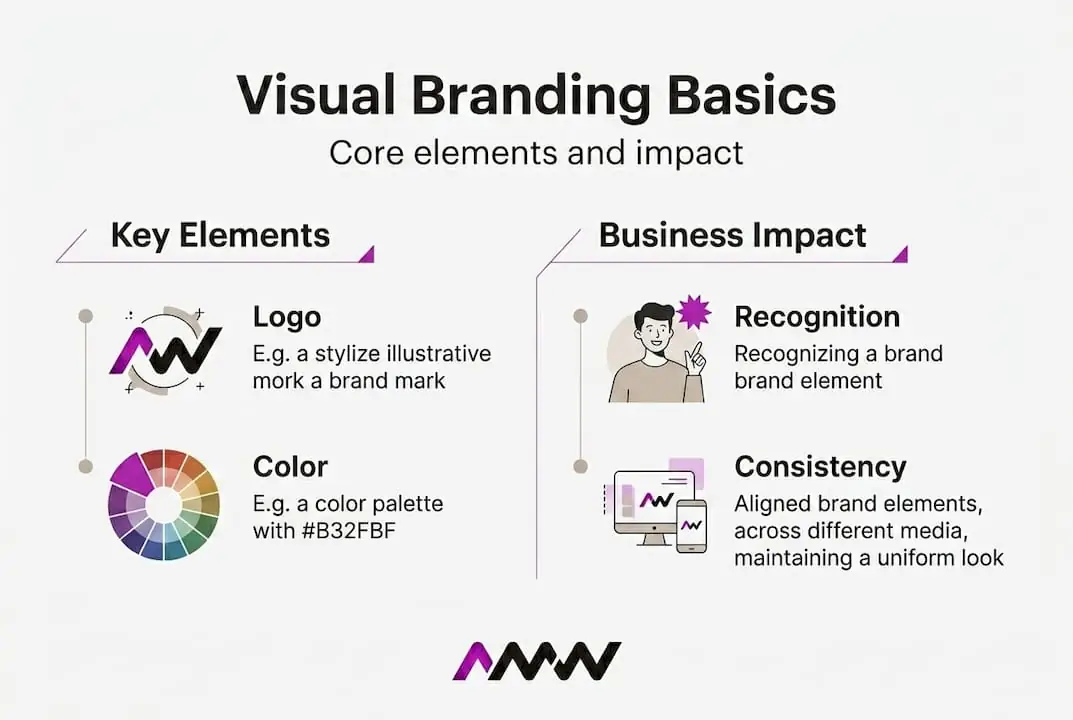
Why consistency in visual branding drives results
Having a beautifully designed brand system means very little if it is applied inconsistently. Consistency is where the real commercial value lives, and it is also where most businesses quietly fail.
Consider the data. Consistent branding increases revenue by 23%. That is not a marginal improvement. That is the kind of performance difference that transforms a business’s financial trajectory. The mechanism is straightforward: consistent visual signals build familiarity, familiarity builds trust, and trust accelerates purchasing decisions. Every deviation from your visual standards introduces friction into that process.
The following comparison table draws on real brand experiences to illustrate what consistent versus inconsistent visual branding looks like in practice:
| Brand | Action taken | Visual consistency outcome | Business result |
|---|---|---|---|
| Tropicana | Removed iconic orange-and-straw imagery from packaging | Lost all recognition cues overnight | 20% sales drop in weeks |
| Kia | Introduced new, bold K logo with cohesive visual refresh | Aligned visuals with elevated product quality | Dramatically improved brand perception |
| Jaguar | Controversial rebrand removed heritage visual cues | Divided existing audience, confused positioning | Ongoing market uncertainty |
The Tropicana case is the most instructive because it was not a small business making a naive mistake. It was a major consumer brand with enormous marketing resources making a catastrophic misjudgement about how much customers rely on visual recognition cues. Shoppers who had bought Tropicana for years simply could not find it on the shelf because the visual anchors they depended on had vanished. The product inside the carton was identical. The visual communication had failed completely.
The Kia example shows the opposite dynamic. When Kia overhauled its visual branding in alignment with a genuine product quality improvement, the visual and product signals reinforced each other. The result was a measurable shift in how consumers perceived the brand, moving it from budget option to considered choice.
Pro Tip: Standardise your logo usage, colour codes, and typography specifications in a shared digital asset management system. Every team member and external supplier should pull assets from the same source. This single habit eliminates the inconsistency that creeps in when people use outdated logos, approximate colours, or incorrect fonts from memory.
For marketing leaders who want to understand how measurable data feeds back into brand decisions, exploring data-driven branding results reveals how the most successful brands treat visual consistency not as a creative preference but as a measurable business input.
Modern best practices: Accessibility and scalability in visual assets
Building a beautiful visual brand in 2026 is not enough if that brand cannot be experienced by everyone in your audience, or if it falls apart when displayed on a 4K monitor, a smartwatch screen, or a printed hoarding. Accessibility and scalability are no longer optional refinements. They are fundamental requirements for any brand that wants to operate effectively in the modern digital ecosystem.
Accessibility in visual branding means designing so that people with visual impairments, colour blindness, or other differences can still engage fully with your content. The Web Content Accessibility Guidelines, known as WCAG, provide a widely adopted standard for this. Designing to WCAG-compliant, scalable standards not only broadens your audience but also reduces legal risk in markets where accessibility compliance is a regulatory expectation.
Scalability means your visual assets remain sharp, clear, and correctly proportioned across every context where they appear. SVG (Scalable Vector Graphics) files are the format of choice for logos and icons in digital environments because they render perfectly at any resolution without any increase in file size.
Here is a practical step-by-step process for auditing your visual brand assets for both accessibility and scalability:
- Gather all active brand assets including logos, icons, templates, and any image guidelines currently in use across your channels.
- Test every colour combination in your palette using a contrast checker tool such as WebAIM’s contrast checker. Any combination used for text on background must meet WCAG AA standard as a minimum.
- Convert raster logo files to SVG format if you have not already done so. Ensure your design team provides SVG, PNG, and JPEG versions for different use cases.
- Review your typography for minimum size compliance. Body text should not fall below 16px in digital contexts, and key labels must maintain legibility at smaller sizes.
- Check colour-only communication. If your brand uses colour alone to convey meaning (such as red for error, green for success), add a secondary indicator such as an icon or text label.
- Test your brand assets across devices. View your logo, key visuals, and templates on mobile, tablet, desktop, and if possible on both standard and high-resolution displays.
- Document all findings and update your brand guidelines to reflect the accessibility and scalability standards you are committing to.
Pro Tip: Always test your colour palettes for contrast and readability on all screens, including those set to night mode or reduced brightness. A brand colour that looks vibrant on a standard display can become nearly invisible on a high-contrast accessibility setting.
Thinking carefully about how your content is produced and structured also supports accessibility goals. Effective content production strategies and learning how to create brand content with inclusive principles built in from the outset will save you significant rework later.
How to implement and maintain visual branding in your business
Designing a strong visual brand system is one challenge. Embedding it consistently into the day-to-day operation of a real business with multiple team members, agencies, and platforms is another challenge entirely. This is where many well-designed brands begin to unravel.
Design-driven companies outperform the S&P 500 by 211%, which tells you that visual brand investment is not a soft, peripheral concern. It is a hard economic signal about the value of creative rigour in business operations.
Here is a practical implementation framework to follow:
- Audit your current visual presence. Collect every visual touchpoint your brand uses. Website, social profiles, email templates, printed materials, presentations, packaging, and signage. Note inconsistencies honestly.
- Align your visual system to your brand strategy. Your visual choices should express your positioning, values, and audience understanding. If your strategy has evolved but your visuals have not, they are working against you.
- Document everything in a brand guidelines document. This should cover logo usage rules, colour specifications (Hex, RGB, CMYK, Pantone), typography hierarchy, imagery direction, and layout principles.
- Educate everyone who touches the brand. Run a brief onboarding session for new team members. Share the guidelines with every supplier, agency, and freelancer at the start of every project.
- Schedule regular brand reviews. Set a calendar reminder to review your visual brand system every 12 to 18 months. Markets evolve. Audiences shift. Your brand needs the opportunity to adapt without losing its core identity.
Your visual brand guidelines document should include the following at minimum:
- Logo files and usage rules (clear space, minimum sizes, forbidden treatments)
- Colour palette with all technical specifications
- Typography system including font names, weights, sizes, and hierarchy
- Photography and imagery style guide with visual examples of approved and unapproved styles
- Iconography and graphic elements library
- Application examples showing the brand in real-world contexts
- Brand voice connection noting how visual and verbal identity align
Your social channels are particularly important for brand reinforcement because they offer the highest frequency of audience touchpoints. Building a coherent social media branding strategy that draws directly from your visual guidelines ensures that your most visible channel is also your most consistent one.
For those working to build a broader marketing strategy that properly integrates visual branding as a component rather than an afterthought, grounding your visual decisions in strategic intent is what separates brands that perform from brands that merely exist.
The hidden edge: Why visual branding is your real economic engine
Here is the perspective that most branding articles avoid because it requires admitting something uncomfortable. Visual branding is not a marketing department concern. It is a board-level business concern, and the companies that treat it as such are the ones consistently outperforming their sectors.
Strong brands yield 20% higher shareholder returns compared to weaker brand counterparts. That is a figure that belongs in an investor presentation, not just a brand guidelines meeting. When you frame visual branding as a revenue and valuation driver rather than a cost centre, the entire conversation changes.
We see this pattern repeatedly with businesses that come to AMW Media having underinvested in their visual systems for years. The common story is the same. They spent heavily on performance advertising, pushed hard on content volume, and optimised their funnels obsessively. But their visual brand was fragmented, inconsistent, and failing to build the recognition that makes all those other investments compound properly.
Here is the counterintuitive insight that we think the marketing industry does not say loudly enough. Your visual brand is the infrastructure that all other marketing activity runs on. Paid advertising without a strong visual identity is renting attention you cannot retain. Content marketing without visual consistency builds volume without recognition. Social media without a coherent visual language is noise competing with more noise.
The brands that dominate their categories are not just spending more. They are building compounding visual equity. Every consistent touchpoint adds to a recognition bank that pays dividends in reduced customer acquisition costs, higher conversion rates, and genuine pricing power. Customers pay more for brands they trust visually. They return more reliably. They refer more confidently.
The businesses that treat visual branding as a one-time project, get a logo designed, pick some colours, and move on, are continuously leaking value that their competitors are quietly banking. A disciplined visual brand system, reviewed regularly and applied rigorously, is one of the few genuinely compounding assets available to a marketing team. It deserves investment, management, and strategic attention proportional to the returns it reliably delivers.
Take your visual branding further with professional support
If this article has clarified what visual branding really means and how much it influences your commercial outcomes, the next question is practical. Do you have the team, the tools, and the strategic framework to build and maintain a visual brand system that genuinely performs?
At AMW Media, our creative and digital strategy teams work with ambitious brands to develop visual identities that are both strategically grounded and beautifully executed. From foundational graphic design services that build your complete visual brand system, to web design and development that brings your identity to life across your most important digital platform, we provide the full spectrum of creative expertise your brand needs to stand out. Starting fresh or ready to elevate what already exists: we would welcome the conversation.
Frequently asked questions
Why does visual branding impact business growth?
Visual branding shapes first impressions and builds recognition, which directly influences customer trust and purchasing decisions. 94% of first impressions are design-related, making your visual identity one of the most commercially significant investments your business can make.
How often should a business update its visual branding?
You should review your visual branding every two to three years to ensure it aligns with evolving strategy and market trends. Minor refinements are often sufficient, but a full review keeps your brand visually relevant without losing established recognition.
What is the risk of inconsistent visual branding?
Inconsistent visuals confuse customers, reduce recognition, and can cause tangible drops in sales. Tropicana’s packaging redesign is the clearest cautionary example, resulting in a 20% drop in sales within weeks of launch.
Why is accessibility important in visual branding?
Accessible branding expands your audience reach and ensures everyone has a positive brand experience. WCAG-compliant visual standards also reduce legal exposure in markets where digital accessibility is becoming a regulatory requirement.
Can visual branding really influence market performance?
Yes, the commercial evidence is clear. Design-driven companies outperform the S&P 500 by 211%, demonstrating that strong visual branding is a genuine driver of business performance, not just a creative preference.
Recommended
- Creative Graphic Design Services London | AMW Media | AMW Media
- Why branding matters: grow and differentiate your business
- AMW Media, Digital Marketing Agency London
- Harness social media in branding for growth in 2026
Our free marketing audit looks at your site, your ads and your content, and comes back with a 30 day plan. No pitch deck.

Owns how everything looks and feels, from a brand identity to the grade on a reel, and makes the animated films such as Blue Light Services' Journey to Net Zero. Meet the team.