
 Black Steel Doors
 Woodstock Campers
 Phillips Joinery
TL;DR:
- Effective visual content combines strong design fundamentals, deliberate hooks, and a structured workflow centred on audience engagement. Applying principles like the 60-30-10 colour rule, negative space, and clear hierarchy ensures visuals are balanced and accessible. Using all three types of hooks, visual, text, and spoken, maximises audience attention and connection.
Engaging visuals are designs or media crafted to capture audience attention instantly, guiding focus through clear messaging and purposeful storytelling. Social media graphics in Canva, imagery generated with Adobe Firefly, a short form video script: the principles that make any of them work are the same, and there are three of them: a strong hook, sound design fundamentals, and a message built around your audience before your tools. The 60-30-10 colour rule, WCAG contrast standards, and a structured six-stage production workflow are not optional extras. They are the difference between content that gets scrolled past and content that earns a second look.
What are the essential design fundamentals for engaging visuals?
Good visual design is built on a small number of principles that, when applied consistently, make everything look intentional and easy to read. The most immediately useful is the 60-30-10 colour rule: 60% of your graphic uses the primary brand colour, 30% a secondary colour, and 10% an accent. This ratio creates visual balance without requiring a degree in colour theory, and it builds the kind of brand recognition that accumulates over time.
Negative space, often called white space, is equally important. Crowding a graphic with text, icons, and imagery does not communicate more. It communicates less, because the viewer’s eye has nowhere to rest. Structured grids and negative space guide the viewer’s eye naturally from one element to the next, which is exactly what you want when someone has three seconds to decide whether your content is worth their attention.
Typography is where many creators quietly lose their audience. Pairing two contrasting fonts, one for headings and one for body text, creates hierarchy without chaos. Readability on mobile requires a minimum font size of 16 to 18px, and WCAG 2026 recommends a minimum contrast ratio of 4.5:1 between text and background for all digital platforms. That standard exists because roughly 8% of men have some form of colour vision deficiency. Designing accessibly is not a niche concern. It is good practice for everyone.
The core design principles to apply from day one are:
- Colour: Follow the 60-30-10 rule and keep your palette to three colours maximum per graphic
- White space: Reserve at least 15 to 20% of your graphic as breathing room
- Typography: Use two font families maximum, with clear size hierarchy between heading and body
- Grid alignment: Align every element to a grid to avoid the “thrown together” look
- Contrast: Meet the 4.5:1 ratio for all text overlaid on images or coloured backgrounds
- Accessibility: Test your designs in greyscale to check legibility without colour dependency
Pro Tip: Limit text on social media graphics to six to eight words. Any more and you are writing a caption, not a visual.
How do hooks stop the scroll and engage audiences?
A hook is the element of your content that interrupts the automatic scrolling behaviour and forces a moment of conscious attention. There are three distinct types: visual hooks, text hooks, and spoken hooks. Understanding how each one works, and when to use them in combination, is what separates average content from content that performs.
Visual hooks rely on contrast, movement, or unexpectedness. A bold colour that breaks the feed’s usual palette, a striking close-up photograph, or a subtle animation in the first frame of a video all function as visual pattern interrupts. The brain is wired to notice things that differ from their surroundings. A graphic that looks exactly like everything else in a feed will not stop anyone.

Text hooks are the headlines, captions, and on-screen copy that appear in the first moment of exposure. They work through specificity and relevance. “Five things you are doing wrong with your brand colours” outperforms “Design tips for marketers” because it implies the reader already has a problem worth solving. Concise, direct, and slightly provocative copy creates a micro-commitment: the viewer reads one line and decides whether to keep going. That decision happens in under two seconds.
Spoken hooks apply primarily to video and audio-visual content. The first three to five seconds of a video’s voiceover or on-screen dialogue function identically to a text hook, but with the added dimension of tone, pace, and personality. A flat, slow opening loses viewers before the message lands. Research into audience and message priorities consistently shows that understanding what your audience needs to hear, before deciding how to say it, produces more purposeful content than leading with production style.
The most effective content combines all three hook types. A video that opens with a visually striking frame, a bold on-screen text statement, and a confident spoken line in the first three seconds is working on three levels simultaneously. That combination is not accidental. It is the result of deliberate research into what your specific audience responds to on a specific platform.
Pro Tip: Use authentic photographs over stock imagery wherever possible. Audiences have developed a near-instant ability to recognise generic stock photos, and that recognition erodes trust before your message has a chance to land.
What tools and workflows make visual content creation efficient?
The tools available to content creators in 2026 are impressive, but they are only as useful as the workflow surrounding them. Canva’s Magic Design, Adobe Firefly, Venngage, and Midjourney each offer AI-assisted generation that can produce a usable base design in seconds. The risk is treating that output as finished work.
Refining AI-generated visuals manually is what separates brand-aligned content from generic output. AI tools are excellent at producing something that looks broadly correct. They are poor at understanding your specific brand voice, your audience’s cultural context, or the subtle visual cues that make your content recognisably yours. The practical rule is to use AI for the base and spend roughly 30% of your total design time on manual refinement. That investment is what makes the difference between content that looks AI-generated and content that looks considered.
Here is a comparison of the main tools and their best applications:
| Tool | Best use | Strengths |
|---|---|---|
| Canva Magic Design | Social media graphics, presentations | Fast templates, brand kit integration, accessible for non-designers |
| Adobe Firefly | Image generation, photo editing | High-quality outputs, integrates with Adobe Creative Cloud |
| Venngage | Infographics, data visualisation | Strong for report-style content, good template library |
| Midjourney | Concept art, hero imagery | Exceptional image quality, highly customisable prompts |
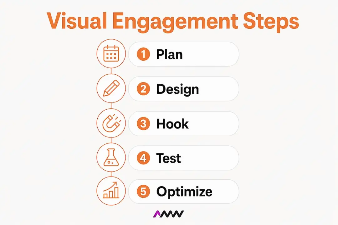
Beyond tool selection, the six-stage production workflow is the structural backbone of efficient visual content creation: brief, plan, produce, edit and approve, format, then measure and repurpose. Following this sequence reduces revision cycles by up to 50%, because problems are caught at the planning stage rather than after production. You can read more about applying this kind of structured approach in AMW Media’s guide to creative content production.
Batching is the other workflow habit worth adopting immediately. Designing two to four weeks of content in a single session reduces the time spent on each graphic by up to three times compared with designing one piece at a time. The reason is cognitive: switching between ideas, tools, and briefs repeatedly is expensive. Staying in one creative mode for a longer block produces faster, more consistent results.
Brand template systems tie everything together. A set of locked templates with consistent fonts, colour palettes, and logo placement means every piece of content you produce looks like it belongs to the same family, even when different team members create it. Brand consistency builds stronger audience associations than creative variation, particularly in the early stages of building a brand presence.
Pro Tip: Apply the 30% rule to every AI-generated design. Generate the base with your tool of choice, then spend 30% of your total design time adjusting typography, colour, and composition manually. This is what makes AI a creative partner rather than a creative shortcut.
What are the most common mistakes in visual content creation?
Most visual content underperforms not because of poor creative instinct, but because of avoidable technical and strategic errors. Recognising these patterns early saves a significant amount of rework.
The most frequent mistakes, and their fixes, are:
- Too many fonts and colours: Using three or more font families and four or more colours in a single graphic creates visual noise. Fix: stick to two fonts and three colours per design.
- Ignoring platform dimensions: A graphic designed at 1080x1080px will be cropped awkwardly on a LinkedIn banner or a Pinterest pin. Fix: design to platform-specific dimensions from the start, not as an afterthought.
- No visual hierarchy: When everything is the same size and weight, nothing reads as important. Fix: establish a clear heading, subheading, and body text hierarchy before adding any other elements.
- Insufficient contrast: Text that is difficult to read on a coloured background fails both aesthetically and accessibly. Fix: check every text-on-background combination against the 4.5:1 WCAG standard.
- Generic stock imagery: Audiences recognise and distrust stock photos. Fix: use original photography, illustrated assets, or AI-generated imagery that is specific to your brand context.
- Designing only for desktop: A significant proportion of social media consumption happens on mobile. Fix: preview every graphic at mobile screen size before publishing.
Cognitive overload from excess design elements is a documented phenomenon. More elements do not communicate more value. They reduce the viewer’s ability to extract any value at all. The most effective graphics are often the simplest ones.
Pro Tip: Before publishing any visual, test it on at least two devices: a desktop monitor and a mobile screen. What looks balanced on a large display often becomes cluttered or illegible at 375px wide.
How do you measure and optimise visual content engagement?
Creating effective graphics is only half the job. Understanding which ones actually work, and why, is what allows you to improve over time rather than repeating the same approach indefinitely.
The metrics worth tracking for visual content are:
- Click-through rate: Measures whether the visual prompted action, not just a pause
- Shares and saves: Indicates content that audiences found useful or resonant
- Comments: Qualitative signal of emotional response and relevance
- Dwell time: On platforms that report it, shows how long viewers engaged with the content
- Reach versus impressions: The ratio reveals whether your content is being shared beyond your existing audience
A/B testing is the most direct way to improve. Publish two versions of the same graphic with one variable changed, whether that is the hook text, the background colour, or the image choice, and measure which performs better. Over time, this builds a picture of what your specific audience responds to, which is far more useful than general design advice.
High-performing visuals should be repurposed rather than retired. A graphic that performed well on Instagram can be reformatted for LinkedIn, adapted into a short video, or used as a hero image in an email campaign. AMW Media’s article on content production strategies covers this repurposing logic in detail. The goal is to extract maximum value from content that has already proven itself with your audience.
Audience feedback, whether through direct comments, polls, or sentiment analysis tools, adds a qualitative layer that metrics alone cannot provide. Knowing that a graphic performed well is useful. Knowing why your audience liked it is what informs the next brief. For a broader view of how visual storytelling connects to brand impact, the principles of message clarity and audience empathy apply at every stage of the measurement cycle.
Regular review cycles, ideally monthly, keep your visual content strategy aligned with both platform algorithm changes and shifts in your audience’s preferences. What worked six months ago may not work today, and the only way to know is to keep measuring.
Key takeaways
Engaging visuals work because they combine sound design fundamentals, deliberate hooks, and a structured workflow built around audience understanding rather than tool selection.
| Point | Details |
|---|---|
| Design fundamentals first | Apply the 60-30-10 colour rule, WCAG contrast standards, and grid alignment before adding creative flair. |
| Use all three hook types | Combine visual, text, and spoken hooks to engage audiences on multiple levels simultaneously. |
| Batch and use templates | Design two to four weeks of content in one session and use locked brand templates for consistency. |
| Refine AI outputs manually | Spend 30% of design time on manual refinement to avoid generic, off-brand results from AI tools. |
| Measure and repurpose | Track clicks, shares, and dwell time, then adapt high-performing visuals across platforms. |
Why message clarity beats tool mastery every time
I have worked with brands that had access to every design tool imaginable and still produced content that felt flat. I have also seen a single well-crafted graphic, made in Canva in twenty minutes, outperform a polished production because the message was right and the hook was sharp. That experience has shaped how I think about visual content creation.
The industry conversation tends to focus on tools. Which AI generator produces the best images? Which platform has the best templates? These are reasonable questions, but they are secondary. Story and audience clarity before tool selection is what produces purposeful visuals. I have seen this play out enough times that I now treat it as a rule rather than a preference.
The role of AI in this process is exciting, but it requires discipline. The temptation is to generate something that looks finished and move on. The brands that use AI well treat it as a starting point, not an endpoint. They use it to accelerate the base work, then apply their own judgement to the refinement. That is where brand voice lives, and no AI tool can replicate it for you.
On hooks specifically: most creators default to visual hooks because they are the most obvious. Text hooks and spoken hooks are underused, particularly in combination. If you are producing video content and your first three seconds are a slow zoom with no on-screen text and a quiet opening line, you are leaving engagement on the table. Experiment within your brand boundaries. The visual branding principles that define your identity should inform your hooks, not constrain them.
The creators who improve fastest are the ones who measure obsessively and stay curious about what their specific audience responds to. General best practices get you started. Your own data gets you ahead.
Amir
Want visuals that actually perform? AMW Media can help
Creating consistent, high-performing visual content takes more than good tools. It takes a clear strategy, a disciplined workflow, and design expertise that keeps your brand looking sharp across every platform. Our Northampton page makes the point that workshops and conversion businesses film well and their buyers search with intent.
AMW Media’s graphic design services and social media management are built for brands that want to show up consistently and compellingly online. From custom social media graphics to full brand template systems, the team handles the creative production so you can focus on the strategy. If you are ready to produce visual content that stops the scroll and builds genuine audience engagement, get in touch and let’s talk about what that looks like for your brand.
FAQ
What is the 60-30-10 colour rule in design?
The 60-30-10 rule is a professional design principle where 60% of a graphic uses the primary colour, 30% a secondary colour, and 10% an accent. It creates visual balance and supports brand consistency across all content.
How many fonts should I use in a single graphic?
Use a maximum of two font families per graphic: one for headings and one for body text. More than two creates visual clutter and undermines the hierarchy that guides the viewer’s eye.
What contrast ratio do I need for accessible visuals?
WCAG 2026 recommends a minimum contrast ratio of 4.5:1 between text and background on all digital platforms. This standard supports readability for users with colour vision deficiencies and improves legibility for everyone.
How does batching content creation save time?
Designing two to four weeks of content in a single session reduces production time by up to three times compared with creating individual pieces separately. It minimises cognitive switching and produces more aesthetically consistent results across a content calendar.
What metrics should I track to measure visual engagement?
The most useful metrics are click-through rate, shares, saves, comments, and dwell time. Together, these signals show whether your visuals prompted action, resonated emotionally, and reached audiences beyond your existing followers.
Recommended
- Innovative social media content ideas to boost engagement
- Creative content production steps for marketing success in 2026
- Elevate your brand identity: What is visual branding? | AMW Media
- UK Digital Marketing Agency | AMW Media
Our free marketing audit looks at your site, your ads and your content, and comes back with a 30 day plan. No pitch deck.

Founded AMW Media in 2024 and runs strategy, paid media and the CRM builds. The reason everything here is in house and measured in revenue. Meet the team.