
 Black Steel Doors
 Woodstock Campers
 Phillips Joinery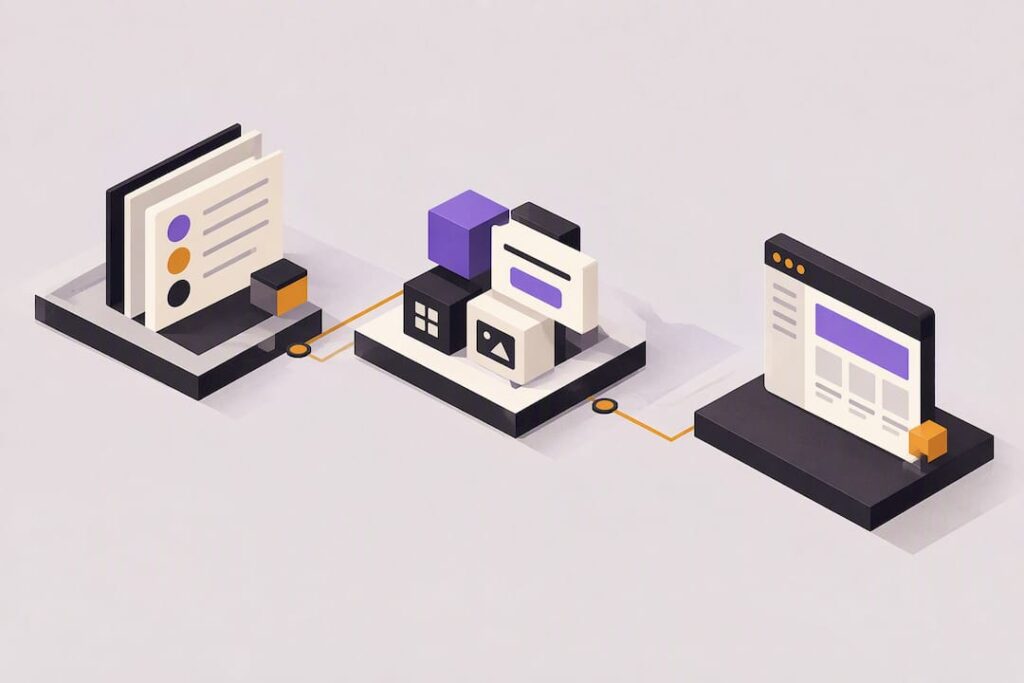
A design system is a shared set of design decisions, tokens, components and documentation that a team reuses instead of rebuilding the same button or form field from scratch each time. If you’re starting out, the first goal is not a perfect system: it’s a small, documented release covering your foundations and a handful of priority components. Done well, this brings consistency, faster delivery and far less duplicated work.
TL;DR:
- Building a design system involves creating a small, documented set of foundational rules and core components that promote consistency and reduce duplicated work.
- Effective systems incorporate design tokens that link shared decisions directly to code, enabling easy updates across all components when a value changes.
- Prioritizing high-frequency components, designing their states, and testing with accessibility checks should come before expanding the system further.
- Integrating the system into existing development workflows and tools, with clear ownership and governance, ensures it stays relevant and well-maintained as it grows.
- Early adoption is driven by demonstrating quick wins and real product use, with external support helpful for accelerating implementation and documentation.
Table of Contents
- What is a design system, really?
- Why bother with a design system at all?
- Foundations, tokens and components: what to build first
- A practical starter workflow you can actually follow
- Accessibility and governance from day one
- Tools and workflows that reduce friction
- Practical perspective from AMW Media: when to bring in help
- How a design system fits your development workflow
- Planning for growth without starting over
- Getting teams and stakeholders to actually use it
- Three quick lessons for anyone starting out
- Where AMW Media fits if you want hands-on support
- Useful resources for learning more
- Sources
- FAQ
What is a design system, really?
A design system is more than a folder of colours and fonts. It’s a managed collection of design decisions, the components built from them, and the documentation that tells people how and why to use each one. That last part trips up a lot of beginners: a system without documentation is just a component library nobody trusts.
People often mix up four related things:
- A style guide covers visual rules such as colour, typography and logo use, but rarely includes working code.
- A pattern library shows recurring UI patterns, like search forms or navigation menus, often without strict governance.
- A component library is the coded building blocks (buttons, inputs, cards) that developers actually import.
- A design system wraps all of the above together with shared tokens, rules for when to use what, and a process for keeping it updated.
The mechanism that ties these together is the design token. A token is a named value, such as a specific blue or a spacing unit, that stands in for a hard-coded value in your designs and code. Change the token once, and every button, link and card that references it updates together. The GOV.UK Design System treats tokens as a shared vocabulary that keeps design and development in sync across a whole service, not just one screen.
Why bother with a design system at all?
The practical case is simple: fewer decisions get remade, so teams move faster. Reusing tested components means designers stop redrawing the same dropdown and developers stop rewriting the same validation logic. Consistency stops being a matter of memory and becomes a matter of using the right building block. Government teams describe this as avoiding repeated work across services, which is exactly the benefit a small team feels first.
There are knock-on business effects too:
- New hires ramp up faster because the patterns, naming and rules are written down instead of living in someone’s head.
- Changing a colour, spacing rule or interaction pattern touches one token or component instead of dozens of screens.
- Support and QA time drops because fewer one-off variations exist to test and maintain.
That said, a full design system isn’t always the right call. If you’re building a single small marketing site with a handful of pages that won’t grow, a lightweight style guide and a short graphic design brief may cover you perfectly well. Systems earn their cost when a product or brand has enough surface area, and enough people touching it, that repetition becomes a real problem.
Foundations, tokens and components: what to build first
Before you draw a single button, decide your foundations. These are the shared rules everything else inherits: colour, typography, spacing, a grid, motion (how things animate or transition) and baseline accessibility rules such as minimum contrast and focus states.
Tokens turn those foundations into something reusable. Think of them in three layers: options (every blue you could use), decisions (the two or three blues you’ve actually chosen for this brand), and component mappings (this specific blue is now “button-primary-background”). That layering means you can update a decision once and every component that maps to it changes automatically, which is the whole point of having tokens rather than scattered hex codes.
For each component, document:
- Its purpose: what problem it solves and when to use it.
- Its anatomy: the parts that make it up (icon, label, container).
- Its variants: primary, secondary, destructive, and so on.
- Its states: default, hover, focus, disabled, error.
- Accessibility notes: contrast ratios, keyboard behaviour, ARIA roles where relevant.
- Code examples: a real, working snippet, not just a picture.
The ONS design system and GOV.UK components both treat a component as a package of template, style, behaviour and documentation, and a visual mock alone doesn’t count.
For a first release, keep the list short: buttons, text inputs, links, a navigation pattern, alerts or notification banners, and one page-level pattern such as a form layout. That’s enough to prove the system works before you expand it.
Pro Tip: Build your first release around whatever components appear most often in your existing screens, not the ones that look most interesting to design.
A practical starter workflow you can actually follow
Most beginners overthink the plan and underthink the audit. Here’s a workflow that keeps things moving:
- Audit existing interfaces. Screenshot your current screens and note every button, input and card style already in use. You’ll usually find far more variations than you expected.
- Prioritise by frequency and impact. Rank the repeated patterns by how often they appear and how much friction they cause for users or the team.
- Design the states. For each priority component, sketch its default, hover, focus, disabled and error states before touching code.
- Implement in code. Build the component so design and code use the same source, whether that’s a shared repository, a framework’s component system, or a simpler shared stylesheet.
- Test. Combine automated checks with a manual pass, including keyboard navigation and screen reader behaviour.
- Publish documentation and a changelog. Even a simple page listing what changed and when saves confusion later.
- Measure adoption before expanding. Watch whether teams actually use the new components in real product work, then add more only once the first batch proves useful.
The ONS design system guidance frames foundations, components and patterns as distinct layers, and recommends prioritising whatever solves the most repeated user or business problems first, which is exactly why the audit step comes before any design work. If you’re doing this for a website rebuild specifically, a step by step web design approach maps well onto the same audit-then-build order.
Accessibility and governance from day one
Accessible components reduce risk, but they don’t replace testing your actual product. Aim for a WCAG 2.2 AA baseline in your styles and components, then test the finished service, not just the component library in isolation. GOV.UK’s own accessibility strategy treats this as continuous work, not a one-off checklist, because a compliant button can still sit inside an inaccessible page.
Practical steps that make this manageable:
- Run automated checks (contrast, missing labels, heading structure) on every component before release.
- Add a manual pass with keyboard-only navigation and at least one screen reader.
- Retest key flows after any significant visual or structural change, not just at launch.
Accessibility and SEO overlap more than people expect. Clear headings, sensible contrast and proper labelling help both assistive technology and search crawlers, a point covered well in this guide to web accessibility and SEO.
Governance matters just as much as the design work. Without a clear owner, contribution rules, a changelog, versioning and deprecation guidance, teams quietly fork components and your documentation drifts away from what’s actually in production. The GOV.UK production guidance frames this as ongoing product work with its own lifecycle, not a document you write once and forget.
Pro Tip: Name one person or small group as the system’s owner before your first release goes out, even if it’s a part-time responsibility.
Tools and workflows that reduce friction
You don’t need an elaborate pipeline to start. The common pattern looks like this: design your components in your authoring tool, export the tokens, store them in a shared repository, generate code artefacts from them, and publish everything through a docs site that developers actually visit.
- Keep component guides next to the implementation code, not in a separate wiki nobody checks.
- Manual token exports are perfectly fine for a first release: automate the pipeline once you’ve proven the system earns its keep.
- Choose a docs format that lets you paste working code examples, since a screenshot alone won’t tell a developer how to wire up a state.
Design tokens work best organised in layers so decisions can evolve independently of each other, which is why they scale far better than copying hex codes between files.
Practical perspective from AMW Media: when to bring in help
Teams often reach for outside support when they need cross-discipline capacity fast, someone to build a token pipeline, or hands-on implementation once the plan is agreed. A typical short engagement looks like an audit of existing screens, a first release covering foundations and priority components, implementation support, and a proper handover so the team can carry it forward. AMW Media’s work spans web design and development and content production, backed by Google, Meta, Shopify, WordPress and Framer partnerships.
How a design system fits your development workflow
A design system only earns its place once it lives inside the tools your developers already use, not as a separate reference nobody opens. In practice, that means the same components you document get imported directly into your codebase, whether through a shared package, a component library built into your framework, or a simpler set of shared stylesheets and templates.
The strongest setups keep design and code pointed at the same source: when a token changes, both the design files and the live product update from it, rather than someone manually copying a new hex code into two places. GOV.UK documents multiple implementation paths, including package-based and compiled-file options, precisely because teams build with different stacks and need to plug the same components in differently.
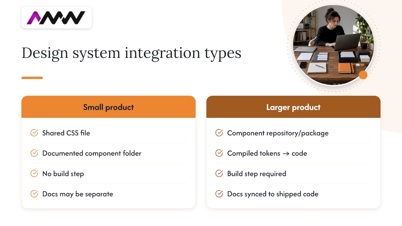
For a marketing site or small product, this can be as simple as a shared CSS file and a documented component folder. For anything larger, expect a proper component repository, a build step that turns tokens into code, and a docs site that stays in sync with what’s actually shipped. Guides on designing a website cover the practical side of getting a first build connected to real components rather than static mock-ups, which is the same principle at a smaller scale.
Planning for growth without starting over
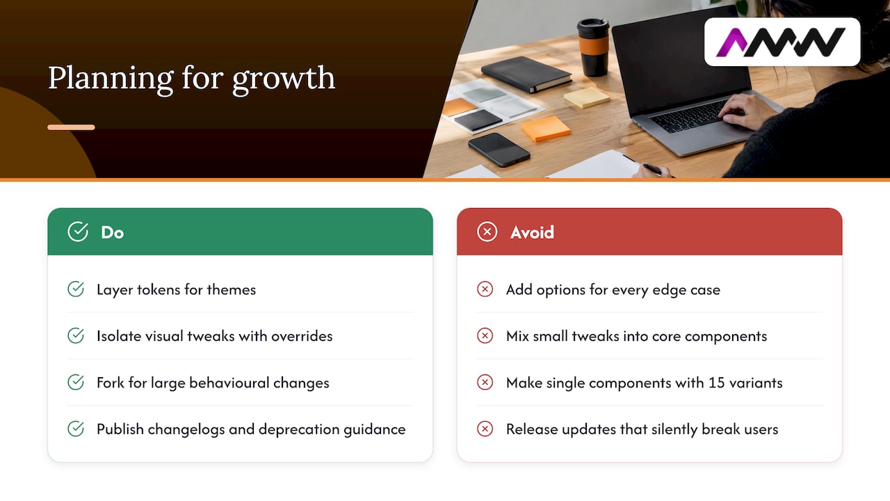
A system built for five components behaves very differently once you’re maintaining fifty. The token layering mentioned earlier (options, decisions, component mappings) is what makes that growth manageable, because you can introduce a new brand variant or theme without rewriting every component that already exists.
Scalability also depends on how you handle change. Small visual tweaks are best isolated with override classes or namespaced styles, kept separate from the core component. Larger behavioural changes are safer as a forked version of the component, so an update to the main library doesn’t silently break something that depends on different behaviour. GOV.UK’s own guidance on extending and modifying components takes this approach specifically to avoid breaking updates and introducing accessibility regressions.
As your component count grows, so does the temptation to add options for every edge case. Resist that. A component with fifteen variants is harder to document, test and maintain than three components with clear, separate purposes. Growth should mean more coverage of real, repeated needs, not more knobs on the same component.
Versioning becomes essential at this stage too: teams need to know whether updating to a new release will break their existing implementation, which is why a changelog and clear deprecation guidance matter more as adoption spreads across more teams and products.
Getting teams and stakeholders to actually use it
A design system that nobody adopts is just documentation. The teams most likely to use it are the ones who were involved in building it, so include a few developers and designers from outside the core team in your priority list and review sessions.
Make the first release easy to try. A short walkthrough showing how to import a button or link a token saves people from reverse-engineering your documentation on their own. Pair that with real examples from your own product, since an abstract component demo rarely convinces a busy team to change their habits.
Stakeholders who aren’t hands-on with the components still need a reason to care. Frame the pitch around what they already worry about: faster delivery, fewer inconsistent screens reaching customers, less rework when a brand update happens. Numbers land better than vague enthusiasm, so if your audit found the same button style rebuilt ten different ways, say so plainly.
Finally, keep the door open for feedback and contribution. A documented process for requesting a new component or flagging an issue, even a simple one, signals that the system is a living tool rather than a rulebook handed down from above.
Three quick lessons for anyone starting out
Ship something small first, connect it to real product work, and let actual use tell you what to build next. Don’t wait for a complete system before shipping anything: a handful of well-documented components beats a beautiful, unused library. Write down the “why” behind each component alongside the “how”, since the reasoning is what stops people reinventing it differently six months later. And treat accessibility and governance as part of the product itself, not paperwork bolted on afterwards.
— Amir
Where AMW Media fits if you want hands-on support
Starting a design system from nothing is manageable, but it’s genuinely faster with an extra pair of hands, especially for the parts that eat time: auditing dozens of screens, building a token pipeline, or writing documentation that developers will actually read. AMW Media offers a mix of relevant support for teams at this stage:
- Web design and development for building and implementing components in a live codebase.
- Content production for the photography and video assets a system needs to document consistently.
- Social media management for teams whose brand system extends beyond the product into marketing channels.
A typical starting scope covers an audit of existing screens, a first release of foundations and priority components, and handover support so your team can keep building on it. Take a look at our recent projects or get in touch through our services page to talk through what a starter engagement would look like for your product.
Useful resources for learning more
For further reading, the GOV.UK Design System and ONS design system are two of the clearest public examples of documentation, accessibility and governance done properly. Martin Fowler’s writing on token architecture is a solid next step for understanding how tokens scale, and design-system.digital.gov offers a useful comparison from the US federal side.
Sources
FAQ
What are the 7 elements of design?
Definitions vary slightly, but a common version includes line, shape, colour, texture, space, form and value. These sit underneath a design system’s foundations rather than replacing them, since a system also needs tokens, components and documentation on top.
What are the top design systems worth studying?
There’s no single official ranking, but the GOV.UK Design System and ONS design system are widely cited as strong, publicly documented examples. Both show clear component documentation, accessibility guidance and governance in practice, which makes them useful references regardless of your industry.
How can I learn about design systems as a beginner?
Start by reading a public, well-documented system such as the GOV.UK components pages, then try auditing your own project’s screens to spot repeated patterns. Building a small first release, even just three or four components, teaches far more than reading theory alone.
What are the 7 pillars of UX design?
There isn’t one universally agreed list, and different practitioners frame UX pillars differently. A commonly cited version includes usability, accessibility, information architecture, interaction design, visual design, content strategy and user research, all of which a mature design system supports rather than replaces.
Is a design system the same as a style guide?
No. A style guide typically covers visual rules like colour and typography, while a design system adds coded components, tokens and documented governance on top. The GOV.UK Design System is a good example of how much further a full system goes beyond a style guide alone.
Recommended
- Website design best practices: top 10 for better UX
- Graphic design process: a step-by-step guide for brands
- Web design process guide: steps, tools, and tips
- Brand style guide: what to include and how to build one
Our free marketing audit looks at your site, your ads and your content, and comes back with a 30 day plan. No pitch deck.

Founded AMW Media in 2024 and runs strategy, paid media and the CRM builds. The reason everything here is in house and measured in revenue. Meet the team.