
 Black Steel Doors
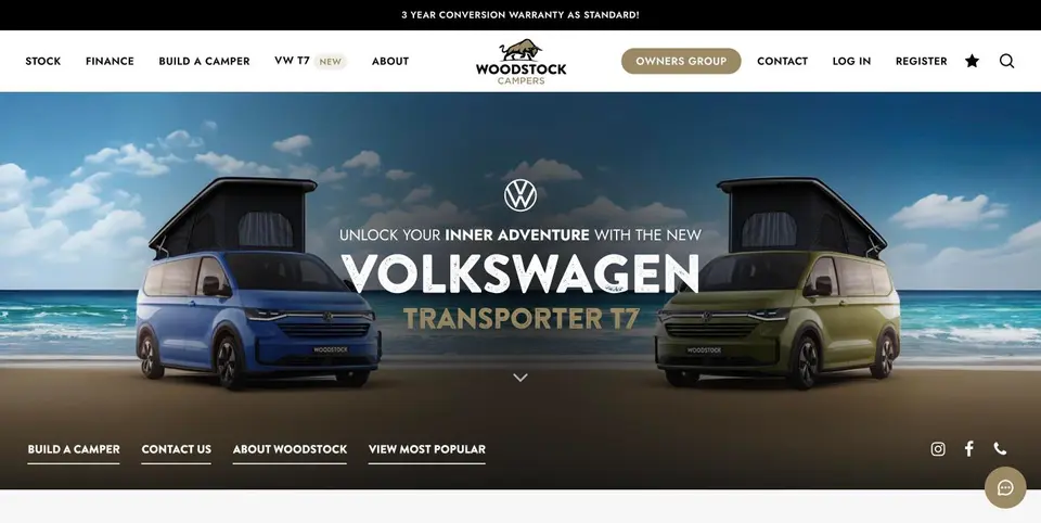 Woodstock Campers
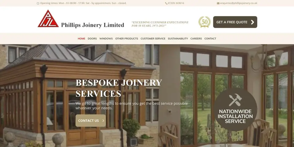 Phillips Joinery
TL;DR:
- Good websites load quickly, are accessible, and guide users smoothly through clear content structures.
- Speed, accessibility, and mobile design directly impact conversions and must be prioritised for effective results.
Good websites share ten qualities: they load fast, work on mobile, guide attention clearly, use accessible typography and colour, structure content logically, earn trust with visible signals, protect user data, convert with clear calls to action, pass WCAG 2.2 AA, and improve through regular testing. If your site is missing even two or three of these, you are likely losing enquiries you have already paid to attract.
Quick wins you can do in under an hour:
- Run your URL through PageSpeed Insights and note your mobile score
- Compress your hero image using Squoosh or ShortPixel (aim below 150 KB)
- Check your primary CTA button: is the label a verb and does it stand out at a glance?
The top 10 at a glance:
- Design for real users, not features
- Mobile-first layout and responsive breakpoints
- Clear visual hierarchy and readable typography
- Fast load times (every extra second costs conversions)
- WCAG 2.2 AA accessibility compliance
- Logical content structure and on-page SEO
- Honest, friction-free calls to action and forms
- HTTPS, cookie consent, and privacy-first defaults
- Consistent branding and colour
- Continuous testing and iteration
Website speed is a direct revenue driver for UK businesses: a site that scores below 50 on PageSpeed Insights on mobile is almost certainly losing enquiries. That single metric is the fastest diagnostic you have.
Pro Tip: Before you redesign anything, run a speed test and an accessibility check. These two audits consistently surface the highest-value fixes for the least effort.
What does “design for people” actually mean in practice?
User-centred design means building every page around what a visitor is trying to accomplish, not around what you want to show them. The distinction sounds obvious, but most sites get it backwards: they lead with company history, product features, or a carousel nobody clicks, rather than the one thing the visitor came to do.

The practical shift is this: map your three or four highest-traffic journeys before you touch a layout. For a service business, those journeys are usually “understand what you do,” “check if you’re credible,” and “get in touch.” Every page element should either support one of those tasks or get out of the way.
A simplified homepage flow that works: headline stating the outcome you deliver → one-sentence proof point → single CTA → social proof (logos or a short testimonial). That is it. Anything added beyond that competes with the CTA.
- Prioritise tasks over features: ask “what does the user need to do?” before “what do we want to show?”
- Remove anything that does not serve a defined journey
- Use qualitative tools (session recordings, heatmaps) to see where attention actually goes
- Revisit your top journeys every quarter as your audience changes
Pro Tip: If you have a small team, pick one journey to optimise at a time. Trying to fix everything at once usually means fixing nothing properly.
How do layout, typography, and visual hierarchy guide attention?
Visual hierarchy is the silent instruction set on every page. Done well, a visitor’s eye moves from headline to supporting detail to CTA without them noticing they were guided. Done poorly, everything competes and nothing wins.
Layout and whitespace:
- Give each section one job; white space is not wasted space, it is breathing room that makes the important thing obvious
- Left-align body text; centred paragraphs slow reading
- Use a 12-column grid and stick to it; inconsistent spacing reads as unfinished
- Keep content width to roughly 65 to 75 characters per line for comfortable reading
Typography:
- Base body size: 16 to 18 px minimum; never go smaller on mobile
- Line height: 1.5 to 1.6 for body copy
- Scale headings using a clear ratio (e.g. 1.25 or 1.333 between steps) so H1, H2, and H3 are visually distinct
- WCAG 2.2 AA requires a contrast ratio of at least 4.5:1 for normal text and 3:1 for large text
Micro-patterns that work:
- Hero area: large headline (outcome-focused), short subheading, one CTA button, no competing links
- Content blocks: lead with the conclusion, support with evidence, end with a next step
- Use bold sparingly to highlight the single most important phrase in a paragraph, not three phrases
Colour contrast is the most commonly failed WCAG criterion on commercial UK sites. Check every text-background combination with WebAIM’s contrast checker before you sign off a design.
Mobile-first design: what to prioritise and how to implement it
Design for the smallest screen first, then add complexity for larger ones. That single rule prevents the most common mobile failures: tiny tap targets, text that requires pinching, forms that are impossible to complete on a phone.
Mobile priorities checklist:
- Tap targets: minimum 44 × 44 px for any interactive element (buttons, links, form fields)
- Viewport meta tag: on every page
- Font size: 16 px minimum for body text to prevent iOS auto-zoom on form inputs
- Images: use srcset and sizes to serve appropriately sized images per device
- Lazy loading: add loading=”lazy” to below-the-fold images
- Forms: use correct input type attributes (email, tel, number) to trigger the right mobile keyboard
- Navigation: test your hamburger menu with one thumb; if it requires two hands, simplify it
At a conceptual level, responsive design uses CSS media queries to apply different layouts at defined breakpoints. A fluid type approach (using clamp() in CSS) scales text smoothly between a minimum and maximum size without needing a separate breakpoint for every screen width. Neither requires deep technical knowledge to specify in a brief to a developer.
Pro Tip: Test on a real mid-range Android device on a throttled 3G connection, not just on your office Wi-Fi. Desktop and high-end phone testing gives a falsely optimistic picture of real-world performance.

Why performance and accessibility are both commercial and legal priorities
Speed and accessibility are not nice extras. For UK businesses, they are commercial priorities and, in the case of accessibility, a legal expectation.
Statistic: A site with a 3 to 5 second load time experiences bounce rates approximately 90% higher compared to a 1 to 2 second baseline.
That conversion loss compounds across every paid and organic channel. Each pound spent on Google Ads or SEO delivers less return when the landing page is slow.
On accessibility: UK public sector websites must meet WCAG Level A and AA success criteria under the Public Sector Bodies Accessibility Regulations 2018. Commercial sites are not legally exempt. The Equality Act 2010 creates a duty to make reasonable adjustments, and inaccessible websites have been the subject of discrimination complaints. WCAG 2.2 AA is the practical benchmark to meet. For further context on how accessibility intersects with SEO, the web accessibility and SEO guidance from our partners is worth reading alongside the GOV.UK service manual.
Performance and accessibility tuning checklist (ordered by impact vs effort):
- Highest impact, lowest effort: Compress images to WebP or AVIF; enable server-side or plugin caching; audit and remove unused plugins or scripts
- High impact, moderate effort: Add a CDN; review hosting (shared hosting is often the bottleneck); implement lazy loading for images and iframes
- Core Web Vitals targets: LCP (Largest Contentful Paint) under 2.5 s; INP (Interaction to Next Paint) under 200 ms; CLS (Cumulative Layout Shift) under 0.1
- Accessibility quick wins: Add descriptive alt text to all images; check colour contrast ratios; ensure all form fields have visible labels; test keyboard navigation end-to-end
- Automated tools: Lighthouse (built into Chrome DevTools), WAVE accessibility checker, WebPageTest for field-condition testing
Quick wins that often halve load times include compressing images, enabling caching, using a CDN, and removing heavy or redundant plugins. Start there before touching anything structural.
How should you structure content for users and search engines?
Structure content for people first. Search engines are good at understanding well-organised, readable pages; they do not need separate treatment.
Structural SEO checklist:
- One H1 per page, containing the primary topic; H2s for major sections; H3s for subsections (never skip levels)
- Short paragraphs: three to five sentences maximum; use bullet lists for scannable items
- Meta title: 50 to 60 characters, primary keyword near the front, brand name at the end (e.g. “Web Design Services London | AMW Media”)
- Meta description: 140 to 160 characters, written as a benefit statement with a soft CTA (“Find out how…”)
- Descriptive URLs: /services/web-design not /page?id=42
- Image file names and alt text should describe the image content, not “image1.jpg”
Meta tag template:
Title: [Primary Keyword] | [Location or Differentiator] | [Brand]
Description: [Benefit statement in plain English]. [Soft CTA].
Pro Tip: Build content hubs for your core service pages: one pillar page per service, supported by three to five related blog posts that link back to it. This internal linking structure concentrates authority on the pages that generate enquiries. Our website optimisation checklist covers this in more detail.
What makes a call to action, form, or trust signal actually work?
Make the next action obvious and low-risk. That is the single rule that covers most CTA failures. A button that says “Submit” tells the visitor nothing; a button that says “Get your free quote” tells them exactly what happens next and frames it as a gain.
CTA text variations by objective:
- Contact: “Get a free quote,” “Book a call,” “Talk to us today”
- Purchase: “Add to basket,” “Start your free trial”
- Sign-up: “Join free,” “Get the guide”
Form design best practices:
- Ask only for what you will actually use; every extra field reduces completion rates
- Use correct input types (email, tel) so mobile keyboards match the field
- Show inline validation as the user types, not only on submission
- Use progressive disclosure: show additional fields only when relevant (e.g. “Do you have an existing site?” reveals a URL field)
- Never use placeholder text as a substitute for a visible label
Trust signals and placement:
- Phone number visible in the header (not just the footer)
- Client logos or case study thumbnails on service pages, near the CTA
- Reviews or star ratings close to the point of decision, not buried on a separate page
- Transparent pricing or at least a “starting from” figure reduces hesitation
- Testimonials placed near CTAs lift conversions; our guide on using testimonials effectively covers placement in detail
Security and privacy basics every UK site needs
Always serve pages over HTTPS and handle personal data with privacy-first defaults. Those two rules cover the majority of trust and compliance risk for a small or medium-sized UK site.
Security and privacy essentials:
- HTTPS on every page, including internal pages and forms; a padlock is now a baseline expectation, not a differentiator
- HTTP security headers: at minimum, X-Content-Type-Options, X-Frame-Options, and a Content-Security-Policy
- Collect only the data you need; do not add form fields “just in case”
- Cookie consent must follow PECR and ICO guidance: opt-in required for non-essential cookies, no pre-ticked boxes, and rejection must be as easy as acceptance
On consent banners: a two-button design (“Accept all” / “Reject all”) is both compliant and far less damaging to UX than a multi-layer banner that buries the reject option. Intrusive banners that make rejection difficult are increasingly flagged by the ICO and harm conversion rates before a visitor has even seen your content.
Pro Tip: Design the consent banner as part of the page layout, not as an afterthought. A well-placed, clearly worded two-option banner takes under ten seconds to interact with and does not block the content behind it.
How do you measure whether your site is actually improving?
Measurement should answer one question: can users complete the tasks that matter most to your business? Everything else is secondary.
A simple prioritisation matrix helps: plot potential fixes on a two-axis grid of impact (effect on task completion or conversion) versus effort (development time and cost). Fix high-impact, low-effort items first. This prevents teams spending weeks on visual polish while a broken checkout form quietly loses orders.
Usability testing plan:
- Define three to five tasks that reflect your highest-traffic journeys (e.g. “Find the pricing page and request a quote”)
- Recruit 10 to 30 participants; GOV.UK guidance recommends aiming for 30 to 60 for statistically useful benchmarking
- Use remote moderated testing (tools: Maze, Lookback, or UserTesting) and record sessions
- Measure: task completion rate, time on task, and perceived difficulty (a simple 1 to 5 rating)
- Repeat the same tasks after changes to measure improvement, not just to gather opinions
A/B testing basics:
- Test one variable at a time (CTA text, button colour, headline)
- Run tests until you reach statistical significance; do not call a winner after 48 hours
- Key metrics: conversion rate, form completion rate, time on task
Analytics tell you what is happening. Qualitative testing tells you why. Combining both is what lets you prioritise fixes that actually change behaviour, rather than fixes that feel logical but make no measurable difference. A UX audit that blends Core Web Vitals data with session recordings and usability testing typically yields a 10 to 30% uplift within 90 days when executed correctly.
Pre-launch and post-launch checklist you can hand to a developer
Test speed and Core Web Vitals on the production environment before you announce a launch. Staging servers often perform differently from live hosting, so a green score in development can turn amber or red on the day.
Performance (Developer, 1 day before launch):
- Run Lighthouse on mobile; target LCP under 2.5 s, CLS under 0.1
- Compress all images to WebP; check no image exceeds 200 KB
- Enable caching and minify CSS and JavaScript
- Confirm CDN is active and serving assets
Accessibility (Designer + Developer, 1 week before launch):
5. Run WAVE on every page template
6. Test keyboard navigation: tab through every interactive element
7. Check colour contrast on all text-background combinations
8. Confirm all images have descriptive alt text
9. Verify all form fields have visible, associated labels
Analytics and tracking (Marketing, 1 week before launch):
10. Google Analytics 4 or equivalent installed and verified
11. Goal events configured (form submissions, phone clicks, purchases)
12. Google Search Console verified and sitemap submitted
Security (Developer, 1 day before launch):
13. HTTPS active on all pages; HTTP redirects to HTTPS
14. Security headers configured
15. Cookie consent banner tested on mobile and desktop
Content and SEO (Marketing, 1 week before launch):
16. Every page has a unique meta title and description
17. H1 present and unique on every page
18. No broken internal links (check with Screaming Frog or Ahrefs)
19. Robots.txt and sitemap.xml accessible
QA and cross-browser (Designer + Developer, 1 week before launch):
20. Test on Chrome, Firefox, Safari, and Edge
21. Test on iOS Safari and Android Chrome on real devices
22. Check all forms submit correctly and trigger confirmation messages
23. Verify 404 page is branded and includes navigation
Post-launch (first 30 days, Marketing + Developer):
24. Monitor Core Web Vitals in Google Search Console weekly
25. Review heatmaps and session recordings after the first 500 sessions
26. Run a usability test on your top three journeys
27. Check for crawl errors in Search Console
28. Review bounce rate and time on task against pre-launch baseline
Quick tools for UK projects:
- PageSpeed Insights for field and lab data
- WebPageTest for throttled mobile testing
- WAVE for accessibility audits
- Screaming Frog for crawl and broken-link checks
Colour theory and branding consistency
Colour does two jobs simultaneously: it communicates mood and it directs attention. A brand that uses five shades of blue inconsistently across its site creates low-level cognitive friction that visitors cannot name but definitely feel.
The practical rule is to define a palette of three to five colours and assign each a role: one primary (dominant brand colour, used on CTAs and key headings), one secondary (supporting elements), one neutral (backgrounds and body text), and one accent (used sparingly for alerts or highlights). Stick to those roles across every page, every component, and every marketing asset.
Colour contrast is a readability requirement before it is an accessibility one. Text that passes the 4.5:1 WCAG ratio is simply easier to read for everyone, not only for users with visual impairments. Run every text-background combination through a contrast checker before finalising a design.
Consistency extends beyond colour to spacing, border radius, icon style, and button shape. When these elements vary across pages, the site feels patched together rather than designed. A simple component library or style guide, even a one-page document, prevents this drift as a site grows.
Loading indicators and user feedback during interactions
When a user clicks a button and nothing visibly happens for more than a second, they click again. That second click often causes a duplicate form submission, a double payment, or a confused state that breaks the journey entirely.
The fix is simple: every interactive element should give immediate feedback. A button that triggers a form submission should change state (spinner, “Sending…” label, or a disabled appearance) within 200 milliseconds of the click. A page transition should show a progress indicator if it takes longer than one second to load.
Feedback patterns worth implementing:
- Loading spinners for operations that take 1 to 3 seconds
- Skeleton screens (placeholder layouts) for content that loads asynchronously; these feel faster than a blank space or a spinner
- Inline success and error messages on forms, appearing next to the relevant field rather than at the top of the page
- Toast notifications for background actions (e.g. “Saved” after an auto-save) that do not interrupt the user’s flow
The principle behind all of these is the same: never leave a user wondering whether their action registered. Uncertainty causes abandonment.
Every figure is published: £2,499 is where a website starts, and the full rate card is on our pricing page, where you can tick what you need and see the total before you speak to anybody.
Cross-browser compatibility and testing
A site that looks perfect in Chrome and breaks in Safari is not a finished site. Safari on iOS is the second most-used browser in the UK, and Firefox and Edge together account for a meaningful share of desktop traffic.
The most common cross-browser failures are CSS features that have inconsistent support (particularly newer properties like container queries or certain grid sub-features), JavaScript APIs that behave differently across engines, and font rendering that shifts layout on Windows versus macOS.
Testing approach:
- Test manually on Chrome, Firefox, Safari (macOS and iOS), and Edge as a minimum
- Use BrowserStack or LambdaTest for device and OS combinations you do not own
- Check your CSS against Can I Use before shipping newer properties
- Use progressive enhancement: build the core experience in plain HTML and CSS, then layer JavaScript enhancements on top so the page remains functional if a script fails
Automated tools catch layout regressions quickly. Percy or Chromatic can run visual regression tests on every pull request, flagging unexpected layout changes before they reach production. For smaller projects without a CI pipeline, a manual checklist run before each release is sufficient.
Microinteractions and animations to enhance UX
A microinteraction is a tiny, contained animation that responds to a user action: a heart icon that fills when you favourite something, a checkbox that ticks with a small bounce, a navigation link that underlines on hover. Done well, these make an interface feel alive and responsive. Done poorly, they slow everything down and distract from the task.
The guiding principle is that animation should communicate, not decorate. An animation earns its place when it helps the user understand what just happened (a form field shaking to indicate an error), what is about to happen (a button scaling slightly on hover to signal it is clickable), or where they are in a process (a progress bar filling during a multi-step form).
Practical guidelines:
- Keep durations short: 150 to 300 ms for most microinteractions; anything over 500 ms feels sluggish
- Use prefers-reduced-motion in CSS to disable or reduce animations for users who have set that preference in their operating system; this is both a WCAG requirement and a considerate default
- Avoid animating layout properties (width, height, top, left) as these trigger expensive browser repaints; animate transform and opacity instead, which the browser can handle on the GPU
- Never use animation to fill time while content loads; use it to confirm actions and guide attention
The difference between a site that feels polished and one that feels clunky often comes down to these small moments. They are worth the attention.
Key takeaways
Good website design is not about aesthetics alone: speed, accessibility, clear hierarchy, and honest CTAs together determine whether visitors convert or leave.
| Point | Details |
|---|---|
| Speed is the first fix | Sites with 3 to 5 second load times see bounce rates that are about 90% higher than 1 to 2 second baselines; compress images and enable caching first. |
| WCAG 2.2 AA is the UK benchmark | Public sector sites must meet it by law; commercial sites face Equality Act expectations, audit with WAVE and fix contrast and labels. |
| Mobile-first, always | Design for the smallest screen first; tap targets must be at least 44 × 44 px and body text at least 16 px. |
| Measure task completion, not just traffic | Run usability tests on your top three journeys; track completion rate and time on task, then iterate. |
| AMW Media for end-to-end delivery | AMW Media handles web design, performance tuning, and UX audits for UK businesses that want measurable results without managing it themselves. |
The part most guides skip
Most website design articles treat speed, accessibility, and mobile-first as separate disciplines to tick off a list. In practice, they are the same problem: friction. Every second of load time, every inaccessible form field, every CTA that requires two taps on a phone is a point where a real person gives up and goes elsewhere.
What tends to get overlooked is that these fixes compound. A site that loads in under two seconds, passes WCAG 2.2 AA, and has a single clear CTA on every page does not just perform better on each individual metric. It performs better on all of them simultaneously, because the underlying cause of most conversion problems is the same: the site is asking the visitor to work too hard.
The anonymised example that sticks with me: a UK professional services firm whose homepage had a 6.8-second mobile load time, a contact form with eleven fields, and no phone number visible above the fold. Fixing those three things, without redesigning a single pixel of the visual identity, lifted enquiry form completions by around 40% within six weeks. No new content, no paid traffic increase. Just removing friction.
The lesson is not that design does not matter. It is that the structural basics, speed, accessibility, and clear hierarchy, are prerequisites. Visual refinement on top of a slow, inaccessible, confusing structure is expensive decoration.
How AMW Media can help you get this right
Getting all of this right at once is a lot to manage alongside running a business. AMW Media’s web design and development service is built for exactly this situation: UK businesses that want a site that converts, not just one that looks good in a screenshot.
Three things AMW Media handles directly:
- Web design and build: user-centred layouts, mobile-first development, and performance-optimised delivery from the start
- Performance and UX audits: Core Web Vitals analysis, accessibility review, and a prioritised fix list you can act on immediately
- SEO and content structure: on-page optimisation, internal linking strategy, and SEO services that make your existing traffic work harder
If you would rather hand this to a team that does it every day, get in touch with AMW Media and we can talk through what your site actually needs.
Useful sources and testing tools
The primary resources cited in this article, plus the tools most useful for UK projects:
UK legal and standards references:
- Public Sector Bodies Accessibility Regulations 2018, the legal basis for WCAG compliance in the UK public sector
- Understanding WCAG 2.2, GOV.UK Service Manual, plain-English guide to the four WCAG principles
- Building accessible services, The GDS Way, practical developer guidance on semantic HTML, focus states, and testing combinations
- Guidance and tools for digital accessibility, GOV.UK, overview for teams responsible for accessibility compliance
Performance and usability:
- Usability benchmarking, GOV.UK Service Manual, task design, participant numbers, and metrics for iterative benchmarking
- Website speed and conversions, Whito, UK-focused data on load time and conversion impact
- UX audit guidance for UK businesses, Softomate Solutions, frameworks, Core Web Vitals targets, and typical uplift ranges
- Faster website speed and SEO, partner guidance on the link between page speed, SEO, and conversions
Testing tools:
- PageSpeed Insights, field and lab performance data, free
- WebPageTest, throttled mobile testing with detailed waterfall analysis
- WAVE (wave.webaim.org), accessibility checker, free browser extension
- Lighthouse, built into Chrome DevTools; covers performance, accessibility, and SEO in one audit
FAQ
What is the most important website design best practice?
Page speed is the highest-impact starting point. A site that loads in under two seconds on mobile retains more visitors across every other metric, and load times in the 3 to 5 second range correspond to bounce rates about 90% higher than a fast baseline.
Do UK commercial websites have to meet WCAG 2.2?
Public sector sites must meet WCAG Level A and AA by law. Commercial sites are not directly covered by the same regulations, but the Equality Act 2010 creates a duty to make reasonable adjustments, and WCAG 2.2 AA is the accepted benchmark for demonstrating compliance.
How many usability test participants do I need?
GOV.UK guidance recommends aiming for 30 to 60 participants for statistically useful benchmarking. For a quick qualitative round to identify obvious problems, five to eight participants will surface the majority of critical issues.
What are the Core Web Vitals targets I should aim for?
Target LCP (Largest Contentful Paint) under 2.5 seconds, INP (Interaction to Next Paint) under 200 ms, and CLS (Cumulative Layout Shift) under 0.1. These thresholds represent the “good” band in Google’s field data and are the practical targets for any UX audit or pre-launch checklist.
Can AMW Media help with both design and performance?
Yes. AMW Media’s web design service covers user-centred layout, mobile-first development, and performance optimisation from the build stage, alongside UX audits and SEO for sites that are already live.
Best practice is not much use if the finished site cannot be found. We plan every build around the searches it needs to win, including our Milton Keynes websites.
Recommended
- how to design a website a practical guide for 2026 | AMW Media
- Website optimisation checklist: your 2026 UK guide | AMW Media
- Website redesign guide 2026: plan it right | AMW Media
- Web design process guide: steps, tools, and tips | AMW Media
Our free marketing audit looks at your site, your ads and your content, and comes back with a 30 day plan. No pitch deck.

Owns how everything looks and feels, from a brand identity to the grade on a reel, and makes the animated films such as Blue Light Services' Journey to Net Zero. Meet the team.