
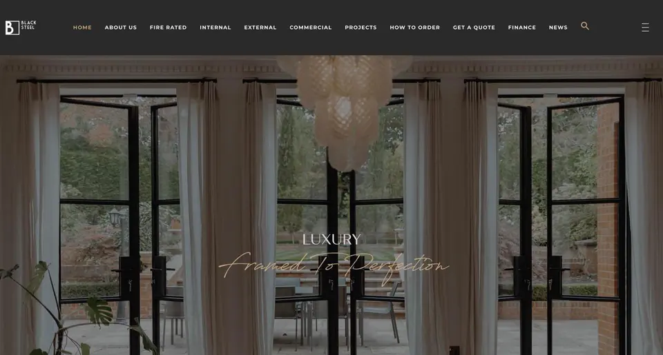
 Black Steel Doors
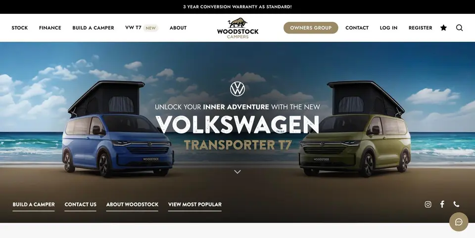 Woodstock Campers
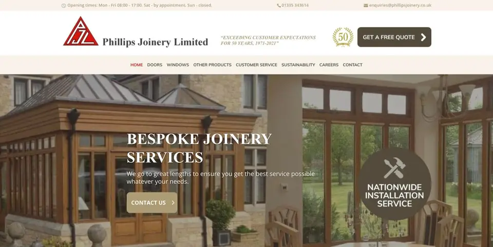 Phillips Joinery
Good brand typography comes down to a small, documented type system: one display font, one body font, defined sizes and weights, and clear fallbacks for the places your main fonts won’t load. The fastest first step is an audit. Look at everything you currently publish, and assign a role to each style, logo, headings, body copy, buttons, captions, then write it down before you touch a single design file.
TL;DR:
- Use no more than two font families, typically one for display and headings and one for body text, to maintain clear hierarchy.
- Prioritize legibility by testing fonts in real content, ensuring proper contrast, size, and spacing across all device sizes and accessibility standards.
- Map font roles to specific sizes, weights, and line heights as tokens, and document fallbacks and licensing to ensure consistency across channels.
- Conduct an audit of current typography, assign clear roles to styles, and track all font usage and licenses to prevent breaches and inconsistencies.
- Rely on practical tests and real content rather than specimen sheets to choose fonts that perform well in context and over time, not only in appearance.
Table of Contents
- Core typographic principles every brand must get right
- How to choose typefaces for your brand
- Accessibility and responsive typography: practical rules to follow
- Applying typography across channels: web, print, email and social
- Turning choices into a brand typography system: a practical checklist
- Why testing should guide typographic choices
- How AMW Media can help you implement your typography
- Sources
- FAQ
Core typographic principles every brand must get right
Every brand needs a small set of type roles, and each one should do exactly one job. Display type carries your logo and hero moments. Headings organise a page. Body text carries the reading load. UI text labels buttons and menus. Captions handle the small print. When one font tries to do all five jobs, hierarchy collapses and everything starts to look the same.
Build hierarchy with size, weight, spacing and colour rather than by adding more fonts. Two families is usually the practical limit: one for display and headings, one for body copy. ONS’s brand guidance is a useful reference here: it uses a single family, Open Sans, across Light, Regular, Semibold and Bold weights to build the entire hierarchy, rather than mixing in extra typefaces.
- Give each type role one job: display, heading, body, UI, caption.
- Use sentence case for readability rather than title case or all caps.
- Set body copy left aligned with a consistent vertical rhythm.
- Reserve italics and capitals for short labels, never long paragraphs.
Pro Tip: If a design feels flat, try adjusting weight and spacing before you reach for a new font.
How to choose typefaces for your brand
Typeface selection works best as a repeatable process, not a moment of inspiration. Start with your brand voice, your audience and the channels you use most, then work through the same steps every time you’re picking or refreshing fonts.
- Translate your brand personality into a type category: humanist sans for warmth, grotesque for confidence, serif for tradition.
- Pick a pairing strategy: contrast categories (a serif heading with a sans body) or stay within one family and vary weight or width.
- Check that x-heights and weights sit well together at both large and small sizes.
- Confirm licensing and web-font availability before you fall in love with anything.
- Name explicit fallbacks for email and PowerPoint, since custom fonts rarely survive either.
- Drop both candidates into real content, not lorem ipsum, at the sizes you’ll actually use.
- Run a quick readability check with a handful of real readers before locking the decision in.
Legibility research backs up that last step. Studies on typeface legibility found that humanist-style type consistently outperformed a square grotesque in glance-reading tests, a reminder that how a font performs in context matters more than how it looks in a specimen sheet.
Accessibility and responsive typography: practical rules to follow
Accessible typography is mostly about treatment, not font choice. Set sizes in relative units (em, rem or percentages) rather than fixed pixels, so text scales properly when someone adjusts their browser or device settings. Home Office design guidance recommends exactly this: relative units, left alignment, and avoiding italics for anything longer than a line or two.
The GOV.UK Design System’s tested type scale pairs specific font sizes with line heights, for example 16px with a 20px line height for small body text, and supports zoom up to 400% without breaking layout.
- Keep web body text at a comfortably readable size, typically around 16 pixels or larger, with an appropriate line height for clarity.
- In print, consider a minimum font size suitable for your audience to ensure readability.
- Limit ALL CAPS to short labels and avoid it in running text.
- Check contrast with a standard tool and test your layout at 200% and 400% zoom.
No single font is accessible on its own. Size, spacing, contrast and how well a layout survives resizing matter far more than the typeface’s name.
Applying typography across channels: web, print, email and social

A type system only earns its keep when it survives contact with real templates. Start by mapping a simple scale, H1, H2, body, small text, to each channel you publish on, so a designer and a marketing coordinator reach for the same sizes without asking each other.
Email and social are where custom fonts usually fall over, since most email clients and social platforms fall back to system fonts regardless of what you specify. Define that fallback in advance rather than discovering it in an inbox: something like “primary body in Open Sans, email fallback to a system sans-serif” removes the guesswork.
- Map each scale point (H1, H2, body, caption) to its channel templates once, then reuse it everywhere.
- Name a slide fallback such as Arial for PowerPoint, where custom fonts rarely embed cleanly.
- Use images sparingly for typography on email and social, since they slow load times and fail screen readers.
- Test every template on a phone screen before it goes live, since that’s where most people will read it.
Write these rules down somewhere accessible to your whole team, not just the design department. A one-page spec with token names and example snippets does more for consistency than a beautifully designed but unread brand book. If you want a broader look at how type fits into the rest of your visual identity, our piece on visual branding covers the wider picture.
Turning choices into a brand typography system: a practical checklist
Once you’ve chosen your fonts, the real work is converting them into something your team can actually use without asking you every time.
- Turn your scale into named tokens (heading-large, body-default, caption-small) with fixed sizes, weights and line heights.
- Keep a licensing register noting where each font is used and what the licence permits, so nobody accidentally breaches it on a new project.
- Document fallbacks for every role, covering email, slides and any tool that won’t render your primary font.
- Run a short accessibility pass: contrast check, zoom test, and a scan for stray italics or block capitals.
- Hand the whole thing over as a short spec document that a non-designer could follow unaided.
Pro Tip: Store your type tokens next to your colour and spacing tokens; typography drifts fastest when it’s documented separately from the rest of the brand system.
For a wider look at governance and how typography sits inside a full identity system, see our guide on building brand identity.
Why testing should guide typographic choices
Trends age fast, but legibility doesn’t. I’d rather see a brand choose a slightly less fashionable typeface that reads well on a cracked phone screen than a striking one that falls apart at small sizes. Personality and legibility pull in different directions sometimes, and when they do, legibility wins. You can see how this plays out in practice across our project work.
— Amir
How AMW Media can help you implement your typography
Working through all of this alone takes time most brand teams don’t have. AMW Media’s graphic design and branding team builds type systems, tokens and templates so your brand looks the same whether it’s on a billboard or a phone screen, and our web design team bakes accessibility and responsive scaling into the build itself.
- Graphic design and branding to define your type system and document it properly.
- Web design and development to implement responsive, accessible type scales.
- Content production for social and video assets that align with your typography.
- A discovery call to review your current type usage and identify improvements.
If you’d rather have someone else run the audit and hand you finished templates, get in touch and we’ll talk through what that looks like.
Sources
- Typography – Brand guidelines – Service manual – Office for National Statistics
- Layout and typography – Home Office User-Centred Design Manual
- Type scale – GOV.UK Design System
- Assessing typeface legibility research (Dobres et al.)
FAQ
What font is used for brands?
There’s no single font every brand uses. Many organisations, including the ONS, choose one flexible family, such as Open Sans, with several weights so it can handle headings, body copy and UI text without needing extra typefaces.
How do you choose the right typography for your brand?
Start with your brand voice and audience, then pick a type category that matches that personality before narrowing down to specific fonts. Test your shortlist in real content at real sizes, and check readability with actual readers rather than relying on how a specimen sheet looks.
What is the 3 font rule?
The 3 font rule is a general design guideline suggesting you limit a project to three typefaces at most to avoid visual clutter. In practice, most brand systems work better with two, one for display and headings and one for body copy, since fewer fonts make hierarchy easier to control.
How many fonts should a brand use?
Two fonts is usually the practical sweet spot for a brand: one for display and headings, one for body text. Adding more fonts to fix a hierarchy problem almost always makes it worse rather than better.
Recommended
- Graphic design ideas for marketing: 2026 guide
- Graphic design for business: what it is and why it matters
- Elevate your brand identity: What is visual branding?
- Creative branding ideas list: top strategies for 2026
Our free marketing audit looks at your site, your ads and your content, and comes back with a 30 day plan. No pitch deck.

Founded AMW Media in 2024 and runs strategy, paid media and the CRM builds. The reason everything here is in house and measured in revenue. Meet the team.