
 Black Steel Doors
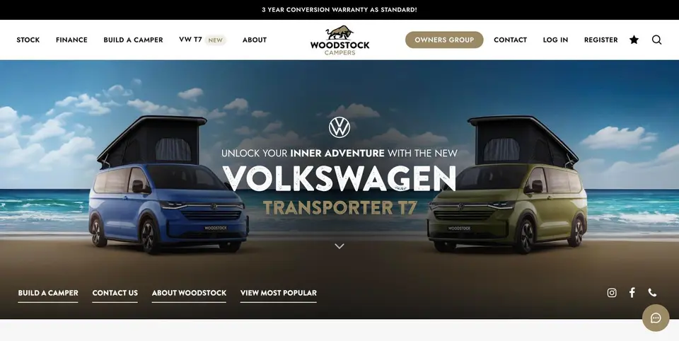 Woodstock Campers
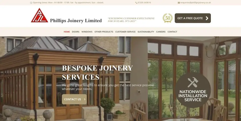 Phillips Joinery
A PPC landing page is a single-purpose page built to convert paid clicks, not to inform or entertain. Its one job is to turn a visitor who just clicked an ad into a lead, sale or booking, and the fastest way to check if yours is working is to see whether the headline and offer actually match the ad that sent someone there.
TL;DR:
- Using a dedicated landing page tailored to a specific ad campaign significantly improves conversion rates and lowers cost per acquisition when message and offer match exactly.
- Mobile speed is critical, as nearly half of mobile visitors abandon pages that load in more than three seconds, making fast load times essential for PPC success.
- Key elements include a headline that mirrors the ad, a clear above-the-fold CTA, minimal form fields, trust cues near the CTA, and no site navigation to prevent exits.
- Testing should focus on high-impact, low-effort changes like headlines and CTA text, run for full cycles, and be based on clear hypotheses rather than guesswork.
- Performance measurement must include conversion rate, cost per acquisition, quality score, and real user monitoring to identify issues early and optimize effectively.
Table of Contents
- What makes a PPC landing page different from a normal web page
- Why dedicated landing pages earn their keep
- The core elements every high-converting page needs
- Mobile speed and technical basics you can’t skip
- Copy and design patterns that actually move the needle
- How to test and improve your landing pages properly
- Measuring performance the right way
- Templates and a checklist you can use today
- A real campaign result and what it teaches you
- Where landing page effort actually pays off
- How AMW Media approaches PPC landing pages for clients
- Sources
- FAQ
What makes a PPC landing page different from a normal web page
Most pages on a website try to do several things at once. A homepage introduces the brand, a category page helps people browse, a product page answers questions and nudges towards checkout. A PPC landing page has none of that ambition. It exists to do one thing: convert the specific visitor who clicked a specific ad for a specific offer.
That singular focus is what separates it from the rest of the site. There’s no menu pulling attention sideways, no blog links tempting people to wander off, no generic “welcome to our company” messaging. Everything on the page points towards one action.
Typical goals for a dedicated PPC landing page include:
- Capturing a lead through a short form (quote request, callback, consultation)
- Driving a direct sale for a specific product or bundle
- Booking a demo or discovery call
- Encouraging a download or sign-up tied to a single campaign
Google Ads guidance is clear that a landing page should mirror the ad’s call to action and offer, because misalignment between what someone clicked and what they land on is one of the biggest drivers of bounce and a poor Quality Score. If your ad promises “50% off garden pods this week” and the landing page opens with a generic company overview, you’ve already lost most of that traffic before they’ve read a word.
Why dedicated landing pages earn their keep
Sending paid traffic to a generic page might feel like less work, but it usually costs more in the long run. A landing page built for one offer converts better because there’s nothing competing for attention, and a higher conversion rate directly lowers your cost per acquisition.
There’s also a knock-on effect inside Google Ads itself. Landing page experience is one of the components behind Quality Score, and a stronger score tends to mean cheaper clicks and better ad positions in the auction. Get the page right and you’re not just converting more, you’re paying less for the traffic that arrives.
Dedicated pages also make tracking and testing far easier. When a page serves one campaign and one goal, you can attribute results cleanly, personalise messaging by audience segment, and run tests without the noise of unrelated site traffic muddying your data.
A large share of mobile visitors abandon slow pages before they even see your offer, according to mobile abandonment research, which found that nearly half of mobile visitors leave a site that takes more than three seconds to load. That single fact should change how you prioritise landing page work.
Dedicated pages tend to outperform generic ones most clearly when:
- The offer is time-limited or campaign-specific
- You’re testing a new audience segment or message
- The product or service needs its own explanation, separate from the main site
The core elements every high-converting page needs
Once you accept that a landing page has one job, the components almost design themselves. Here’s the order to think about them in, roughly matching what a visitor sees first.
- Headline that mirrors the ad. Repeat the offer or benefit from the ad copy in the first few words. If the ad says “Free consultation this week,” the headline should say the same thing, not a rebranded version of it.
- A single, obvious CTA above the fold. One button, one action, visible without scrolling. Avoid giving people a choice between “Buy now,” “Learn more” and “Contact us” on the same screen.
- Supporting copy that answers the one objection that matters. Keep it short. Two or three lines addressing price, timing or trust is usually enough.
- Trust cues placed near the CTA. Testimonials, review scores, accreditation badges or client logos work best when they sit close to the action you want people to take, not buried at the bottom.
- A form with as few fields as possible. Every extra field is a reason to abandon. Ask for name and contact details first, and use progressive disclosure (asking for more detail only after the initial submission) if you genuinely need more information later.
- Validation that catches errors early. Inline error messages, not a form that clears itself and blames the user for a missing field.
- Imagery that supports the offer, not decoration for its own sake. A photo of the actual product or service performs better than generic stock imagery.
- No site navigation. Strip the header menu, footer links and anything else that gives visitors an exit route other than the CTA.
Pro Tip: If you can only fix one thing this week, fix the headline. It’s the first thing people read and the easiest thing to get wrong.
Visual hierarchy matters as much as the content itself. The eye should move naturally from headline to supporting proof to CTA, which usually means keeping the layout narrow, the whitespace generous, and the colour palette limited to two or three tones that draw attention to the button rather than fighting it. Warm colours like orange or red often work well for CTAs precisely because they stand out against calmer backgrounds, though the actual test is always whether it converts, not whether it matches a colour theory chart.
If you’re setting up a new campaign structure alongside your landing pages, our guide on PPC campaign setup steps covers how to align ad groups and pages from the start.
Mobile speed and technical basics you can’t skip
Most paid traffic now arrives on a phone, which means mobile performance isn’t a nice-to-have, it’s the foundation everything else sits on. Mobile abandonment data shows nearly half of visitors will leave if a page takes longer than three seconds to load, so speed problems can undo every other improvement you make.
Think With Google’s mobile speed playbook sets out useful lab benchmarks to aim for:
- Start render under 2 seconds
- Speed Index under 3,000
- Visually complete in under 5 seconds where possible
The quickest wins tend to be the same across most sites:
- Compress and resize images before upload rather than relying on the browser to scale them
- Enable server-side compression (Gzip or Brotli) for text-based files
- Defer non-critical JavaScript so it loads after the visible content
- Serve assets through a CDN and use HTTP/2 for faster parallel loading
AMP and progressive web app approaches can help in specific cases, particularly for content-heavy pages, but they add build complexity and aren’t automatically worth the trade-off for a simple lead form page. Measure both lab data (Lighthouse or WebPageTest, useful for reproducible debugging) and field data (real user monitoring or Google Analytics, which shows what’s actually happening for real visitors) before deciding whether the extra engineering is worth it. Our Core Web Vitals guide walks through prioritising fixes if you’re not sure where to start.
Copy and design patterns that actually move the needle
Message match isn’t just about the headline. Every element that a visitor scans in the first few seconds, subheading, hero image, button text, should echo the language of the ad they clicked. If your Google Ads copy mentions “same-day quotes,” your subheading shouldn’t switch to “get in touch at your convenience,” because that mismatch quietly raises doubt.
Button microcopy is worth testing on its own. “Get my free quote” tends to outperform a flat “Submit,” because it restates the benefit at the exact moment someone is deciding whether to commit. Small wording changes like this cost nothing to test and often produce disproportionate results.
Scarcity and social proof both work, but only when they’re honest. A countdown for a genuinely time-limited offer builds urgency; a fake one erodes trust the moment a visitor notices the timer resets. Real client logos, a specific review count, or a named case study carry far more weight than a vague “trusted by thousands” line.
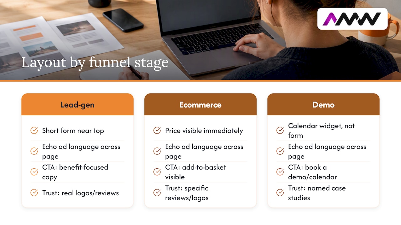
Pro Tip: Match your landing page layout to the funnel stage. A lead-gen page wants a short form near the top; an ecommerce page wants price and add-to-basket visible immediately; a demo-booking page wants a calendar widget, not another form.
For readers wanting a broader look at testing frameworks, our conversion optimisation guide covers the methodology in more depth.
How to test and improve your landing pages properly
Testing only works when it’s tied to a real hypothesis, not a hunch. Before changing anything, write down what you expect to happen and why: “Moving the form above the fold will increase form starts because visitors currently scroll past it.”
- Start with the highest-impact, lowest-effort changes first. IAB UK’s performance advertising principles frame message match elements, headline, offer visibility, CTA, as the best place to begin testing, since they’re quick to change and have an outsized effect on bounce rate and Quality Score.
- Check you have enough traffic before running a test. A page getting a handful of conversions a week won’t produce a reliable result in any reasonable timeframe, so smaller campaigns may need to test bigger, more obvious changes rather than fine details.
- Run tests for a full business cycle, not just a few days. Weekday and weekend behaviour often differs, and cutting a test short on an early lead is a common way to draw the wrong conclusion.
- Pair ad creative tests with landing page variants. Testing a new ad angle against the old page (or vice versa) muddies the result, since you won’t know which change caused the shift.
Google’s own guidance on experimentation and optimisation makes the same point: high-performing pages come from continuous, paired testing rather than one-off fixes. If you’re also running social ad tests, our Facebook A/B testing guide covers experiment design that applies just as well here.
Measuring performance the right way
Conversion rate is the obvious headline number, but it’s only useful alongside cost per acquisition, conversion value and return on ad spend. A page converting brilliantly on cheap, low-intent traffic can still lose money if the resulting leads never buy.
Inside Google Ads itself, keep an eye on:
- Quality Score, which reflects expected click-through rate, ad relevance and landing page experience together
- Landing page status flags, which highlight mobile-friendliness and technical issues
- The Landing pages report, which shows performance broken down by URL so you can spot which specific pages are dragging on results
Pairing that account-level data with real user monitoring gives you the fuller picture: Google Ads tells you what happened in the auction, RUM tells you what actually happened once someone landed. A weekly check of conversion rate and CPA by campaign, with an alert set for any sudden drop in landing page status, catches most problems before they become expensive. Make sure your conversion tracking itself is correctly configured too. Our note on updating Google Ads conversion tracking is worth a look if you haven’t checked yours recently.
Templates and a checklist you can use today
A few quick examples to adapt rather than copy outright:
- Lead-gen headline: “Get a free quote in 24 hours” paired with a CTA button reading “Get my free quote.”
- Ecommerce headline: “Garden pods from £X, delivered and installed” paired with a CTA reading “See pod options.”
- Demo-booking headline: “See the platform in 15 minutes” paired with a CTA reading “Book my demo.”
For lead forms, keep the first step to three fields: name, phone number and postcode or one qualifying question. Anything more can wait until after the first submission. For ecommerce landing pages, make the add-to-basket or “buy now” button the single most visible element on the screen, with price and delivery timescale directly beside it.
Before launch, run through this checklist:
- Headline and CTA match the ad’s exact offer and wording
- Page loads in under 3 seconds on a mobile connection
- Conversion tracking is firing correctly on form submission or purchase
- Privacy notice and consent checkbox are visible near the form, not hidden in a footer link
Adjust the emphasis by funnel stage: top-of-funnel traffic needs more reassurance and explanation, while bottom-of-funnel traffic (people who’ve already compared options) responds better to a page that gets straight to price and next steps.
A real campaign result and what it teaches you
Numbers from an actual campaign are more useful than theory. For the GoMo Garden Pods campaign, AMW Media delivered 351 leads at £11.65 per lead by applying the same principles covered in this guide: tight message match between ad and page, a streamlined form, and continuous CRO adjustments based on early results.
The tactics behind that result weren’t exotic:
- Landing page headlines mirrored the exact offer language used in the ads
- Form fields were kept to the minimum needed to qualify a lead
- Conversion tracking was set up correctly from day one, so budget could be reallocated towards what was actually working
AMW Media holds certifications across Google, Meta, Shopify, WordPress and Framer, and the same landing page and CRO approach applies across those platforms. If you want a rough benchmark for your own campaign, per-lead cost is the number to compare, but remember that garden pods sit in a specific price bracket and audience, so treat it as a reference point rather than a target to hit blindly.
Where landing page effort actually pays off
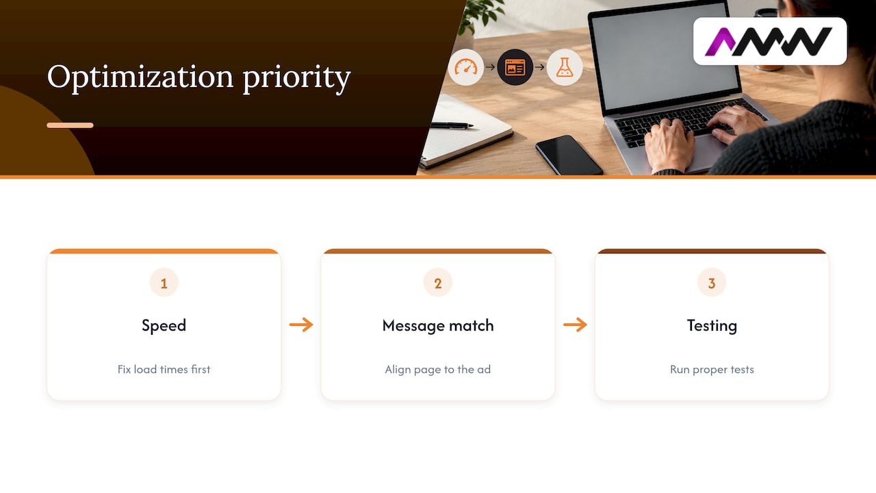
If you only have time to fix one thing, fix speed first, then message match, then start testing. In that order. I’ve seen teams spend weeks tweaking button colours on a page that takes six seconds to load on mobile, which is a bit like repainting a car with a flat tyre.
The most common rookie mistake isn’t a bad headline, it’s an overcomplicated form asking for eight fields when three would do, or a page that looks great on a laptop and falls apart on a phone. Both are avoidable with basic discipline.
Optimise in-house when you have the time to run proper tests and the traffic volume to make them meaningful. Bring in an agency when you need the work done faster, or when your in-house testing has stalled without a clear reason why.
— Amir
How AMW Media approaches PPC landing pages for clients
Building a landing page that matches your ad, loads fast and tracks properly takes time most in-house teams don’t have spare, especially alongside everything else on a marketing calendar. That’s the gap AMW Media fills: PPC landing pages, CRO and campaign tracking handled end to end, with no long-term contract locking you in if it’s not working.
Our services cover the areas this guide has walked through:
- Google Ads and Meta Ads management, including landing page strategy and message match
- Web design and development for fast, mobile-first landing pages
- Conversion tracking setup so every lead and sale is attributed correctly
A recent campaign example (351 leads at a specific per-lead cost) resulted from applying this process with the same discipline covered above. If you’d like a second opinion on an existing landing page or want one built from scratch, take a look at our PPC services or browse recent projects to see the work in context. For a full list of what we offer, visit our services page, or get in touch through our contact page if you’re not sure where to start.
Sources
- Google Ads Help — Landing page basics
- ScientiaMobile — mobile abandonment statistics
- Think With Google — Mobile site speed playbook
- IAB UK — Digital performance advertising principles
FAQ
How much should I pay for a landing page?
AMW Media doesn’t publish a fixed price for landing page or web design work since scope varies by project, so pricing is available on request through our services page. Costs generally depend on design complexity, the number of pages and whether custom tracking or copywriting is included.
What is a good example of a landing page?
A good landing page mirrors the ad that sent the visitor there, has one clear CTA above the fold, and keeps the form as short as possible. The GoMo Garden Pods campaign is a practical example, generating 351 leads at £11.65 per lead by sticking to exactly that approach.
Is PPC just Google Ads?
No, PPC (pay-per-click) is a broader advertising model that includes Google Ads alongside Meta Ads, Microsoft Ads and other platforms where advertisers pay per click rather than per impression. Google Ads is simply the largest and most commonly used platform within that model.
What does SEO and PPC mean?
SEO (search engine optimisation) is the practice of improving a website’s organic, unpaid visibility in search results, while PPC (pay-per-click) is paid advertising where you bid for clicks on platforms like Google Ads or Meta Ads. Many businesses run both together, using SEO for long-term organic growth and PPC for immediate, controllable traffic.
Recommended
- PPC campaign setup steps for competitive success
- What is PPC advertising? A 2026 guide for business growth
- 90 Day YouTube Ads Strategy | Creative and First Party Data
Our free marketing audit looks at your site, your ads and your content, and comes back with a 30 day plan. No pitch deck.

Founded AMW Media in 2024 and runs strategy, paid media and the CRM builds. The reason everything here is in house and measured in revenue. Meet the team.