
 Black Steel Doors
 Woodstock Campers
 Phillips Joinery
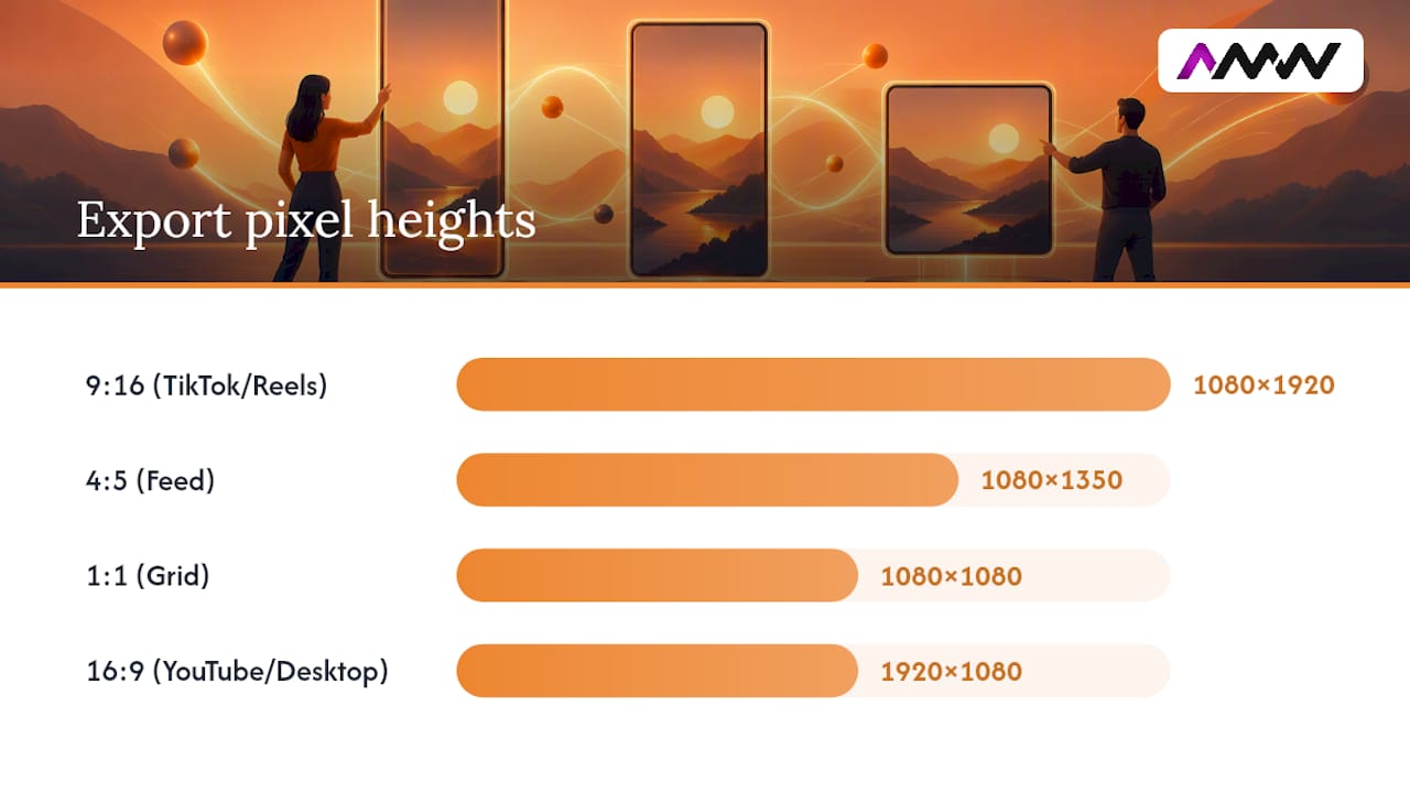
For short-form social, use 1080×1920 (9:16) every time. For Instagram or Facebook feed posts, drop to 1080×1350 (4:5). For long-form or desktop-first viewing, go back to 1920×1080 (16:9), and keep 1:1 in your back pocket as the safe cross-platform fallback. Whatever you pick, keep logos, captions and calls to action off the bottom and right edges, where app menus tend to sit.
TL;DR:
- Using a vertical 1080×1920 aspect ratio is essential for short-form content on TikTok, Reels, Shorts, and Snapchat, as it maximizes screen fill and engagement.
- For Instagram feed posts, a 4:5 aspect ratio (1080×1350) offers the best balance of vertical space and content clarity, outperforming the square 1:1 format.
- Platforms like YouTube and LinkedIn favor landscape 16:9 (1920×1080), with Shorts requiring 9:16, making it vital to choose the correct ratio for each platform’s primary device.
- Consistent safe zones and centered subjects improve reformatting flexibility and reduce cropping errors, especially when repurposing videos across different ratios.
Table of Contents
- Social video aspect ratios at a glance: the quick reference table
- Why vertical video dominates TikTok, Reels and Shorts
- Instagram feed, Stories and Reels: which ratio wins where
- YouTube, LinkedIn and X: when landscape still makes sense
- Pinterest and Snapchat: the exceptions worth knowing
- How to build one master file and export every ratio you need
- Safe zones, composition traps and what happens when ratios don’t match
- Encoding and upload checklist before you publish
- Why aspect ratio shapes engagement more than most marketers realise
- Choosing the right ratio for your content and your audience
- Getting aspect ratio right for paid social video ads
- Where social video aspect ratios are heading next
- AMW Media’s take: what actually drives the export decisions
- How AMW Media handles multi-format video for you
- Where these guidelines come from
- Sources
- FAQ
Social video aspect ratios at a glance: the quick reference table
Every platform has its own preferred shape, but the underlying pattern is simple: vertical wins on mobile, and everything else is a variation on a theme. Here’s the cheat sheet worth pinning above your desk.
When in doubt, 9:16 covers short-form and 1:1 covers everything else. That pairing gets you through 90% of upload screens without a second thought, and it’s backed by Hootsuite’s platform-by-platform sizing guide, which lands on the same defaults.
Why vertical video dominates TikTok, Reels and Shorts
There’s a reason 9:16 has become the house style of short-form video: it fills the entire phone screen with no black bars, no thumb-swiping to reposition, no wasted pixels. As of 2026, 1080×1920 pixels is the standard resolution across TikTok, Instagram Reels, YouTube Shorts, Facebook Reels and Snapchat Spotlight, and apps built around full-screen autoplay simply perform better when the content matches the frame exactly.
Getting the composition right matters as much as the resolution. Keep these safe zones in mind:
- Leave the right-hand rail clear of text or logos. That’s where likes, comments and share icons live.
- Avoid placing key information in the bottom 15% of the frame, where captions and profile details usually sit.
- Centre your subject rather than pushing it to one edge. Crops and reformats are far more forgiving that way.
- Add burned-in captions where possible. Most viewers watch with sound off, especially on the commute.
Before you hit publish, run through this: export as H.264 MP4, shoot at 30fps for talking-head content or 60fps if there’s fast motion, and check your bitrate hasn’t been throttled by the editing app’s default export settings.
Pro Tip: Always export your vertical video at native 1080×1920 rather than letting the platform stretch a smaller file. Platforms compress on upload anyway, and starting with a soft file just compounds the quality loss.
Instagram feed, Stories and Reels: which ratio wins where
Instagram is the one platform where the “just use 9:16 everywhere” rule breaks down, because it runs three different placements with three different expectations. Get this wrong and your carousel looks amateurish or your feed video gets cropped mid-face.
For static feed posts and in-feed video, 4:5 is the smarter default over 1:1. A 1080×1350 pixel portrait frame occupies more vertical real estate as someone scrolls, which means more scroll-stopping power for the same content. Square (1:1) still has its place though, particularly when:
- You’re repurposing the same asset to X or LinkedIn, where 1:1 behaves consistently.
- You need one file that works across a grid of mixed content without visual imbalance.
- The footage was shot square from the start, and cropping to 4:5 would cut off something important.
Reels and Stories, on the other hand, both run on 9:16, so a single export does double duty. That’s one less render to manage, and one of the easier wins in a multi-platform workflow.
Carousels deserve a specific mention. Every slide in a carousel should share the same aspect ratio. Mixing 1:1 and 4:5 slides in one carousel creates an ugly jump as viewers swipe, and Instagram doesn’t auto-correct for it.
YouTube, LinkedIn and X: when landscape still makes sense
Not every platform has gone vertical, and pretending otherwise wastes good footage. YouTube remains the anchor for landscape-first, desktop-and-TV viewing, and standard uploads should stay at 16:9, 1920×1080. Shorts, by contrast, need genuine 9:16 vertical to even qualify as a Short. Upload a landscape clip to the Shorts shelf and YouTube will either letterbox it or simply refuse to classify it as short-form, which defeats the purpose of using that feed at all.
- YouTube long-form: 16:9, 1920×1080, built for sitting-back viewing on a bigger screen.
- YouTube Shorts: 9:16, 1080×1920, same technical spec as TikTok and Reels.
- LinkedIn: 16:9 or 1:1 for most professional content; vertical is technically supported but renders noticeably smaller when viewed on a desktop feed, which is where a lot of LinkedIn’s audience still is.
- X: 1:1 or 16:9 both perform reliably whether someone’s scrolling on a phone or reading at a desk, making it one of the more forgiving platforms for reused assets.
The practical takeaway: if your content genuinely benefits from a widescreen frame, whether that’s a product demo, a webinar clip or an interview, YouTube and LinkedIn are where that investment pays off. Save the vertical-only exports for the platforms actually built to show them full-screen.
Pinterest and Snapchat: the exceptions worth knowing
These two get lumped in with “everything else is 9:16 now,” and that’s a mistake. Both have their own quirks, and ignoring them means your content gets cropped or buried.
Pinterest is the odd one out. Rather than 9:16, its algorithm favours a taller 2:3 portrait ratio (around 1000×1500 pixels) for standard Pins, because that shape fills more of the vertical masonry grid the platform is built around. That said, 9:16 video pins do work for full-screen video content, so you’re not locked out of reusing a vertical master entirely, just aware it won’t get the same visual priority as a proper 2:3 crop.
Snapchat sits at the opposite end: it’s vertical-only, full stop. Snapchat’s own spec documentation confirms 9:16 across Snaps and Spotlight, with no landscape or square option worth building for. If you’ve already got a 1080×1920 master from your TikTok or Reels workflow, it drops straight into Snapchat with zero extra editing.
A couple of practical habits make reuse easier:
- When cropping a vertical master down to Pinterest’s 2:3, check nothing important sits in the top or bottom strips that get trimmed away.
- Keep your subject dead centre in the original vertical shoot. It gives you the most flexibility when reformatting for a taller or shorter crop later.
- Don’t assume Pinterest ignores square or vertical entirely. It’ll display them, just without the reach boost 2:3 gets.
How to build one master file and export every ratio you need
The single biggest time-waster in social video production is reshooting the same idea for every platform. The fix is a repurposing workflow: shoot once, export many.
Decide upfront whether your primary use case is short-form or long-form. If most of your output is going to TikTok, Reels and Shorts, shoot a vertical master at 1080×1920 and treat any landscape need as the exception. If you’re producing predominantly for YouTube or a website, shoot a high-resolution landscape master and compose with generous headroom so a vertical crop still has something usable in frame.
From there, the export sequence looks like this:
- Export your 9:16 master first. This is your TikTok, Reels, Shorts and Snapchat file, and it should be the highest-quality version you produce.
- Crop to 4:5 (1080×1350) for feed placements. Reframe rather than stretch, keeping the subject centred so nothing critical falls outside the tighter frame.
- Crop to 1:1 (1080×1080) for cross-platform posting. This becomes your safety net for X, LinkedIn and any grid-based feed.
- Export 16:9 (1920×1080) last, if you need a long-form or desktop version. This usually only applies if you shot with a landscape master or need a YouTube-native cut.
Working this way, rather than editing four separate timelines from scratch, preserves quality because you’re cropping down from one clean source instead of re-encoding multiple times. It also cuts editing time dramatically, since colour grading, audio mixing and caption timing only need doing once. AMW Media’s guide to video production for creators and small businesses covers the shoot-side version of this same logic in more depth.
Pro Tip: Export at the platform-recommended pixel dimensions directly rather than letting the app resize on upload. Native-resolution exports hold their bitrate and avoid the soft, blocky look that comes from double-compression.
Safe zones, composition traps and what happens when ratios don’t match
Every platform has a “danger zone” where its own interface sits on top of your video, almost always the bottom-right corner. That’s where like buttons, comment icons, share arrows and profile tags live on TikTok, Reels and Shorts alike, so a caption or logo placed there simply won’t be seen. Keep anything essential to the centre third of the frame and you’re safe regardless of which app is rendering it.
When a video doesn’t match a platform’s expected ratio, one of three things happens:
- Letterboxing, where black bars appear top and bottom because the footage is wider than the display expects.
- Pillarboxing, the reverse: black bars on the left and right when a vertical clip lands in a landscape player.
- Direct cropping, where the platform simply chops off the edges of the frame to force a fit, sometimes cutting off a face or a key graphic entirely.
None of these are catastrophic on their own, but they all read as unpolished, and unpolished content tends to get scrolled past faster. The fixes are straightforward: centre your subject during the original shoot rather than composing off to one side, use a softly blurred version of the footage to fill any letterbox space rather than a stark black bar, and always preview the finished export inside the actual app before you schedule it. What looks fine in your editing software can shift once a platform applies its own compression and interface overlay.
Encoding and upload checklist before you publish
Getting the ratio right only matters if the file itself uploads cleanly. Most quality problems creators blame on “platform compression” actually start with an export setting chosen incorrectly in the first place.
Stick to H.264 MP4 as your container and codec combination. It has the broadest compatibility across TikTok, Instagram, YouTube, Facebook, LinkedIn and X, and it’s unlikely to trigger a re-encode that degrades quality further. For resolution, 1080p is the sensible baseline everywhere; anything higher rarely adds visible benefit once a platform compresses it anyway. Frame rate depends on content: 30fps suits talking-head and interview-style videos, while fast-motion content such as sport or dance benefits from 60fps to avoid a stuttery look.
Before you hit publish, run through this list:
- Confirm the aspect ratio matches the destination (9:16, 4:5, 1:1 or 16:9).
- Check the resolution is native, not upscaled from a smaller source file.
- Verify your bitrate hasn’t been quietly capped by a default export preset.
- Add captions or subtitles, since a large share of viewers watch muted.
- Preview the finished file inside the actual app before scheduling it live.
Length and file-size limits vary by platform and change often enough that it’s worth checking the current caps in-app before a big upload, particularly for anything approaching the ten-minute mark.
Why aspect ratio shapes engagement more than most marketers realise
A mismatched aspect ratio doesn’t just look untidy. It actively works against the algorithm and against how people physically hold their phones. Vertical formats fill the screen without requiring any interaction, so a viewer’s thumb stays still and their attention stays on the content rather than on adjusting the view. A landscape video forced into a vertical feed, by contrast, shows up small with black bars either side, and that visual gap reads subconsciously as “not made for me.”
Platforms also reward format-native content in how they distribute it. A Short built at genuine 9:16 gets treated as a Short; a landscape clip uploaded to the same shelf can get deprioritised or simply won’t surface in that feed at all, because it isn’t optimised for the placement it’s competing in.
There’s a viewer-experience angle too. Full-frame vertical video means less visual noise, since there’s no surrounding interface bleeding into the edges of the footage the way there is with a small, centred landscape clip. That cleaner presentation tends to hold attention longer, which feeds back into watch time, which feeds back into how much the algorithm chooses to show it. It’s a loop, and getting the ratio right at the start is what keeps you inside it rather than fighting against it.
Choosing the right ratio for your content and your audience
Not every piece of content should default to vertical just because it’s fashionable. The right ratio depends on what you’re making and where your audience actually watches it.
Fast, casual, mobile-first content, think tutorials, behind-the-scenes clips, reactions, trends, belongs in 9:16. That’s where the audience already is, scrolling one-handed on a commute or a sofa. Polished brand storytelling, product demos or anything meant to be watched with intent rather than stumbled across tends to suit 16:9 better, especially if your audience is watching on YouTube via a smart TV or a laptop rather than a phone.
Consider where your specific audience actually consumes your content, not where you assume they do. A B2B audience on LinkedIn skews more desktop-heavy than a consumer audience on TikTok, so a square or landscape export genuinely performs better there even though vertical dominates almost everywhere else. Carousel-style educational content, meanwhile, often works better as 4:5 static or video slides than as a single vertical video, simply because it gives the swipe mechanic something to do.
The pattern worth remembering: match the format to the platform’s dominant device, not to whatever’s trending that month.
Getting aspect ratio right for paid social video ads
Paid placements raise the stakes on aspect ratio, because a poorly framed ad doesn’t just underperform organically, it burns budget while doing it. Most ad platforms now let you upload multiple aspect ratios against a single campaign, and taking that option seriously usually beats picking one ratio and hoping it stretches across every placement.
Feed placements on Instagram and Facebook favour the same 4:5 logic as organic posts, while Stories and Reels placements within the same campaign need a 9:16 version to avoid awkward cropping or wasted canvas. Skipping the vertical version and letting the platform auto-crop your landscape ad is one of the more common budget leaks in paid social, since a poorly cropped call-to-action button can end up cut off entirely.
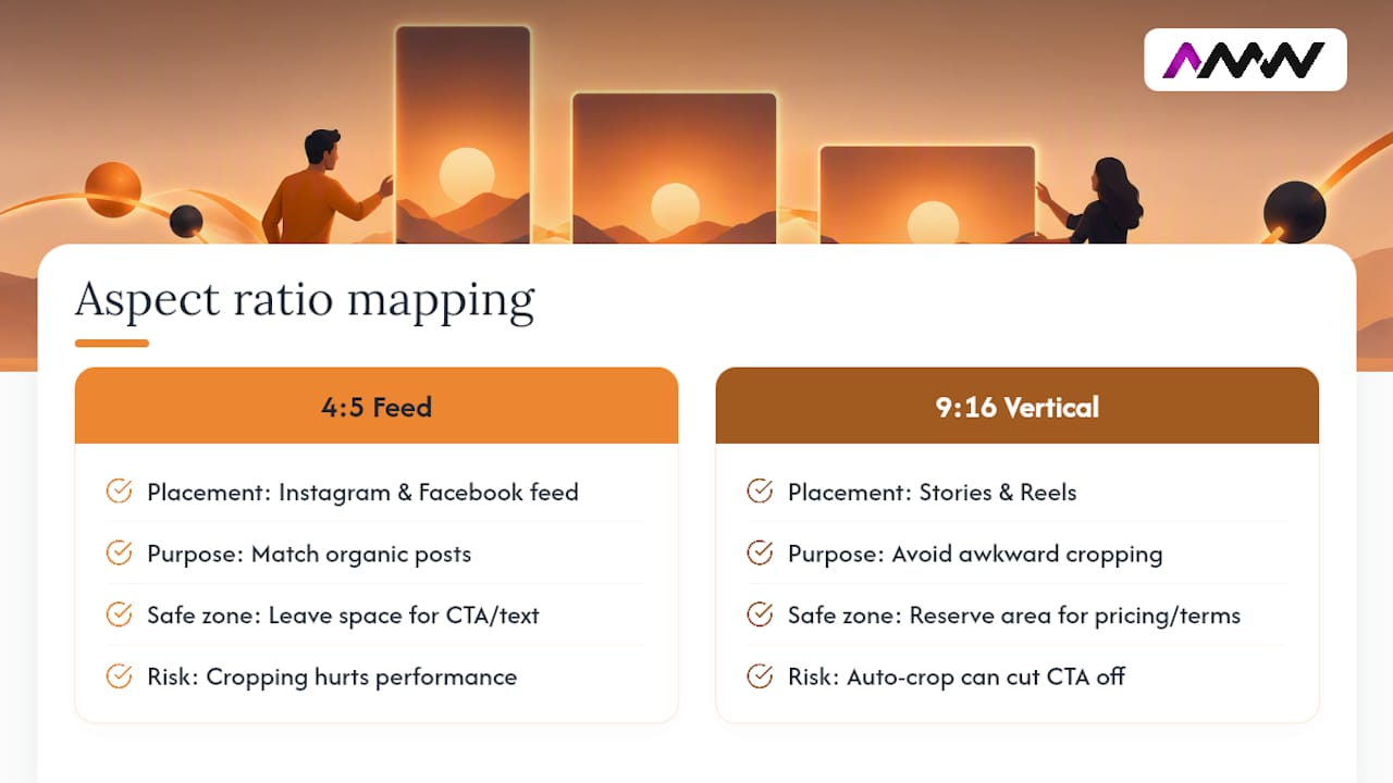
Safe zones matter even more in paid work, because compliance elements such as disclaimers, pricing or terms often need to sit somewhere visible, and that space competes directly with the platform’s own UI overlays. Build ad creative with that constraint in mind from the storyboard stage, not as an afterthought during export.
Where social video aspect ratios are heading next
The vertical-first shift that felt experimental a few years ago is now simply the baseline, and that shift shows no sign of reversing. Producing a vertical master as your default, rather than an afterthought squeezed out of landscape footage, has become standard practice rather than a shortcut for smaller teams.
What’s changing next is less about new ratios and more about how platforms handle the ones that already exist. Expect continued blurring between “short-form” and “standard” content as YouTube, Instagram and Facebook keep testing hybrid feeds that mix ratios in the same scroll. Mixed-ratio feeds place more pressure on creators to get framing right at the shoot stage, since there’s less guarantee of knowing in advance exactly how a clip will be displayed. The safest long-term habit is the one covered earlier: compose with a centred subject and generous headroom, so whichever ratio a platform decides to serve your content in, the important parts are still in frame.
AMW Media’s take: what actually drives the export decisions
Most clients ask us for “the TikTok version” and stop there, which is usually a mistake. When budget allows, we produce a vertical master plus feed-ready crops as standard, because the incremental cost of a second export is small next to the reach lost by only serving one platform well.
Where budget is tighter, we prioritise a single, correctly-composed vertical master over a rushed multi-format set. A clean 9:16 file with proper safe zones consistently outperforms a scattered batch of poorly cropped alternates. We’ve seen vertical-first delivery noticeably improve reach for clients who previously repurposed old landscape ads without reframing them.
For smaller teams, the trade-off usually comes down to this: spend the extra time getting one ratio right, or spread thin across four and get none of them quite right. The first option wins more often than people expect.
— Amir
How AMW Media handles multi-format video for you
This service offers a practical alternative to juggling four separate edits yourself. Rather than exporting one flat version and hoping it holds up everywhere, our production process builds safe-zone-aware framing into the shoot from the start, so the crops to 4:5, 1:1 and 16:9 come out clean rather than salvaged.
That means one shoot day can cover multiple platform needs, without reshooting or compromising on framing for any single platform. We handle the video production, the platform-specific exports and, if you need it, the ongoing social media management that gets it all scheduled and posted correctly. If you’d rather not manage four different aspect ratios across five different platforms on your own, take a look at our full range of services and get in touch for a quote tailored to what you’re actually producing.
Where these guidelines come from
The aspect ratio specs and safe-zone rules in this guide are drawn from platform documentation and current industry cheat sheets rather than guesswork.
- Meta Business Help Centre for Instagram and Facebook aspect ratio specs.
- YouTube’s support pages for standard uploads versus Shorts.
- Snapchat Business Help for vertical-only Snap specs.
- Hootsuite’s sizing guide and Teleprompter for cross-platform confirmation.
Sources
- Best practices for aspect ratios | Meta Business Help Center
- Social media image sizes for all networks September 2026
- YouTube help: video formats and aspect ratios
- Snapchat business help: top Snap specs
- Social Media Video Sizes: The Complete Guide
FAQ
What is the best aspect ratio for social media videos?
There isn’t one universal answer, but 9:16 (1080×1920) is the safest default for short-form platforms like TikTok, Reels and Shorts. For feed posts on Instagram or Facebook, 4:5 (1080×1350) performs better than square, and 16:9 remains correct for standard YouTube uploads.
Are TikTok videos 9:16 or 3:4?
TikTok videos should be 9:16, not 3:4. The 3:4 ratio sometimes gets mentioned in older guides, but current TikTok upload specs and full-screen playback are built around vertical 9:16 at 1080×1920.
Is Instagram now 3:4 or 4:5?
Instagram feed posts use 4:5, not 3:4. The 1080×1350 pixel dimension gives feed content maximum vertical space without cropping, while Reels and Stories both use the taller 9:16 ratio.
Should you use 4:3 or 16:9?
For modern social platforms, 16:9 is the correct choice over 4:3, which is largely a legacy television ratio. Use 16:9 for standard YouTube uploads and desktop-first content, and switch to 9:16 for anything destined for a short-form vertical feed.
How do I avoid my video getting cropped or letterboxed?
Match your export ratio to the platform’s native spec rather than relying on the app to resize it for you. Centring your subject and keeping text away from the bottom and right edges also reduces the risk of important content being trimmed during cropping.
Can AMW Media handle multi-format exports for my brand?
Yes, video production and platform-specific exports are part of AMW Media’s service offering, covering vertical masters through to feed and long-form crops. Current pricing isn’t published, so get in touch for a quote based on your production needs.
Recommended
- What is video marketing: effective strategies for 2026
- The role of video content in digital brand engagement
- Guide to video production for creators and small businesses
- How to create engaging social media content that works
Our free marketing audit looks at your site, your ads and your content, and comes back with a 30 day plan. No pitch deck.

Founded AMW Media in 2024 and runs strategy, paid media and the CRM builds. The reason everything here is in house and measured in revenue. Meet the team.