
 Black Steel Doors
 Woodstock Campers
 Phillips Joinery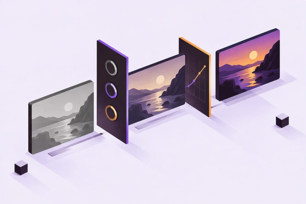
Colour grading is the creative process of shaping a video’s palette, contrast and mood after the technical faults have already been fixed, serving as a powerful storytelling tool to enhance brand strength and customer engagement. The single rule to remember: correct first, grade second. Every tonal choice you make afterwards should serve the story, not just look nice on its own.
TL;DR:
- Correct all white balance, exposure, and shot matching issues before beginning creative grading to prevent compounded errors later.
- Organize and label footage clearly during correction to streamline the grading process and maintain consistency across scenes.
- Use industry-standard tools like DaVinci Resolve with input LUTs at the start and look LUTs at the end to ensure accurate color workflows.
- Regularly monitor scopes, especially the vectorscope, to protect skin tones and avoid clipped highlights during correction and grading.
- Keep grading simple, subtle, and story-driven, verifying the final look across multiple screens before delivery to ensure consistency and accuracy.
Table of Contents
- Colour correction vs colour grading: what each step fixes and why order matters
- A compact beginner workflow: prepare, correct, grade, deliver
- Tools, LUTs and colour management basics beginners must know
- Foundational concepts: colour wheels, scopes, hue, saturation, luminance and skin tones
- Step-by-step node workflow and a simple example grade
- Common rules of thumb and mistakes beginners make
- Display and calibration: affordable checks and when to upgrade
- Practical perspective: quick grading choices for brand and social video
- Editorial perspective: prioritise emotional intent over preset “film looks”
- How AMW Media can help with professional grading and content production
- FAQ
- Sources
Colour correction vs colour grading: what each step fixes and why order matters
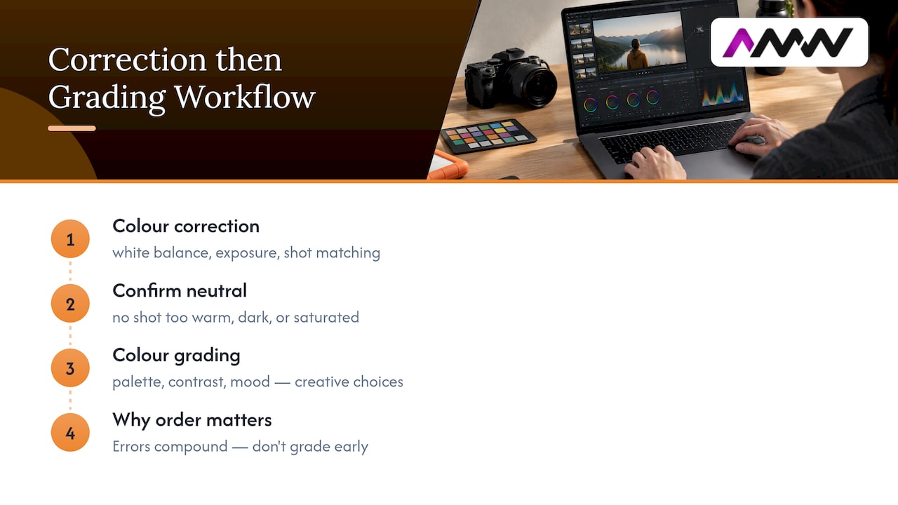
Colour correction is the technical clean-up stage. It covers white balance, exposure levels and matching shots from different cameras or lighting setups so a scene cuts together without jarring jumps in skin tone or brightness. Think of it as getting every shot to a neutral, consistent starting line.
Colour grading comes after that. It’s the creative layer: choosing a palette, pushing contrast, deciding whether a scene feels warm and nostalgic or cold and clinical. This is where mood lives.
The order matters because errors compound. If you start grading before correction is finished, you end up pushing creative colour on top of a white balance mistake, and the fix becomes much harder to track down later. Cinematographers and colourists treat lighting and camera decisions as choices made for emotional effect, and grading is meant to support that intent, not fight against uncorrected footage.
In practical terms, correction ends once every shot in a sequence matches reasonably well under neutral viewing conditions; no shot stands out as too warm, too dark or too saturated compared with its neighbours. Grading begins the moment you start making a deliberate creative choice rather than fixing a technical fault. If you’re adjusting because something looks wrong, that’s correction. If you’re adjusting because you want it to feel a certain way, that’s grading.
A compact beginner workflow: prepare, correct, grade, deliver
A repeatable process saves you from rebuilding your approach every project. Here’s a simple four-stage order that works for most beginner edits:
- Prepare: set your timeline colour space (usually Rec.709 for standard delivery), import footage, and organise shots into scenes or groups with clear labels.
- Correct: balance white balance and exposure on each shot, then match shots within the same scene so cuts feel seamless.
- Grade: build your creative look, starting with primary adjustments (overall tone and contrast) before layering secondary corrections and masks for specific areas.
- Deliver: apply the correct output colour transform for your target platform, using a delivery LUT if the platform or client needs a specific look baked in.
Shot organisation deserves more attention than beginners usually give it. Group clips by scene or lighting setup and label your nodes clearly from the start, because a messy, unlabelled node tree becomes unreadable the moment you revisit a project a week later. This habit also speeds up grading in team environments, where consistency across many shots matters more than any single clever adjustment.
The correction pass should feel almost boring: you’re hunting down anything that looks technically wrong, not interesting. Save the fun part, the creative pass, for once everything is clean. That’s when you build your look, add masks for skies or faces, and start shaping mood. Delivery is often overlooked, but sending out a file with the wrong colour transform can undo every careful decision you made upstream.
Tools, LUTs and colour management basics beginners must know
Most professional and hobbyist colourists work in DaVinci Resolve, which is widely regarded as the industry-standard application for both correction and creative grading, partly because its free version includes a genuinely capable colour page. Adobe Premiere Pro’s Lumetri panel covers similar ground if you’re already inside that ecosystem.
A few terms worth nailing down early:
- Input or camera LUTs convert footage from a camera-specific format into something viewable, and they go at the start of your grading chain.
- Look LUTs apply a creative style and belong near the end, after correction is finished.
- Rec.709 is the standard colour space for most online and broadcast delivery, and it’s usually your working space unless you have a specific reason to use something else.
- Log footage looks flat and washed out straight off the camera because it’s designed to preserve as much dynamic range as possible; applying the correct decode or LUT restores normal contrast and colour before you start grading.
Camera-specific log formats behave differently depending on exposure settings, so using the correct decode or LUT for your specific camera avoids tone-scale errors that are hard to spot until you’re deep into a grade.
Foundational concepts: colour wheels, scopes, hue, saturation, luminance and skin tones
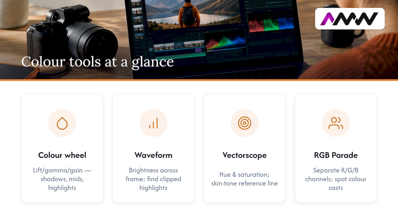
Colour wheels, sometimes labelled lift, gamma and gain, or shadows, mids and highs, let you push colour and brightness into three separate tonal zones. Lift affects your darkest areas, gamma controls the midtones where most of the image detail sits, and gain shapes your highlights. Adjusting these separately is how you create depth rather than just a flat colour tint over everything.
Scopes are your objective check against a screen that might be lying to you. The waveform monitor shows brightness levels across the frame, helping you spot clipped highlights or crushed shadows before they become permanent mistakes. The vectorscope shows hue and saturation, and it has a built in skin tone line that most footage should sit close to if skin looks natural. The RGB parade splits those three channels out individually, which makes colour casts easy to spot, especially in skin tones where even a small shift reads as unhealthy or artificial.
Protecting skin tones comes down to a simple habit: check the vectorscope regularly during both correction and grading, and pull back saturation if faces start drifting away from that skin tone line. Highlights deserve the same caution, since clipped highlights on a face or a bright sky can’t be recovered later.
It’s a useful starting thought for building a balanced palette, but treat it as a loose guide rather than a rule, since footage rarely divides that cleanly and forcing it can flatten a scene’s natural variation.
Step-by-step node workflow and a simple example grade
A clear node order keeps your grade readable and easy to adjust later. A common beginner structure looks like this:
- Input LUT: decode log footage into a viewable space.
- Balance and exposure: fix white balance and overall brightness.
- Primary contrast: shape your lift, gamma and gain for overall tone.
- Saturation and hue: adjust colour intensity and any hue shifts.
- Secondary nodes: isolate specific colours or areas with masks or qualifiers.
- Filmic or grain layer: add texture if your look calls for it.
- Output transform: convert to your delivery colour space, such as Rec.709.
Label every node as you build it, and once you’re happy with a look on one shot, copy that node tree across the rest of the scene rather than rebuilding it from scratch. This is exactly the habit that professional pipelines rely on to keep a consistent look across hundreds of shots.
Here’s a small example. Say you’re grading a warm, reflective interview scene: warm up the midtones slightly with the gamma wheel, lift the shadows a touch so they don’t feel heavy, and pull back the gain if highlights near a window start threatening to clip. Check the waveform after each move.
For a quick face enhancement, draw a tracked Power Window around the subject’s face, feather the edge so the mask blends naturally, and boost the catchlight in the eyes slightly with a small gain adjustment inside that mask. Tools like Resolve’s Magic Mask can speed up this kind of tracking considerably.
Pro Tip: Build your secondary masks after your primary grade is locked, since changing the primary later can shift how the mask looks on screen.
Common rules of thumb and mistakes beginners make
A handful of habits separate a clean grade from a messy one:
- Check your waveform for clipping before committing to any bold contrast move.
- Keep an eye on the vectorscope’s skin tone line whenever faces are in frame.
- Favour subtlety with saturation, since a look that seems right on your monitor often reads as garish elsewhere.
The most common beginner mistakes are crushing blacks until shadow detail disappears, over-saturating a look because it feels more “cinematic”, and building sprawling, unlabelled node trees that become unworkable within a week. Colour grading decisions are meant to serve the story, and chasing technical perfection for its own sake usually works against that.
Before calling a grade finished, proof it on at least two screens, ideally a calibrated reference monitor and an ordinary phone, since most viewers will watch on the latter. Run through a short checklist: do shots match across the scene, do skin tones look natural, and does the grade still hold up outside your edit suite’s controlled lighting?
Display and calibration: affordable checks and when to upgrade
Calibration means adjusting your monitor so what you see matches an agreed standard, usually via an ICC profile or a hardware calibrator that measures your screen’s actual output. Without it, you’re grading against guesswork, since every uncalibrated screen renders colour slightly differently.
For standard online delivery, you’re monitoring in Rec.709, and you can roughly verify this by checking your output against known test patterns or reference clips rather than trusting your eye alone.
A basic hardware calibrator for a consumer monitor is a reasonable starting investment for anyone grading regularly, and it will catch drift that your eyes adjust to without noticing. Professional pipelines go further, using LUT boxes and dedicated colour suites with carefully controlled ambient lighting, but that level of kit only becomes necessary once you’re delivering final masters for client review or broadcast, rather than learning the craft.
Practical perspective: quick grading choices for brand and social video
Grading choices shape how a brand feels in the first three seconds of a scroll, long before anyone reads a caption. On projects with tight deadlines, turnaround speed matters, so relying on a small library of tested looks and baseline LUTs can keep videos consistent across campaigns without regrading from scratch each time. Our content production work treats colour as part of brand tone, not decoration. A simple starter checklist, matched shots, protected skin tones, and phone-proofed exports help keep a look library usable across a whole campaign.
Editorial perspective: prioritise emotional intent over preset “film looks”
Grading exists to support a story, not to chase a trending preset. The most convincing grades I’ve seen come from colourists who studied specific films and understood why a scene felt the way it did, not from applying someone else’s LUT and hoping it fits. Build your own look library slowly, and try replicating one film shot a week. You’ll learn faster from failed attempts at a specific look than from a dozen generic presets.
— Amir
How AMW Media can help with professional grading and content production
If you need a video graded properly and delivered on a deadline, this kind of work is available from professionals experienced in these tasks. Rather than learning the node tree yourself, you can hand footage to experts and get back a finished, consistent look across every platform cut, often without long-term contracts.
- Video production and photography services that cover shooting, editing, and grading in a unified process.
- Content production services for ongoing social and campaign video, with consistent look libraries across deliverables.
- A quick look at our recent projects if you want to see finished results before getting in touch.
Have a look at our content production services or browse the full services list, and get in touch when you’re ready to talk through a project.
FAQ
What are the basic rules for colour grading?
Correct technical faults, white balance, exposure and shot matching, before making any creative colour choices. Keep an eye on your scopes to avoid clipped highlights or crushed blacks, and let the grade serve the story rather than chasing a trendy look.
How do beginners start with colour grading?
Start in software like DaVinci Resolve, which includes a capable free colour page, and learn the correction pass first. Once shots match and look technically clean, move on to primary creative adjustments before touching secondary masks or effects.
What is the 60/30/10 rule in photography?
It’s worth keeping in mind when building a palette. However, real footage rarely divides that neatly and shouldn’t be forced to.
What is colour grading in simple terms?
Colour grading is the creative stage of video editing where you shape a clip’s palette, contrast and mood after technical issues have already been fixed. It happens after colour correction and is where a video gets its emotional tone.
Sources
- What is colour grading? Everything you need to know | Creative Bloq
- Looking under the hood (The Look): production and grading pipeline | Televisual
- How to do colour grading | Amateur Photographer
- Talking about cinematography: BAFTA sessions 2019 | BAFTA
Recommended
- How to create engaging visuals that stop the scroll
- Elevate your brand identity: What is visual branding?
- Guide to video production for creators and small businesses
- The role of video content in digital brand engagement
Our free marketing audit looks at your site, your ads and your content, and comes back with a 30 day plan. No pitch deck.

Founded AMW Media in 2024 and runs strategy, paid media and the CRM builds. The reason everything here is in house and measured in revenue. Meet the team.