
 Black Steel Doors
 Woodstock Campers
 Phillips Joinery
TL;DR:
- Effective landing pages focus on a single conversion goal and are optimised to remove friction, align with visitor intent, and prioritise strong headlines, simple forms, social proof, and mobile responsiveness. Continuous testing using frameworks like LIFT and tracking source-specific data help refine performance, while eliminating distractions and matching messaging significantly increase conversions. The most impactful improvements often come from removing unnecessary elements and iterating over time, rather than redesigning for aesthetics alone.
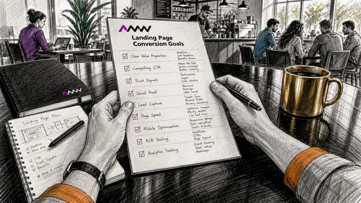
An effective landing page is a standalone web page with one conversion goal, designed to turn visitors into leads or customers through focused messaging and a single call to action. The median landing page conversion rate sits at 6.6% across industries, based on analysis of over 57 million conversions by Unbounce. Beating that figure places you in the top 25% of performers. Knowing how to create effective landing pages means understanding that every element, from the headline to the form length, either moves a visitor toward conversion or pushes them away. This guide covers the tools, layout principles, optimisation tactics, and common pitfalls that separate pages that convert from pages that just exist.
How to create effective landing pages: what you need before you start
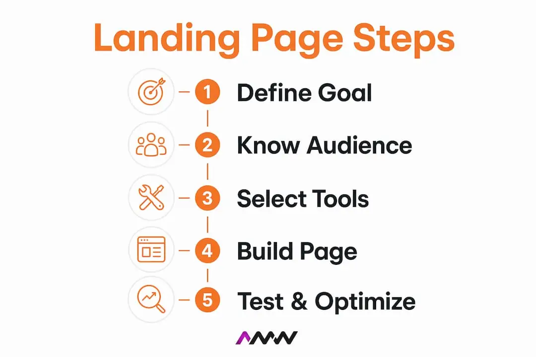
Before you open a page builder, you need three things locked in: your single conversion goal, your audience, and your measurement setup. Skipping any one of these is the fastest route to a page that looks polished but performs poorly.
Define one conversion goal
The single most important decision you make is choosing one conversion goal before anything else. Every other element on the page flows from this choice. Are you capturing email addresses, booking discovery calls, selling a product, or driving app downloads? Pick one. A page trying to do two things at once typically does neither well.
Know your traffic source and audience intent
A visitor arriving from a Google Ads campaign for “accountant London” has very different expectations from someone clicking through a Facebook retargeting ad. Your page must speak directly to the intent behind that specific traffic source. Mismatched messaging is one of the most common and most avoidable reasons pages underperform.
Choose the right tools
Here is a quick reference for the core tools you will need before building:
| Tool category | Recommended options | Purpose |
|---|---|---|
| Page builder | Unbounce, Webflow, Framer | Build and test pages without heavy dev work |
| Analytics | Google Analytics 4, Hotjar | Track conversions and user behaviour |
| CRM / email | HubSpot, Mailchimp, ActiveCampaign | Capture and nurture leads post-conversion |
| Speed testing | Google PageSpeed Insights, GTmetrix | Measure and improve load performance |
| A/B testing | VWO, Google Optimise, Unbounce | Run split tests on page variants |
Set up tracking before launch
Install Google Analytics 4 and configure a conversion event or goal before the page goes live. Without this, you are flying blind. Set up a thank-you page or confirmation event so every completed conversion is recorded accurately. This data becomes the baseline against which every future test is measured.
The basics of page speed matter here too. Core Web Vitals use real-user, percentile-based measurement, which means your page needs to perform well for the majority of actual visitors, not just on a fast desktop in a testing environment. Slow pages lose conversions before a visitor even reads your headline.
What are the essential components of a high-converting landing page?
Designing high-converting landing pages comes down to a handful of non-negotiable elements arranged in the right order. Get these right and the page does the persuasion work for you. Our web design High Wycombe page explains why most websites fail in month eighteen rather than at launch, and how owning the site and being trained on it prevents that.
Benefit-driven headline above the fold. Your headline is the first thing a visitor reads and the primary reason they stay or leave. It must communicate a clear, specific benefit in plain language. “Get 30 leads in 30 days” outperforms “Welcome to our marketing service” every single time.
Supporting copy that handles objections. The subheadline and body copy beneath your headline should clarify the offer and pre-empt the most common reasons someone would hesitate. Keep paragraphs short. Use bullet points to highlight key benefits. Visitors scan before they read.
A single, dominant call to action. A high-converting page eliminates competing navigation and links, keeping the visitor focused on one primary CTA. Your CTA button should be visually dominant, use action-oriented language (“Start my free trial”, “Book my call”), and appear above the fold as well as further down the page for longer layouts.
Short, low-friction forms. Each additional form field can lower conversion by 4 to 8%. For B2B lead capture, aim for 3 to 4 fields. For ecommerce email capture, 1 to 2 fields is the sweet spot. Ask only for what you need at this stage of the relationship.
Social proof near the CTA. Testimonials, star ratings, client logos, and case study snippets placed close to your CTA reduce the anxiety a visitor feels before committing. A single specific testimonial (“We booked 12 new clients in our first month”) beats a vague five-star rating every time.
Responsive mobile design. More than half of paid traffic arrives on mobile devices. Test your page on real handsets, not just a browser resize. Buttons need to be thumb-friendly, forms need to be easy to complete on a small screen, and load time on mobile networks matters as much as on desktop.
Minimal distractions. Remove the main site navigation. Remove footer links. Remove anything that gives a visitor a reason to click away before converting. The page should have one entry point and one exit: the conversion.
Pro Tip: Write your headline and CTA first, then build the rest of the page around them. This keeps every element aligned to the conversion goal and prevents the common mistake of writing copy that sounds good but does not drive action.
How do you optimise and test your landing page for better results?
Building the page is only the beginning. The real gains in landing page performance come from systematic testing and iteration after launch. Here is how to approach it properly.
Run A/B tests one variable at a time
A/B tests should change one variable at a time and run for approximately two weeks to reach statistical significance. Testing your headline and your CTA button colour simultaneously tells you nothing useful, because you cannot isolate which change caused the result. Patience here pays off. A test that runs for three days on low traffic is not a test. It is a guess with extra steps.
Use the LIFT framework to prioritise what to test
The LIFT framework gives you six conversion levers: Value Proposition, Relevance, Clarity, Urgency, Anxiety, and Distraction. The counterintuitive insight is that you should tackle Anxiety and Distraction before you invest in creative alternatives like new imagery or copy rewrites. Removing friction is cheaper and faster to validate than building new creative, and it typically yields a stronger return on your testing time.
Track conversion rates by traffic source
A page converting at 8% from organic search but only 2% from paid social is telling you something important. The offer, the messaging, or the audience match is off for that paid channel. Segment your conversion data by source in Google Analytics 4 and treat each traffic source as a separate optimisation problem.
Hit your Core Web Vitals targets
For good page performance, target a Largest Contentful Paint of 2.5 seconds or less at the 75th percentile. This means 75% of real users experience your page loading within that threshold. A page that loads quickly for someone on a fast broadband connection but slowly for someone on a 4G network is failing a significant portion of your audience. Use Google PageSpeed Insights to identify the specific assets or scripts causing delays.
Quick wins worth testing first
- Shorten your form to the minimum viable number of fields
- Match your headline to the exact language used in the ad or link that brought the visitor
- Move a strong testimonial directly above or below your CTA button
- Replace a generic CTA like “Submit” with a specific one like “Send me the guide”
- Test removing the site navigation entirely if it is still present
- Add a brief line beneath the CTA explaining what happens next (“No credit card required. We will email you within 24 hours.”)
These changes are fast to implement and often produce measurable lifts within a single test cycle. For a broader view of how these tactics fit into your overall digital marketing process, it helps to see landing page optimisation as one component of a larger conversion system.
What are the most common landing page mistakes to avoid?
Even experienced marketers make the same landing page mistakes repeatedly. Recognising them early saves you weeks of poor performance.
Serving multiple conversion goals on one page. A page that asks visitors to book a call, download a guide, and follow you on Instagram is not a landing page. It is a homepage with ambitions. Every additional goal dilutes the primary one. If you have multiple offers, build multiple pages.
Overloading forms. This is the hidden conversion killer on paid campaigns. Form friction drives significant drop-off in paid traffic, and reducing fields while clarifying what happens after submission recovers meaningful conversion losses. Asking for a phone number, company size, job title, and annual revenue before someone has even seen your product is a conversion disaster.
Mismatching the headline to the ad source. If your Google Ad promises “Free SEO audit for London businesses” and the landing page headline reads “Digital marketing services for growing brands”, you have broken the visitor’s expectation. This disconnect, called message mismatch, is one of the most powerful optimisation levers available to you. Fix it and conversion rates often jump immediately.
Ignoring page speed and mobile usability. A beautiful page that takes six seconds to load on mobile loses visitors before they read a single word. Run your page through Google PageSpeed Insights before launch and fix the highest-impact issues first.
Launching without tracking in place. If you go live without a conversion event configured in Google Analytics 4 or your CRM, you have no baseline. You cannot improve what you cannot measure. Set up tracking, test it, and confirm conversions are recording before you spend a penny on traffic.
Forgetting the thank-you page. The thank-you page closes the conversion loop. It confirms the action was completed, sets expectations for what happens next, and gives you a clean URL to track as a conversion event. It is also an opportunity to offer a secondary action, such as booking a call after downloading a guide, without cluttering the main page.
Pro Tip: Always build and test your thank-you page before launching. A broken or missing confirmation page leaves new leads confused and makes your conversion tracking unreliable from day one.
For more on building lead generation strategies that work alongside your landing pages, it is worth understanding how the full funnel connects from ad click to closed sale.
Key takeaways
Effective landing pages convert because they remove friction, match visitor expectations, and focus every element on a single conversion goal.
| Point | Details |
|---|---|
| One goal per page | Define a single conversion goal before building; every element must serve that goal. |
| Form length matters | Limit forms to 3 to 4 fields for B2B and 1 to 2 for ecommerce to minimise drop-off. |
| Test one variable at a time | Run A/B tests for at least two weeks to reach statistically reliable results. |
| Fix friction before creative | Use the LIFT framework to reduce anxiety and distraction before testing new copy or imagery. |
| Speed is a conversion factor | Target an LCP of 2.5 seconds or less at the 75th percentile to retain real-world users. |
What I have learned from building landing pages that actually convert
Here is something most landing page guides will not tell you: the biggest conversion gains rarely come from better design. They come from removing things.
I have worked on pages that looked impressive. Strong photography, well-written copy, a clear value proposition. And they were converting at 2%. When we stripped out the navigation, shortened the form from seven fields to three, and moved a client testimonial directly above the CTA, conversions more than doubled. We did not change the headline. We did not redesign the page. We just got out of the visitor’s way.
The LIFT framework changed how I think about testing. Most people jump straight to creative tests because they are exciting. New headline, new hero image, new colour scheme. But tackling anxiety and distraction first is almost always the faster path to a meaningful result. A visitor who trusts the page and has no distractions will convert on mediocre copy. A visitor who is anxious or confused will not convert on brilliant copy.
Form friction is the one I see businesses underestimate most consistently. There is always a reason why the sales team wants seven fields. They want to qualify leads before the first call. That is a reasonable goal, but the cost is paid in conversions you never see. The leads who would have converted at three fields but abandoned at seven are invisible in your data. You only see the ones who stayed.
The other thing worth saying plainly: a landing page is never finished. The best-performing pages I have seen are the ones that have been tested and iterated over months, not the ones that were built perfectly on the first attempt. Launch something solid, set up your tracking, and treat every month as a new opportunity to improve. The digital strategy that wins is the one that keeps learning.
Amir
Ready to build landing pages that convert?
If you want pages that do the heavy lifting for your paid campaigns and organic traffic, AMW Media builds conversion-focused landing pages as part of a broader digital strategy. From custom web design built around your conversion goals to expert PPC management that sends the right visitors to the right pages, the team handles the full picture.
Starting from scratch or improving an existing page: AMW Media works with ambitious brands to turn traffic into measurable results. Get in touch to discuss what a properly built, tested landing page could do for your business.
FAQ
What is a good conversion rate for a landing page?
The median landing page conversion rate is 6.6% across industries, based on analysis of over 57 million conversions by Unbounce. Achieving above this figure places your page in the top 25% of performers.
How many fields should a landing page form have?
For B2B lead capture, 3 to 4 fields is the recommended maximum. For ecommerce email capture, 1 to 2 fields performs best. Each additional field beyond the optimum can reduce conversions by 4 to 8%.
How long should I run an A/B test on a landing page?
Run each A/B test for approximately two weeks to reach statistical significance. Testing for shorter periods on low-traffic pages produces unreliable results and can lead to poor decisions based on insufficient data.
What is message match and why does it matter?
Message match means aligning your landing page headline with the exact language and promise used in the ad or link that brought the visitor. A mismatch between ad copy and page headline is one of the most common causes of high bounce rates and low conversions.
Do I need a separate landing page for each traffic source?
Not always, but it is best practice for paid campaigns. Visitors from Google Ads, Facebook Ads, and organic search have different intent levels and expectations. A page matched to each source consistently outperforms a single generic page used across all channels.
Recommended
- how to design a website a practical guide for 2026 | AMW Media
- Creative content production steps for marketing success in 2026
- Digital presence strategy guide for brand growth in 2026 | AMW Media
- How to master your digital marketing process for 2026
Our free marketing audit looks at your site, your ads and your content, and comes back with a 30 day plan. No pitch deck.

Leads the WordPress, Shopify and custom builds, and the integrations that connect them to your CRM. Fast, accessible and yours to keep. Meet the team.