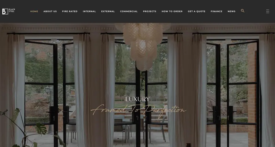
 Black Steel Doors
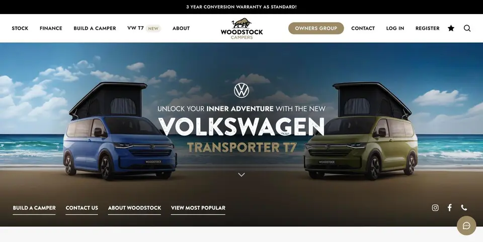 Woodstock Campers
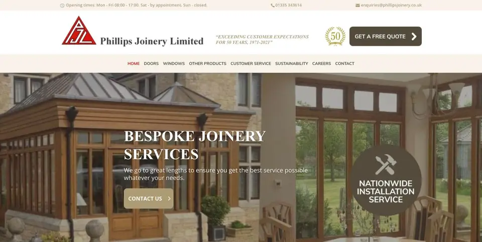 Phillips Joinery
TL;DR:
- Mastering core principles like contrast and white space is essential for effective graphic design. Regular practice and structured workflows help beginners develop professional skills quickly. Avoid common mistakes such as overusing fonts and neglecting the design brief to create clearer, more impactful visual communication.
Graphic design is the art and practice of communicating ideas visually through typography, colour, images, and layout. An aspiring designer or a marketer building brand assets: understanding visual communication principles separates work that looks professional from work that merely looks busy. This graphic design guide covers the core principles, practical tools, common mistakes, and a step-by-step project process to help you produce designs that actually do their job. The industry term for this discipline is visual communication design, and the two terms are used interchangeably throughout.
What are the fundamental graphic design principles you must master?
The seven core principles of graphic design are contrast, emphasis, balance, repetition, proportion, movement, and white space. Every professional design uses at least several of these at once. Ignoring even one creates work that feels off, even if the viewer cannot explain why.
Contrast is the difference between elements. Dark text on a light background is the most obvious example, but contrast also applies to size, shape, and texture. Strong contrast directs the eye and makes information easy to scan.
Emphasis determines what the viewer sees first. If all elements are bold, none stand out. That insight sounds obvious, but it is the single most common error in beginner work. Pick one focal point per design and build everything else around it.
Balance keeps a layout feeling stable. Symmetrical balance places equal visual weight on both sides of a composition. Asymmetrical balance achieves the same stability through contrast and proportion rather than mirroring. Neither is superior. Both require deliberate choices.
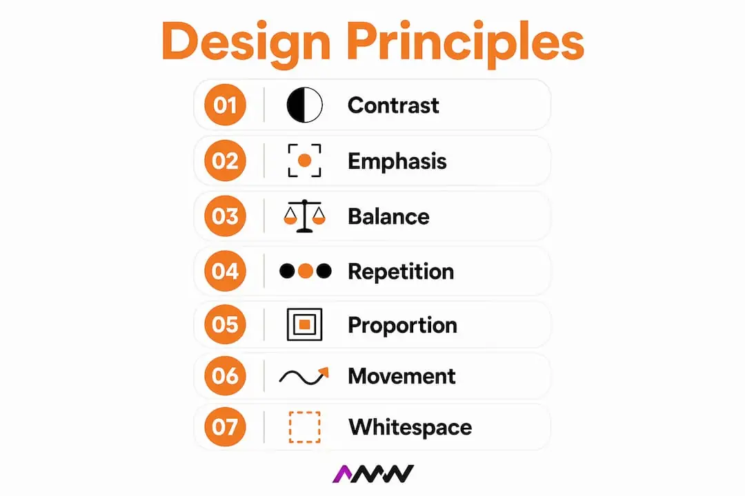
Repetition creates consistency. Using the same font, colour, and spacing pattern across a set of social media graphics makes them feel like a family rather than a random collection. Repetition is how brands build recognition.
Proportion governs the size relationship between elements. A headline that is only slightly larger than body text fails to signal its importance. A headline that is dramatically larger creates instant hierarchy.
Movement guides the eye through a composition in a deliberate sequence. Diagonal lines, arrows, and the direction a subject faces all create movement. A well-designed poster leads the viewer from the headline to the supporting detail to the call to action without them noticing.
White space, also called negative space, is the empty area around and between elements. Removing clutter through negative space is a mark of professional design. Beginners fill every corner. Professionals leave room to breathe.
Colour theory and typography
Colour affects perception before the viewer reads a single word. Warm colours like red and orange signal urgency or energy. Cool colours like blue and green suggest calm or trust. A consistent colour and typography approach builds the visual identity that makes a brand recognisable across every touchpoint.
Typography carries equal weight. The typeface you choose communicates tone before the words do. A serif font feels authoritative and traditional. A sans-serif font feels modern and clean. Mixing too many typefaces creates visual noise rather than personality.
Pro Tip: Limit your design to two typefaces maximum. Use one for headlines and one for body text. If you want variety, adjust weight or size within the same font family rather than introducing a third typeface.
Mastering visual hierarchy through scale and contrast is the single most effective way to distinguish professional work from amateur designs. Scale and contrast are the two levers you pull most often.
How can beginners start practising graphic design effectively?
The most accessible starting point for beginner graphic design is a tool with a shallow learning curve and a structured workflow. Canva and CorelDRAW Graphics Suite are two widely used options at different levels of complexity.
Beginners can learn the core Canva workflow from project setup to exporting files in approximately three to four hours. That speed makes it an excellent first tool. It handles file formats, sizing presets, and basic typography so you can focus on learning composition rather than software menus.
CorelDRAW Graphics Suite supports beginner designers by simplifying the learning curve while still producing professional outputs. It suits designers who want to move beyond drag-and-drop templates into more controlled vector work. The step up in complexity is worth it once you have the fundamentals in place.
Typical beginner workflow
A reliable workflow removes decision fatigue and keeps projects moving. The sequence below applies whether you are designing a social media post or a printed flyer.
- Project setup. Define the output dimensions and resolution before placing a single element. Web graphics typically use 72 dpi. Print graphics require at least 300 dpi.
- Element selection. Choose your colour palette, typefaces, and any images or icons before you start composing. Deciding these mid-layout leads to inconsistency.
- Composition. Place elements using a grid. Grid systems organise layout and improve clarity by giving every element a logical home.
- Review and export. Check alignment, spacing, and contrast. Export in the correct format for the medium: PNG or SVG for web, PDF or TIFF for print.
File management matters more than most beginners expect. Name files descriptively (for example, “client-name-social-post-v2-final”) and keep versions in clearly labelled folders. Disorganised files waste time and cause costly errors when a client requests changes six months later.
Dedicating 20 minutes daily of consistent practice leads to visibly professional results within three months. That is a small daily commitment for a marketable skill.
Pro Tip: Set a daily 20-minute design challenge. Pick a real brief, such as redesigning a local café’s takeaway menu, and complete it from setup to export. Real constraints produce faster learning than open-ended practice.
| Tool | Best for | Key strength | Complexity |
|---|---|---|---|
| Canva | Social media, presentations | Fast workflow, template library | Low |
| CorelDRAW | Print, vector illustration | Precise vector tools, professional output | Medium |
| Adobe Illustrator | Branding, logos, print | Industry standard, full vector control | High |
| Adobe Photoshop | Photo editing, digital art | Pixel-level control, layered editing | High |
What common beginner mistakes should you avoid?
Most beginner design errors fall into four categories: typography, colour, layout, and workflow. Correcting these early saves months of frustration.
Using too many fonts. Limiting typography to a maximum of two fonts and maintaining a colour palette of two to three key colours improves readability and cohesion. Every additional font introduces visual noise.
Ignoring the design brief. Neglecting the design brief leads to purely aesthetic choices instead of strategic designs. A beautiful poster that fails to communicate the right message to the right audience is a failed design, regardless of how it looks.
Over-relying on templates. Templates are useful learning tools, but leaning on them too heavily prevents you from understanding layout structure. Use a template to understand proportions, then rebuild the layout from scratch to test your understanding.
Neglecting white space. Cramming elements into every corner makes a design feel anxious and hard to read. White space is not wasted space. It is the breathing room that makes the important elements stand out.
Not testing across mediums. A design that looks sharp on a laptop screen may look muddy when printed or tiny on a mobile screen. Always preview your work at the intended output size and on multiple devices before signing off.
Skipping version control. Saving over the original file is a habit that causes real pain. Keep numbered versions and never delete earlier drafts until the project is fully approved and delivered.
Correcting these six mistakes alone will move your work from amateur to credible. None of them require advanced software skills. They require discipline and attention to process.
How do you create a graphic design project from scratch?
A clear process turns a blank canvas into a finished, purposeful design. The steps below apply to any project, from a social media graphic to a printed brochure.
Step 1: Understand the brief and define the audience
Read the brief carefully before opening any software. Identify the audience, the message, the medium, and the desired action. A design for a 25-year-old fitness brand communicates differently from one for a solicitor’s firm. Knowing who you are designing for shapes every decision that follows.
Step 2: Build a mood board
Collect visual references that reflect the tone you want. Mood boards are not about copying. They are about calibrating your aesthetic instincts to the project. Pinterest, design blogs, and printed magazines are all valid sources. Aim for ten to fifteen references before you start composing.
Step 3: Select colour and typography
Choose a palette of two to three colours and two typefaces. Test them together before committing. A colour that looks strong in isolation may clash badly with your secondary choice. Use a colour wheel to check harmony. Complementary colours sit opposite each other on the wheel and create strong contrast. Analogous colours sit adjacent and create calm, cohesive palettes.
For graphic design ideas applied to marketing, the colour and typography choices carry the brand’s personality. Get these right early and the rest of the layout falls into place more naturally.
Step 4: Build the layout using grids
Grids are the invisible scaffolding of professional design. They create consistent margins, align elements across a composition, and make layouts feel intentional rather than accidental. Most design tools include a grid or guide feature. Turn it on and use it from the first element you place.
Apply visual hierarchy at this stage. The most important element should be the largest and have the strongest contrast. Supporting information sits below it in scale and weight. The viewer’s eye follows this sequence without conscious effort.
Step 5: Add images and apply effects carefully
Images should support the message, not decorate it. Choose photos with a clear focal point and enough negative space to place text over them without obscuring the subject. Apply effects like drop shadows or gradients sparingly. One well-chosen effect adds depth. Three competing effects add confusion.
Step 6: Final checks and export
Check alignment, spacing, colour consistency, and typography before exporting. Zoom out to see the full composition at a glance. If something feels wrong at a distance, it is wrong. Export in the correct format for the medium.
| Consideration | Print design | Digital design |
|---|---|---|
| Resolution | 300 dpi minimum | 72 dpi standard |
| Colour mode | CMYK | RGB |
| File format | PDF, TIFF, EPS | PNG, SVG, JPEG |
| Bleed | 3mm bleed required | Not applicable |
| Font embedding | Required for print | Web-safe fonts preferred |
Following a structured web design process shares many of the same principles as graphic design. The discipline of brief, structure, and testing applies across both disciplines.
Key takeaways
Effective graphic design combines core principles, consistent practice, and a disciplined process to produce work that communicates clearly and looks professional.
| Point | Details |
|---|---|
| Master the seven principles | Contrast, emphasis, balance, repetition, proportion, movement, and white space underpin every effective design. |
| Practise daily | Twenty minutes of daily practice produces visibly professional results within three months. |
| Limit fonts and colours | Use a maximum of two fonts and two to three colours to maintain cohesion and readability. |
| Always start with the brief | Defining the audience and message before opening software prevents aesthetic-only designs that miss the point. |
| Use grids for every layout | Grid systems create consistent, balanced compositions and remove guesswork from element placement. |
Why most designers improve slowly (and how to fix it)
Most designers plateau not because they lack talent, but because they skip the fundamentals and rely on templates too early. I have seen this pattern repeatedly. Someone discovers Canva, produces a few decent-looking posts, and then hits a wall when a client asks for something outside the template library. The work falls apart because the underlying principles were never learned.
The fix is deliberate. Spend the first month studying one principle per week. Contrast one week, hierarchy the next. Recreate designs you admire from scratch, without templates. This is the equivalent of a musician learning scales before playing songs. It feels slow, but it compounds.
The mindset shift that matters most is moving from “does this look nice?” to “does this communicate the right thing to the right person?” Aesthetics are a tool, not the goal. A design that looks beautiful but confuses the viewer has failed. A design that looks simple but drives the desired action has succeeded.
Brand consistency is where this thinking pays off commercially. Designers who understand principles can build visual systems that hold together across dozens of touchpoints. That is the skill clients pay for, not the ability to use a specific tool.
The other thing worth saying: do not wait until you feel ready. The gap between where you are and where you want to be closes only through making work, getting feedback, and making more work. Twenty minutes a day is enough to start. Our Northampton page makes the point that workshops and conversion businesses film well and their buyers search with intent.
Amir
AMW Media’s graphic design and creative services
Good design skills take time to build. While you are developing yours, having expert support for client-facing work makes a real difference.
AMW Media is a digital marketing and creative agency that produces brand visuals, marketing graphics, and social media content for ambitious brands. The team handles everything from initial concept through to final delivery, with a focus on designs that serve a clear marketing purpose rather than just looking good. If you need professional graphic design support while you build your own skills, or if you want a team to handle your brand’s visual output entirely, AMW Media offers specific packages to suit both needs. Get in touch to discuss what your brand requires.
FAQ
What is graphic design in simple terms?
Graphic design is the practice of communicating ideas visually using typography, colour, images, and layout. The goal is always to convey a specific message to a specific audience clearly and effectively.
How long does it take to learn graphic design basics?
Twenty minutes of daily practice produces visibly professional results within three months. Learning the core workflow of a tool like Canva takes approximately three to four hours.
What are the most important graphic design principles for beginners?
Contrast, emphasis, and white space are the three principles that produce the most immediate improvement in beginner work. Mastering visual hierarchy through scale and contrast separates professional designs from amateur ones.
Do I need expensive software to start designing?
No. Canva is free to use and covers most beginner needs. CorelDRAW Graphics Suite offers a more controlled environment for designers ready to move beyond templates, at a mid-range price point.
What is the difference between RGB and CMYK colour modes?
RGB is used for digital screens and combines red, green, and blue light. CMYK is used for print and combines cyan, magenta, yellow, and black ink. Using the wrong colour mode produces unexpected results when a design moves from screen to print.
Recommended
- Graphic design ideas for marketing: 2026 guide | AMW Media
- Elevate your brand identity: What is visual branding? | AMW Media
- How to create engaging visuals that stop the scroll | AMW Media
- Creative Graphic Design Services London | AMW Media | AMW Media
Our free marketing audit looks at your site, your ads and your content, and comes back with a 30 day plan. No pitch deck.

Owns how everything looks and feels, from a brand identity to the grade on a reel, and makes the animated films such as Blue Light Services' Journey to Net Zero. Meet the team.