
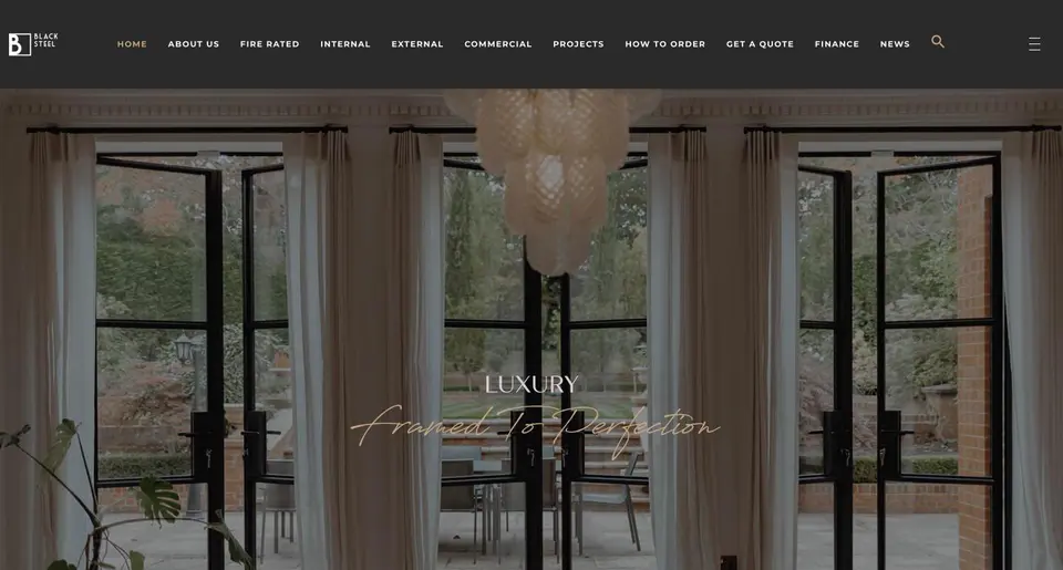
 Black Steel Doors
 Woodstock Campers
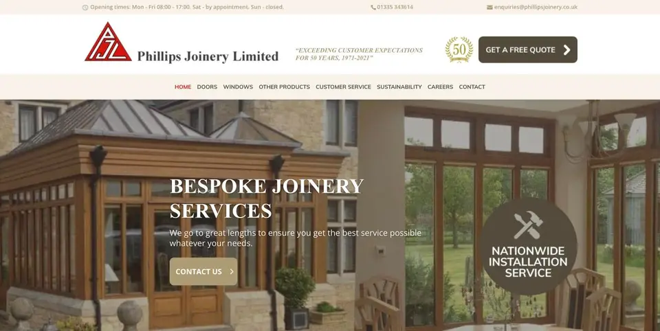 Phillips Joinery
TL;DR:
- A web design tutorial guides beginners through creating functional, visually appealing websites using HTML, CSS, and UX principles. It emphasises starting with free tools like VS Code and Chrome, understanding structure and style, and applying responsive design and user-centred practices. Building a simple project such as a blog helps solidify skills, with community critique and iterative improvement being crucial for progress.
A web design tutorial is a step-by-step learning pathway that teaches beginners how to create functional, visually appealing websites by covering core skills from HTML structure and CSS styling through to user experience principles. Whether you want to build a personal blog, a portfolio, or a small business site, the process follows the same logical sequence: understand the tools, learn the code, apply design thinking, then build something real. This guide walks you through each phase in plain English, with no assumed knowledge and no unnecessary detours. By the end, you will have a clear picture of how to design a website from scratch, using free tools that professional designers rely on every day.
What tools and prerequisites do beginners need for web design?
The only two things you need to start a web design tutorial are a text editor and a web browser. Free tools like Visual Studio Code and Chrome are sufficient to build a fully styled, responsive page without spending a penny. That matters because it removes the most common excuse for not starting.
Choosing your text editor and browser
Visual Studio Code (VS Code) is the leading free code editor for beginners in 2026. It highlights syntax errors in real time, offers extensions for live browser preview, and has a vast community producing tutorials and plugins. Chrome and Firefox both include developer tools (right-click, then “Inspect”) that let you examine and edit HTML and CSS live in the browser. Edge works equally well. Pick one browser and learn its developer tools properly before switching.
Setting up your project folder
Before writing a single line of code, create a folder on your desktop called something like “my-first-site. Inside it, create two files: index.htmlandstyles.css`. This simple structure is the foundation of almost every website ever built. Keeping files organised from day one saves hours of confusion later.
CMS platforms and website builders
Using a CMS or website builder helps beginners focus on content, design, and SEO rather than wrestling with server configuration. Platforms like Webflow, WordPress, and Squarespace let you see design changes instantly, which accelerates learning. The trade-off is that you learn less about underlying code. The best approach is to use a builder for your first live project while studying HTML and CSS in parallel.
Pro Tip: Have your content ready before you open a design tool. Placeholder text like “Lorem ipsum” leads to layouts that fall apart the moment real words appear. Write your headings, body copy, and image descriptions first.
Here is a quick comparison of the most beginner-friendly tools:
| Tool | Type | Cost | Best for |
|---|---|---|---|
| Visual Studio Code | Code editor | Free | Manual HTML/CSS coding |
| Webflow | Visual builder | Free tier available | No-code/low-code design |
| WordPress | CMS | Free (hosting extra) | Blogs and content sites |
| Google Fonts | Font library | Free | Typography without licensing fees |
| Chrome DevTools | Browser inspector | Free | Debugging and layout testing |
Google Fonts deserves a special mention. Custom web fonts can be loaded via a single line of CSS using @font-face or by linking a Google Fonts stylesheet in your HTML <head>. Learning this early prevents the common mistake of designing with a font your users will never actually see.
How to understand and apply HTML and CSS in web design
HTML and CSS are the two languages that every web designer needs to know, even if they eventually work primarily in visual builders. HTML defines the structure and meaning of content. CSS controls how that content looks. Together, they form the backbone of every page on the internet.
Understanding HTML structure
HTML is built from elements wrapped in tags. A basic page looks like this:
<!DOCTYPE html>
<html lang=”en”>
<head>
<meta charset=”UTF-8″>
<title>My First Page</title>
<link rel=”stylesheet” href=”styles.css”>
</head>
<body>
<h1>Hello, world</h1>
<p>This is my first paragraph.</p>
<a href=”https://example.com”>Visit this link</a>
</body>
</html>
The <head> section contains metadata and links to your stylesheet. The <body> contains everything the user sees. Headings run from <h1> (most important) to <h6> (least important). Paragraphs use <p>. Links use <a href=”…”>. That covers roughly 80% of the HTML you will write as a beginner.
Styling with CSS
CSS works by selecting an HTML element and declaring how it should look. A simple rule looks like this:
h1 {
font-family: ‘Inter’, sans-serif;
colour: #1a1a1a;
font-size: 2rem;
}
The selector (h1) targets the element. The declarations inside the curly braces set the visual properties. External stylesheets, linked from your HTML <head>, keep your code clean and reusable. Inline styles (written directly on an element) work but become unmanageable quickly, so avoid them as a habit.
The CSS box model
Every HTML element is treated as a rectangular box. That box has four layers: content, padding, border, and margin. Understanding this is the single most important concept for controlling layout. When elements overlap or spacing looks wrong, the box model is almost always the culprit. Set box-sizing: border-box at the top of your stylesheet to make width calculations predictable.
Responsive design with Flexbox
Flexbox is a CSS layout system that arranges elements in rows or columns and adapts them to different screen sizes. A responsive web design tutorial cannot skip this. A basic Flexbox container looks like this:
.container {
display: flex;
flex-wrap: wrap;
gap: 1rem;
}
Adding flex-wrap: wrap means items drop to the next line on smaller screens rather than overflowing. This single property handles a surprising amount of mobile layout work.
Pro Tip: Learn CSS font-display and unicode-range properties early. Font loading optimisation prevents invisible text flashing on slow connections, which is a common issue beginners only discover after launch.
Here is a numbered summary of the steps to build a simple styled page:
- Create index.html with a valid HTML5 structure
- Add headings, paragraphs, and at least one link in the <body>
- Create styles.css and link it in the <head>
- Set box-sizing: border-box and a base font in CSS
- Style headings, body text, and links with colour and font rules
- Add a Flexbox container for any multi-column layout
- Open the file in Chrome and use DevTools to inspect and adjust
What are the UX and UI fundamentals every beginner should know?
UX and UI are two distinct disciplines that beginners often conflate. UX focuses on the user’s overall experience and emotional journey through a site, while UI concerns the specific interactive controls and visual elements the user touches. A beautifully styled button (UI) placed where no one looks (poor UX) fails both disciplines. You need both working together.
User personas and information architecture
A user persona is a fictional profile representing your typical visitor. It includes their goals, frustrations, and technical comfort level. Building even one rough persona before designing forces you to make decisions based on user needs rather than personal taste. Information architecture (IA) is the practice of organising your content so users can find what they need without thinking too hard. A simple IA exercise is writing every page of your site on a sticky note and grouping them logically before touching any design tool.
Wireframes and prototyping
A wireframe is a low-fidelity sketch of a page layout, showing where elements sit without any colour or typography. Tools like Figma (free tier) and even pen and paper work perfectly for this stage. Wireframing before coding prevents the expensive habit of building something, hating the layout, and rebuilding it from scratch. Prototyping adds interactivity to wireframes so you can test navigation flows before writing a line of code.
Layout patterns that guide the eye
F-pattern and Z-pattern layouts are visual hierarchies that reflect how users naturally scan a page. The F-pattern applies to text-heavy pages: users read across the top, then scan down the left side. The Z-pattern suits simpler pages with a clear call to action: eyes travel across the top, diagonally to the bottom left, then across to the bottom right. Placing your most important content along these paths increases the chance users actually read it.
Colour theory and typography basics
Colour communicates before words do. A blue palette signals trust and calm. Red signals urgency. Limiting yourself to two or three colours in your first project prevents the visual chaos that plagues beginner designs. For typography, pairing one serif font with one sans-serif font covers most use cases. Google Fonts offers hundreds of free, well-optimised options.
Pro Tip: Test your colour contrast using the WebAIM Contrast Checker before finalising your palette. Accessibility is not optional. Low contrast text fails users with visual impairments and also hurts your SEO.
Key UX/UI principles to apply from day one:
- Keep navigation to five items or fewer on your first project
- Use consistent spacing (a base unit of 8px works well for most layouts)
- Write link text that describes the destination, not just “click here”
- Never use more than two typefaces on a single page
- Prioritise mobile layout first, then scale up to desktop
How to build your first website step by step
Starting with a simple project like a blog is the most effective way to apply everything you have learned without becoming overwhelmed. A blog has a homepage, a post page, and an about page. That is enough complexity to practise HTML structure, CSS styling, navigation, and responsive layout without needing a team or a budget.
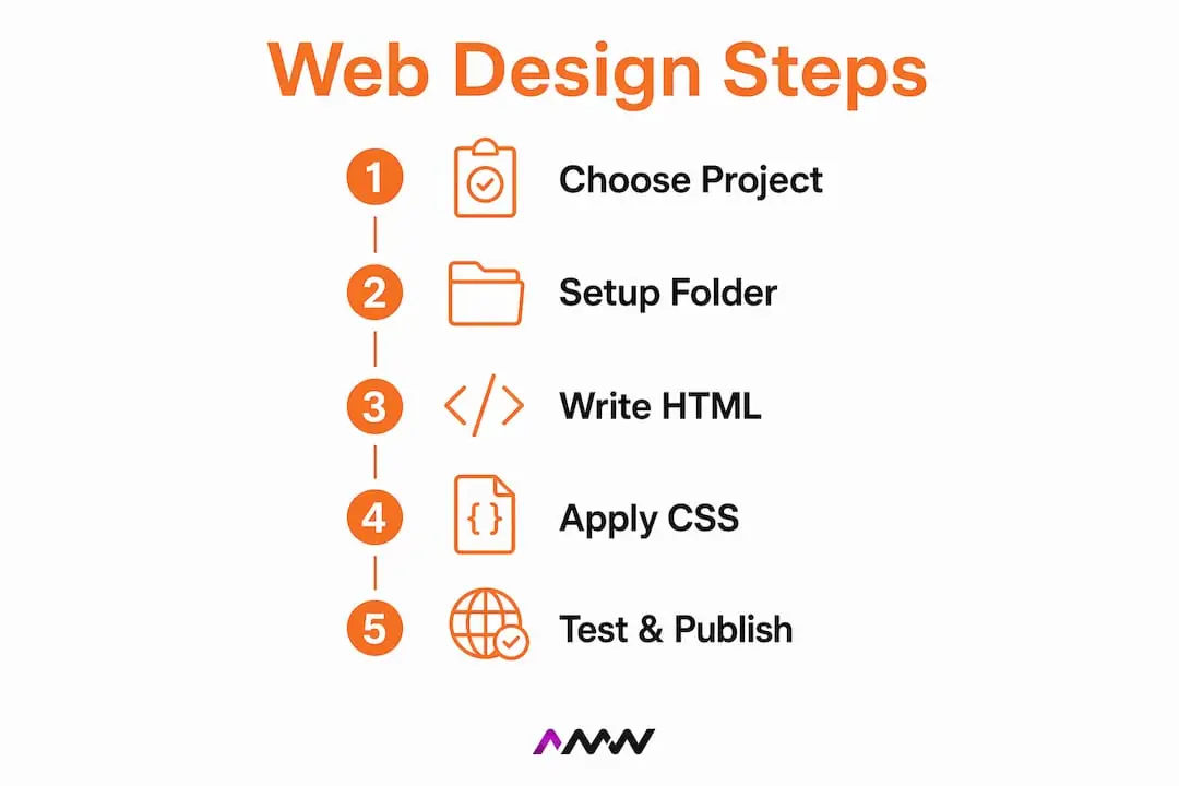
Step 1: Choose your project type and prepare content
Decide what your site is for before opening any tool. Write your homepage headline, a short paragraph about yourself or the site’s purpose, and at least one sample blog post. Real content reveals layout problems that placeholder text hides.
Step 2: Choose your platform
If you want to learn HTML and CSS directly, build manually in VS Code. If you want a live site quickly while learning design principles, use WordPress or Webflow. CMS templates let you build real pages fast, then gradually refactor to manual coding for advanced control. Neither path is wrong. They serve different learning goals.
Step 3: Build the HTML structure first
Write the full HTML for your homepage before adding any CSS. This forces you to think about content hierarchy rather than aesthetics. Use semantic elements:
Step 4: Apply CSS styling
Link your stylesheet and begin with global styles: font family, base font size, colour variables, and box-sizing. Then style individual sections from top to bottom. Resist the urge to make it look perfect immediately. Get the layout right first, then refine colours and typography.
Step 5: Test responsiveness and cross-browser compatibility
Open Chrome DevTools and toggle the device toolbar (Ctrl+Shift+M on Windows, Cmd+Shift+M on Mac). Check your layout at 375px (iPhone), 768px (tablet), and 1280px (desktop). Fix any overflow or stacking issues using Flexbox or CSS media queries. Then open the same page in Firefox and Edge to catch browser-specific quirks.
Pro Tip: Using templates to accelerate learning is not cheating. Dissecting a well-built template teaches you patterns you would take months to discover independently. Edit every section, break things deliberately, and observe what changes.
Common mistakes to avoid on your first build:
- Skipping the wireframe stage and designing directly in code
- Using fixed pixel widths instead of percentages or rem units
- Forgetting to add a <meta name=”viewport”> tag (this breaks mobile layouts)
- Uploading uncompressed images that slow page load significantly
- Ignoring keyboard navigation and focus states for accessibility
Iteration is the real skill. Your first version will not be your best version. Publish it, share it with three people whose opinions you trust, collect specific feedback, and improve one thing at a time. A good beginner tutorial integrates visual design, coding, and user experience from the start rather than treating them as separate subjects to tackle in sequence.
Key takeaways
Mastering web design as a beginner requires combining HTML and CSS fundamentals, UX/UI principles, and practical building experience in a single structured process rather than learning each discipline in isolation.
| Point | Details |
|---|---|
| Start with free tools | Visual Studio Code and Chrome are sufficient to build and test a fully styled, responsive page. |
| Learn HTML before CSS | Structure your content semantically first, then apply styling to avoid layout confusion later. |
| Apply UX before you design | Wireframe your layout and define user goals before writing a single line of code. |
| Use templates strategically | Start with a CMS template to build quickly, then refactor manually to deepen your coding knowledge. |
| Test on real devices | Check layouts at 375px, 768px, and 1280px breakpoints before publishing anything publicly. |
Why I think most beginners learn web design in the wrong order
Most tutorials I encounter teach HTML first, then CSS, then maybe a paragraph on UX at the end as an afterthought. That sequence produces developers who can build pages that technically function but feel confusing and visually flat. I have seen this pattern repeatedly when reviewing work from people early in their careers.
The order that actually works is the reverse. Start with user intent. Who is this page for, and what do they need to do on it? Sketch a wireframe on paper. Only then open VS Code. When you write HTML with a clear wireframe in front of you, every element has a purpose. When you write CSS with a defined colour palette and type scale, every rule feels deliberate rather than experimental.
The other thing most tutorials undervalue is community. Joining a Discord server for web designers, sharing your work on forums like the Webflow community or freeCodeCamp, and asking for critique from people slightly ahead of you accelerates progress faster than any course. Feedback on real work is irreplaceable. You can read about the F-pattern all day, but someone pointing out that your navigation is buried below the fold teaches you the same lesson in ten seconds.
Patience is the unglamorous part nobody talks about enough. Your first site will embarrass you in six months. That is not failure. That is evidence you have improved. The designers I respect most are the ones who publish imperfect work, learn from it, and iterate. Perfectionism at the beginner stage is just procrastination with better branding.
Experiment freely. Break your layout deliberately. Rebuild it. That cycle is the actual tutorial.
Amir
Ready to go beyond the basics with your web design?
Learning the fundamentals is satisfying, and the skills you build through a structured web design tutorial will serve you for years. But there comes a point where a personal project needs professional execution, whether that is a client site, a product launch, or a brand that needs to compete in a serious market.
AMW Media’s custom web design and development team builds custom websites that blend strategic thinking with creative craft, from initial wireframes through to a fully optimised, responsive build. If you have built your foundational skills and want to see what a professionally engineered site looks like from the inside, or if you simply want expert hands on your next project, AMW Media works with ambitious brands across the UK to deliver sites that perform as well as they look.
FAQ
What is a web design tutorial for beginners?
A web design tutorial for beginners is a structured guide that teaches the core skills needed to build a website, typically covering HTML, CSS, basic UX principles, and practical project steps. Effective tutorials balance theory with hands-on building to accelerate real learning.
Do I need to learn coding to design a website?
Basic HTML and CSS knowledge is strongly recommended even if you use a visual builder, because it helps you troubleshoot layout issues and customise designs beyond template limits. A text editor and browser are all you need to start practising immediately.
What is the difference between UX and UI in web design?
UX (user experience) covers the overall ease and emotion of using a site, while UI (user interface) covers the specific visual controls and interactive elements. Both disciplines must work together for a site to feel intuitive and look polished.
How long does it take to learn web design basics?
Most beginners can build a simple, styled, responsive page within four to eight weeks of consistent daily practice using free resources. Starting with a small project like a blog, as recommended for beginners, prevents overwhelm and produces a tangible result quickly.
What is responsive web design and why does it matter?
Responsive web design means a site adapts its layout to fit any screen size, from mobile phones to large desktop monitors. With the majority of web traffic now coming from mobile devices, a site that only works on desktop loses a significant portion of its potential audience from day one.
If you would rather not build it yourself, the same principles run through every site we make, including our Milton Keynes builds on WordPress, Shopify and Framer.
Recommended
- How to design a website: a practical guide for 2026
- Types of SEO strategies: a practical 2026 guide
- How to master your digital marketing process for 2026
- Web Development and Design That Elevates Your Brand
Our free marketing audit looks at your site, your ads and your content, and comes back with a 30 day plan. No pitch deck.

Owns how everything looks and feels, from a brand identity to the grade on a reel, and makes the animated films such as Blue Light Services' Journey to Net Zero. Meet the team.