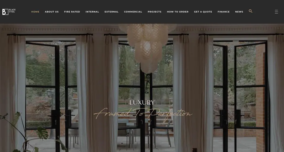
 Black Steel Doors
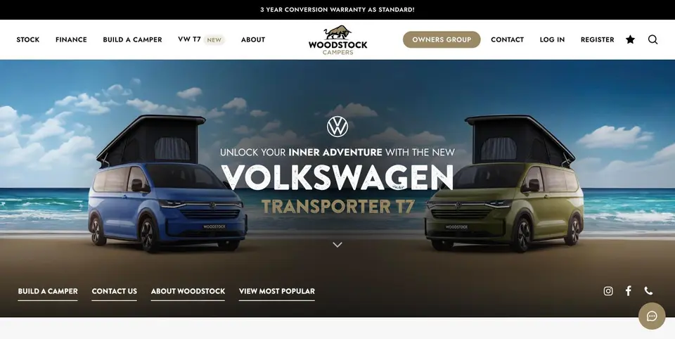 Woodstock Campers
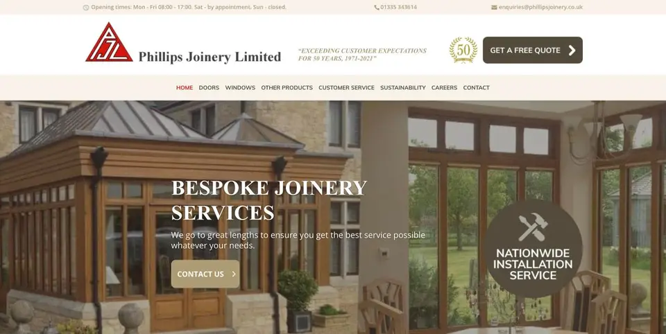 Phillips Joinery
Case study · AMW Media · High Wycombe Why we rebranded, and what changed
We rebranded ourselves the way we rebrand clients: discovery, directions, refinement, roll out. The result is the identity you are looking at, and we hold it to the same standard as every other project on this page.

A studio brand for an agency business
AMW Media started as a video and photography studio. By 2026 it was an in house agency with eight services, a team of twelve and a software product, and the old identity said the first thing while the business did the second. Clients were hiring us for Google Ads and CRM builds off a brand that looked like a camera hire company.
Who we work for, and what they say about us
Discovery with the team: who we work for, what they buy, what they say about us in reviews. Then three directions, argued over, one chosen. The same process we run for clients, with the same discomfort of being on the other side of it.
Two typefaces, six colours, and rules
Refinement into a system: Anton for headlines, Montserrat for body text, a hand drawn accent face for the moments that need a human touch; a palette of off white, black, purple, blue, green and orange with rules for how much of each; a dark studio direction for the website where the work is the hero. The astronaut mascot stayed, in a supporting role, because a mascot people already recognise is worth keeping.
Site, proposals, social, films
Rolled out across the website you are on, the proposals, the social channels and the films. A website where the work is the hero, results are published with dates, and every page has one thing you remember.
Measured the way we measure clients
Whether it worked is measured the same way we measure clients: enquiries, and where they came from, in the same CRM and the same dashboard. We will publish that here when there are complete months to publish.
How it unfolded
The same four stages we run for clients.
- DiscoveryWho we work for
The team, the reviews, what clients actually buy from us.
- DirectionsThree, then one
Argued over, refined, chosen.
- RefinementThe system
Type, colour, tone and the rules for using them.
- Roll outEverywhere
The website, proposals, social and the films.
- NowMeasured
Enquiries and their sources, in the same dashboard as our clients.
The work, in the open
What we learned
Rebranding yourself is harder than rebranding a client, because nobody can be objective about their own name. The process is what saves you: discovery before opinions, directions before decisions, rules before roll out. It is the process on our graphic design page, and it works on us too.
The identity you are looking at
This site is the roll out. The type, the colour, the astronaut in a supporting role and the results published with dates are all the brand system in use.
If your brand says one thing while your business does another, the audit is where we start.
See more projectsQuestions
What does a rebrand include?
How long does a rebrand take?
Why keep the astronaut?
How do you know when a business needs a rebrand?
Why should we trust an agency's own rebrand as proof?
Explore further
Other brands we grow
Tell us what you need
Four details and a line about your business. A director reads it and replies within one working day. If you want us to review your marketing first, the free audit and 30 day plan is the place to start.
- ✓ Replies from a person with a name, not a sequence
- ✓ No mailing list, no contract, no obligation
- ✓ Video, social, ads, web, SEO, design, email and CRM under one roof